You’re running A/B tests. That already puts you ahead of most websites. But running tests and running them well are two different things.
Bad tests are worse than no tests. They give you confidence in the wrong answer. You make changes based on data that looked real but wasn’t. Then conversions drop, and you have no idea why. (Our A/B testing guide covers how to get started the right way, and our guide on proper experiment design helps you avoid most of these mistakes before they happen.)
These are the A/B testing mistakes that trip up beginners and experienced testers alike. Some are obvious once you see them. Others are sneaky. All of them are fixable. Getting your testing methodology right matters more than running more tests. (For the flip side, our A/B testing best practices guide covers what to do right.) (Not sure what to test? The A/B testing ideas list helps you pick high-impact experiments. And the sample size calculator tells you how long to run each one.)
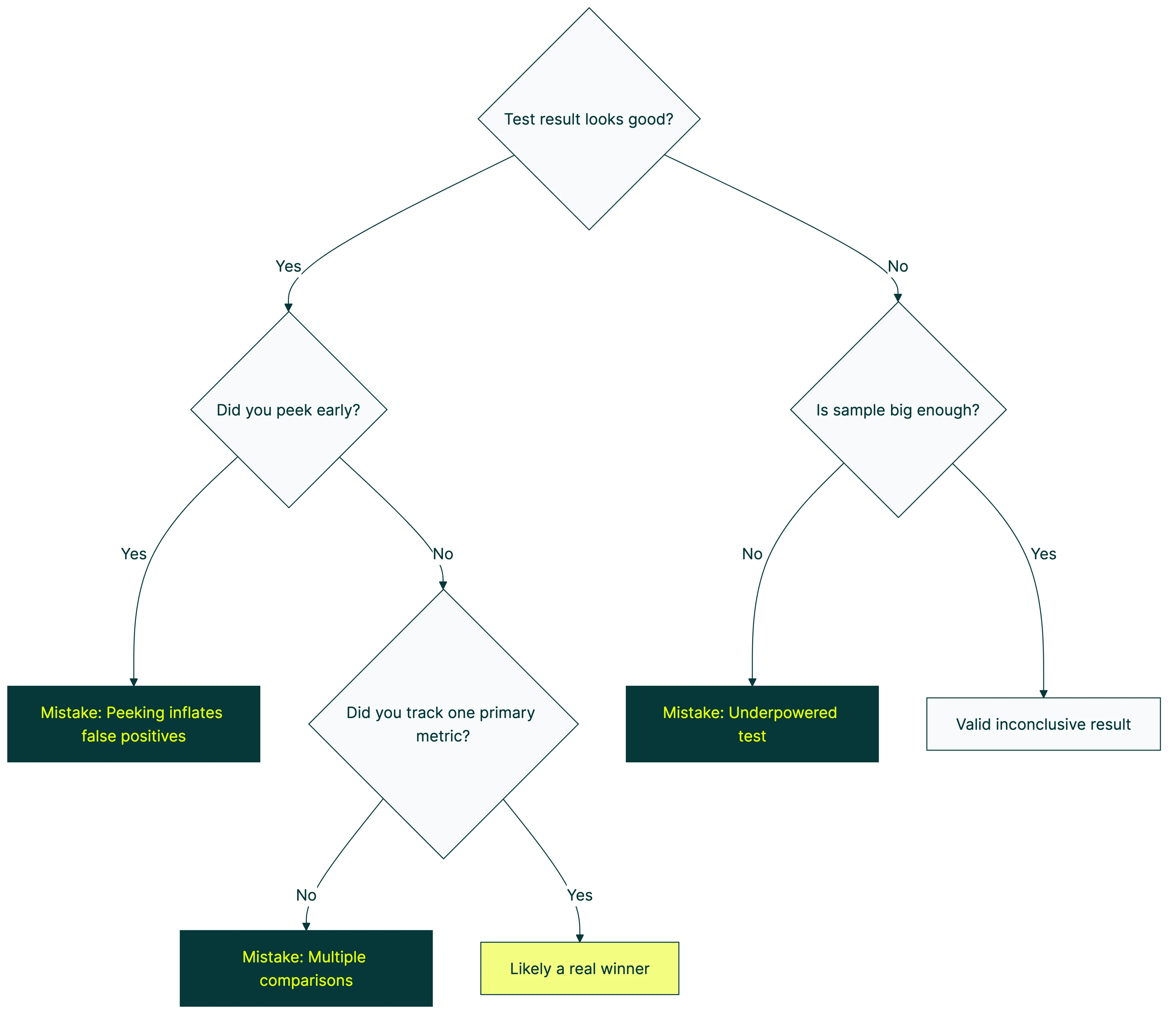
1. Stopping the test too early
This is the number one A/B testing mistake. It’s also the most tempting.
Your test has been running for 48 hours. Version B is up 25%. The graph looks beautiful. Everything in you wants to call it a winner and move on.
Don’t.
Early results are noise. Research from Evan Miller shows that checking results continuously makes you 5x more likely to pick a fake winner. Think of it like asking 15 people at a coffee shop if they prefer your old headline or your new one. Even if 12 say the new one, that doesn’t mean much. Too few people, too short a window.
Statistical significance and null hypothesis testing exist for exactly this reason. They tell you when you’ve seen enough visitors to trust the result. Most tests need at least 1,000 to 2,000 visitors per version before the data means anything. Some need more.
How to fix it: Set your sample size before you start by running a power analysis before your test and picking the right minimum detectable effect for your test. If you want to catch setup problems before they contaminate real results, run an A/A test first to confirm your tool splits traffic correctly and doesn’t flag false winners. Don’t look at results daily (seriously, don’t). And use a tool with a Bayesian stats engine that tells you in plain language when the answer is ready. Picking the right CRO software makes a difference here. You want something that handles the statistics for you. (If you’re stuck between the two biggest names, our VWO vs Optimizely comparison breaks down which one handles stats better.) You can set up a test like this in about three minutes and let the math do the waiting for you.
2. Testing too many things at once
When you change five things between Version A and Version B, you learn nothing useful. You can’t repeat the win because you don’t know what drove it.
The only time multi-element changes work is when you’re testing two completely different page concepts. “Minimalist design vs. feature-heavy design” is a fair test. “Same page but I tweaked seven random things” is not. If you’re comparing completely different pages, that’s actually a split test. Our guide on split testing meaning explains the three types, and choosing the right split testing software matters for that approach.
How to fix it: Test one change at a time. Headline against headline. Button text against button text. It feels slower. It is slower. But you’ll actually learn something you can use on every page, not just this one.
Our take: The simple stuff works. Test your headline first. Then your button text. Then your offer. In that order. You’ll learn more from three simple tests than from one big messy one.
3. No hypothesis before the test
“Let’s test a red button vs. blue button” isn’t a hypothesis. It’s a guess with a visual editor.
A hypothesis sounds like this: “Our signup button blends into the background. A higher-contrast color should get more clicks because visitors will actually notice it.”
Now if the test wins, you learned something about visual contrast on your page. If it loses, you learned that button visibility wasn’t the problem, which is also useful.
How to fix it: Before every test, write one sentence: “I believe [change] will [result] because [reason].” If you can’t fill in the “because,” you’re not ready to test yet. Our hypothesis generator tool walks you through the format. Your CRO process should start here, not with the visual editor.
4. Running tests on pages with too little traffic
Low traffic doesn’t mean you can’t test. It means you have to be smart about what you test, or consider alternatives to A/B testing that work better with limited visitors. An analysis of 115 real A/B tests found that nearly 70% didn’t have enough visitors to detect a real difference. Our guide on measuring conversion rates in A/B tests covers how much traffic you actually need for reliable results. And with more visitors opting out of tracking, understanding how cookie consent affects your tests is becoming just as important as traffic volume. Even your choice between client-side and server-side testing affects how much data you can collect. The tests ran, the numbers moved around, and the results meant nothing.
Subtle changes (a slightly different shade of green on your button) need massive traffic to detect. Bold changes (a completely new headline, rearranged page layout, different offer) can show results with fewer visitors.

How to fix it: On low-traffic pages, go big. Test your value proposition, not your font size. And pick your highest-traffic page for your first test. For most sites, that’s the homepage. CUPED can help get results faster by stripping out noise using pre-experiment data, so your limited traffic goes further. Our landing page split testing guide has the exact traffic thresholds you need.
5. Peeking at results and making decisions
This is called “peeking,” and it’s closely related to mistake #1. Looking is fine. Acting on what you see before the data is ready? That’s where things go wrong. CXL’s research on peeking found that checking at every 10% of your sample makes you pick fake winners 30% of the time.
When a test is running, results fluctuate. That’s normal. The first 500 visitors might lean heavily toward Version B. The next 500 might flip it. Early patterns almost never hold. Acting on those early patterns is how you end up with false positive and false negative errors that quietly wreck your results.
How to fix it: Check once a week, maximum. Better yet, set up your A/B testing tool to email you when results are significant. Then ignore the dashboard until that email arrives. If you genuinely need to monitor results as they come in, sequential testing solves the peeking problem by adjusting the math at each check-in. Alternatively, multi-armed bandit testing sidesteps the issue by automatically shifting traffic toward the better-performing version as data accumulates. Some automated A/B testing platforms handle both peeking protection and traffic allocation for you, so you don’t have to choose.
Our take: This is the mistake we built Kirro to prevent. Bayesian stats tell you when the answer is ready in plain English. No peeking temptation, no guessing when to stop. The tool just says “this one’s better” when it actually is. Want the full story on how Bayesian A/B testing works? We wrote the honest version.
6. Testing when you don’t have enough conversions
Traffic matters. But conversions matter more.
You need enough conversions (not just visitors) to spot a real difference. If your conversion rate is 0.2%, you need a huge amount of traffic before anything stabilizes. Most small tests never get there. And you’re left staring at a dashboard that says “inconclusive” for weeks.
The fix: Pick a conversion goal that happens more often. Instead of tracking “purchased the annual plan,” track “clicked the pricing page” or “started the signup form.” More events means faster, more reliable tests.
7. Ignoring mobile vs. desktop differences
An overall winner can hide a segment loser. Mobile and desktop visitors behave differently. Different layouts, different patience levels, different mobile testing challenges. That gorgeous hero image? Looks great on a 27-inch monitor. On a phone, it’s just something to scroll past.
What to do instead: Segment your results by device before making any decision. If mobile and desktop tell different stories, you might need separate tests. Or a version that works well enough for both.
8. Testing the wrong things first
Not all tests are created equal. Some changes have the potential to move the needle by 50%. Others, maybe 2%. If you test the 2% changes first, you’ll burn months before seeing real results. This is especially common when testing UX elements — our guide on UX A/B testing pitfalls covers which design changes are worth testing and which rarely move the needle.
Here’s a rough hierarchy of what moves the needle:
| What to test | Typical impact | How fast to set up |
|---|---|---|
| Offer and value proposition | Huge. Can double conversions. See value proposition examples to test. | Medium (needs copywriting) |
| Headline and subheadline | High. Often 20-50% swings. | Fast. Change one sentence. |
| Page layout and structure | Medium to high. | Slower (more design work) |
| Button text | Medium. Surprisingly powerful. | Fast. Two minutes in a visual editor. |
| Images and social proof | Low to medium. | Medium |
| Colors and minor tweaks | Usually tiny. Under 5%. | Fast, but rarely worth it. |
How to fix it: Start at the top. Test your headline before your button color. Test your offer before your layout. The simple stuff works. Usually better than you’d expect. A CRO audit gives you a prioritized list so you’re not guessing which test to run first.
9. Not accounting for external factors
Seasonal events, ad campaigns, viral posts, competitor outages. Anything that suddenly changes who visits your site will mess with your test results. Ad platforms have their own quirks too. Meta’s built-in A/B testing tool handles some of this automatically, but you still need to watch for seasonal bias. CXL found that Thursdays can convert 2x better than Saturdays on the same page. Day of the week alone can flip your results.
A test during a product launch measures a different crowd than one during a quiet Tuesday in February. Both are “your visitors.” But they’re not the same people.
Avoid launching tests during major campaigns or seasonal spikes. If you can’t avoid it, let the test run long enough to include “normal” periods too. And note in your test log what was happening externally. Future-you will thank present-you.
10. Treating a losing test as a failure
Losing tests teach you things. That’s the whole point. Research from Harvard Business Review found that at companies like Google and Bing, only 10-20% of tests generate positive results. The rest are neutral or negative. That’s normal.
If your new headline lost, that tells you something about what your visitors respond to. If your simplified page layout lost to the complex one, maybe your audience actually wants more detail before they commit. Every loss is a clue.
The companies that test best have more losing tests than winning ones. The difference is that they document what they learned and use it to design the next test. If you’re a PM dealing with this, our guide on product managers and A/B testing covers how to frame failures as learning for your stakeholders.
How to fix it: After every test (win or lose), write one sentence: “We learned that…” If you can’t finish that sentence, your test wasn’t set up to teach you anything (see mistake #3). A test plan template with built-in fields for hypotheses and learnings makes this automatic.
11. Running tests without a clear goal
Tracking multiple metrics is fine. But you need one metric that decides the winner. Pick it before the test starts. Everything else is context. Our guide on which metrics to track breaks this into four categories: primary, guardrail, secondary, and data quality.
If your primary metric is “signup rate,” that’s what calls the test. Click-through rate went up? Cool. Time on page went up? Neat. But signups went down? Version B lost. Full stop.
One rule: One test, one primary metric. Decide what “winning” means before you start. Not after.
The biggest mistake of all
Every mistake on this list can be fixed. Running a bad test and learning from it is still better than guessing forever. Booking.com runs over 1,000 tests at a time with only about a 10% success rate. They still convert 2-3x better than the industry average. The secret isn’t perfection. It’s volume and learning.
Start with your highest-traffic page. Write a hypothesis. Test one change. Wait for the data. Learn something. A strategic approach to CRO keeps you from repeating these mistakes by giving every test a clear purpose. Not sure which test type to run first? Our CRO testing guide covers all seven methods and when each one fits.
Then do it again.
Want to go deeper? Ronny Kohavi (ex-Airbnb, ex-Microsoft, author of the definitive book on A/B testing) covers common pitfalls and surprising results in this interview:
If you want a tool that makes this easy (and keeps you from most of these mistakes automatically), start a free test with Kirro. Free for 30 days. Three minutes to set up. Testing your pricing page? Our guide covers the pricing test mistakes to avoid that are specific to price and packaging experiments. Still deciding? Our guide to finding the right testing tool covers seven alternatives at every price point. And if you need more than just testing (heatmaps, surveys, analytics), our conversion optimization tools guide covers the full stack. For ongoing learning from practitioners who share real results, browse the best conversion optimization blogs. Planning to test your SEO changes? The same mistakes apply there, with even higher stakes.
Frequently asked questions
What is the most common A/B testing mistake?
Stopping the test too early. It’s the most tempting and the most damaging. When early results look good, the urge to call a winner is strong. But early data is unreliable. Always wait for statistical significance before making decisions.
How long should I run an A/B test?
Until you reach statistical significance. For most websites, that’s at least 1 to 2 weeks. Low-traffic sites might need 4 to 6 weeks.
Don’t set a time limit. Set a sample size goal and wait for the data.
Can I test more than one thing at a time?
If you mean testing multiple elements within a single test, that’s multivariate testing, and you need a lot of traffic to pull it off. If you mean running multiple separate tests on different pages, that’s totally fine as long as the tests don’t interfere with each other.
How do I know if my sample size is large enough?
Use a sample size calculator before you start. Most A/B testing tools have one built in. You’ll need your current conversion rate and the minimum improvement you want to detect. Our A/B test sample size formula guide walks through the math step by step. A Bayesian stats engine (like the one in Kirro) handles a lot of this math automatically.
What should I test first on my website?
Your headline on your highest-traffic page. Headlines have the biggest impact on conversions and they’re the easiest change to make. Don’t start with button colors or minor layout tweaks. Start where the impact is highest.
Is a test with no winner a waste of time?
Not at all. A “no difference” result tells you your current version is already solid for that element. That’s useful. Now you can focus your testing energy somewhere else instead of guessing about something that turns out not to matter.

Randy Wattilete
CRO expert and founder with nearly a decade running conversion experiments for companies from early-stage startups to global brands. Built programs for Nestlé, felyx, and Storytel. Founder of Kirro (A/B testing).
View all author posts