CRO best practices are specific, tested tactics that help more visitors do the thing you want on your website. Buy. Sign up. Click.
Most articles won’t mention this part: every single one of these tips has failed on someone’s site. Reducing form fields dropped conversions by 14% in one well-known study. Removing a charity message from a product page increased purchases. The “best” in best practice really means “worked for someone else, once.”
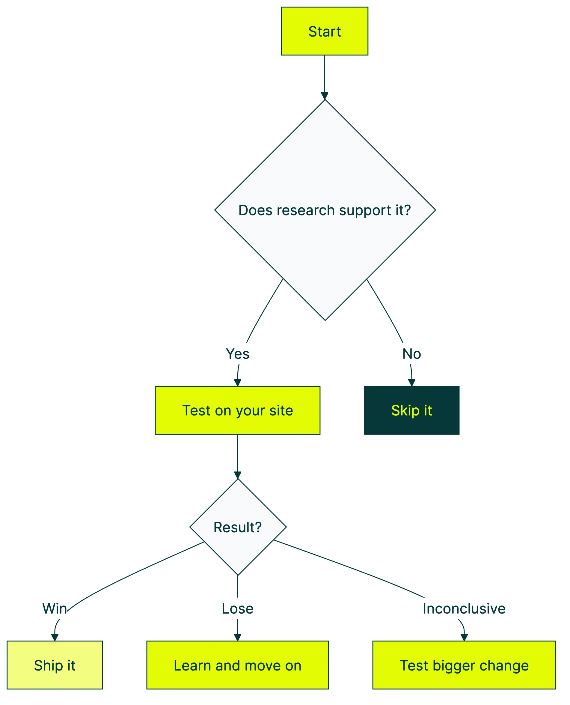
These practices are still useful. They’re just starting points, not rules. Every conversion rate optimization best practice is a guess until you test it on YOUR site, with YOUR visitors. Run through the CRO audit checklist to see how your site stacks up against these practices.
Below: seven CRO best practices backed by real data. Each one includes the evidence for it AND the counterexample showing when it fails. For more real-world evidence, check these examples of conversion rate optimization with methodology scores.
| Best practice | Usually works when… | Backfires when… |
|---|---|---|
| Fewer form fields | Fields feel like paperwork | Fields are engaging, personal questions |
| Faster pages | Load time exceeds 3 seconds | Messaging is the real problem |
| Social proof | It matches the visitor’s specific doubt | It’s irrelevant to the purchase decision |
| Mobile-first design | You rethink the mobile flow | You just shrink the desktop version |
| Personalized CTAs | Buttons match what the visitor browsed | You’re guessing at copy without data |
What makes a CRO best practice “best”?
A “best practice” is, by definition, something that worked in the past. For someone else. On their site. With their audience.
That’s useful context. It’s not a guarantee.
The real definition: a practice backed by evidence that you’ve validated on your own audience. Companies using CRO tools (tools that help you test changes on your website) see an average 223% return on investment. The return comes from testing, though. Not from blindly copying what worked for a company ten times your size.
Think of it like cooking advice. “Salt your pasta water” is a best practice. It works for almost everyone. But “add chili flakes” depends on who’s eating. CRO best practices work the same way. Some are nearly universal. Others depend entirely on your visitors, your product, and your price point.
Our take: If someone tells you a best practice “always works,” they’re either selling something or they haven’t tested it enough. The only practice that always works is testing.
For a visual walkthrough of CRO best practices and common pitfalls, Neil Patel covers the key concepts:
Each section below gives you the data supporting a practice, then shows you when it blows up. For a complete CRO guide that walks through the full optimization process from start to finish, we wrote that too. If you want a broader CRO strategy and process framework for planning tests over time, we wrote separate guides for that. For a conversion optimization strategy that ties tactics together into a single plan, start there. This post is tactical. Specific things you can test this week.
Whether you’re doing digital CRO on a SaaS site or improving an ecommerce checkout, these practices apply. For store-specific tactics, our ecommerce conversion optimization guide goes deeper. If you’re not sure where to start, a CRO audit helps you find the biggest leaks. Then come back here for what to fix.
Start with what people see first: headlines, buttons, and value propositions
The stuff above the fold (the part of your page visitors see before scrolling) matters more than anything below it. That’s not opinion. The data backs it up.
Headline tests produce an average 9% lift in conversions. Value-focused headlines (ones that tell visitors what they’ll get) improve conversions by 27%. If you’re not sure what “value-focused” looks like in practice, check these real value proposition examples.
And buttons? HubSpot studied 330,000 of them over six months. Personalized button text (tailored to what the visitor already looked at) converts 202% better than generic. That’s just one example of how a website personalization strategy compounds small changes into big lifts.
Even tiny copy changes add up. Switching from “Download Your Ebook” to “Download My Ebook” has moved numbers in multiple tests. First-person language feels like ownership instead of instruction.
A visual editor tool like Kirro lets you change headlines and buttons without touching code. Set up a test in about three minutes, and let your visitors tell you which version wins.
When this backfires: Testing copy without a clear idea of what your visitor wants. If you don’t know why someone landed on your page, swapping random words is just guessing with extra steps. The lift comes from understanding visitor intent, not from shuffling synonyms.
If you want a checklist of what to fix first on your site, start there before running tests.
Reduce friction in forms and checkout
This is the most common CRO tip on the internet: remove form fields to increase conversions. And it’s mostly right. Formstack’s data shows that reducing to four or fewer fields increases conversions by 160%.
The Baymard Institute found that the average checkout has 23.48 form elements. The ideal? Somewhere around 12 to 14 (that’s 7 to 8 actual fields). Their other finding? The average large ecommerce site could gain a 35% conversion rate increase from checkout design alone.
And the cart abandonment numbers are brutal: 70.19% of carts get abandoned. The top reasons? Extra costs they didn’t expect (48%), being forced to create an account (26%), and security concerns (25%).
When this backfires: Michael Aagaard ran a study with Unbounce where reducing form fields decreased conversions by 14%. The fields they removed were engaging, personal questions that actually motivated people to finish the form. Turns out, the labels and context of your fields matter more than how many you have.
Research from Venture Harbour shows form length follows a U-shaped curve, not a straight line. Very short forms convert well. Medium forms dip. And longer, well-designed forms (think multi-step with progress bars) can convert just as well as short ones.
The real CRO tip here: don’t just remove fields. Ask which fields help the visitor feel like they’re making progress, and which ones feel like paperwork. Our form design principles guide covers the full research on layout, labels, and when more fields actually convert better.
Want to know how to run a proper form test? We have a guide for that.
Make your site fast (but know where speed actually matters)
Page speed matters. And the data here is hard to argue with.
Google’s research: going from 1 to 3 seconds of load time increases bounces by 32%. Going from 1 to 5 seconds? A 90% bounce increase. Portent’s research puts it at a 4.42% conversion drop for every additional second in the 0 to 5 second range.
For ecommerce specifically, sites that load in 1 second convert at 3.05%. Sites that take 5 seconds? 1.08%. That’s a 3x difference from just speed.
At Amazon’s scale, 100 milliseconds of added latency costs 1% in sales. That’s $1.6 billion a year. You’re probably not Amazon, but the principle scales down. Vodafone tested this in 2024. They improved their largest content paint (the time it takes for the biggest visible element to load) by 31%. Result: 15% better lead-to-visit rates and 8% more sales.
Speed also helps your SEO. Faster pages rank better and convert better, so it’s a two-for-one. More on how CRO and SEO work together.
The trap: Spending weeks shaving milliseconds while your homepage headline says “Welcome to Our Platform.” Speed matters, but it won’t save bad messaging. A fast page with a confusing headline still won’t convert. Fix what you’re saying before you fix how fast you say it.
Track page speed alongside your other CRO metrics to see if speed improvements actually move conversions.
Use social proof (but not all social proof works the same way)
Social proof works because humans are wired to follow the crowd. Displaying reviews increases conversions by 34% at baseline. Get five or more reviews, and that jumps to 270%. For social proof examples that convert, we put together 15 real examples from small businesses.
The trust data backs this up. BrightLocal: 84% of people trust online reviews as much as personal recommendations. Nielsen: 92% trust peer recommendations over advertising.
Video testimonials perform especially well. They increase conversion rates by up to 80% compared to text reviews. And user-generated content on product pages can lift conversions by up to 166%.
For B2B conversion optimization, social proof looks different. Case studies, company logos, and specific ROI numbers work better than star ratings.
The counterexample: Kameleoon tested removing a “10% of profits go to charity” message from product pages. Add-to-cart and purchases both increased. The charity message was social proof, technically. But it was irrelevant to the purchase decision. It created cognitive load (extra mental effort to process), not trust.
Our take: Social proof is powerful when it answers the specific objection your visitor has at that moment. “Other people bought this” works on a product page. “We donate to charity” on a product page just distracts. Match the proof to the doubt.
Design for mobile first (not mobile too)
Desktop converts at roughly 4.8%. Mobile sits around 2.9%. The gap is narrowing, but it’s still significant.
Most websites get over half their traffic from mobile. That gap represents real money.
The mobile numbers are rough: 53% of mobile visitors abandon sites that take more than 3 seconds to load. Mobile cart abandonment hits 85.65%. And mobile-friendly sites (not just shrunken desktop sites, but actually designed for mobile) see 5.7% higher conversion rates.
Responsive design (layouts that automatically adjust to screen size) and flexible containers can boost mobile conversions by up to 400%. That’s not a typo. Four hundred percent. But only if you’re actually rethinking the mobile experience, not just making the desktop version smaller.
When this backfires: Another Kameleoon study removed cross-sell recommendations (those “you might also like” boxes) from mobile checkout. The result? Every metric improved. Conversion rate went up. Revenue per visitor went up. Average order value went up.
Cross-sells work fine on desktop, where people have more screen space and patience. On mobile, they’re an interruption. Your visitor is trying to buy the thing they already decided on. Don’t make them reconsider.
The principle: don’t shrink desktop. Rethink mobile entirely. What works in a browser window often fails on a phone screen. For a deeper look at how UX decisions drive conversions, see optimising UX for conversions.
In our experience optimizing your landing pages, the mobile version almost always needs its own treatment. For a breakdown of the anatomy of a high converting landing page, including what to prioritize on mobile vs. desktop, see our full guide. Shorter copy. Bigger buttons. Fewer distractions. For native apps, mobile app conversion optimization has its own set of rules around onboarding, paywalls, and push notifications. If you’re split testing your landing pages, always check mobile and desktop results separately. A test that “won” overall might be winning on desktop and losing on mobile (or the other way around).
The one CRO practice that never goes outdated: test everything
Every best practice above came with a “when this backfires” example. Not because CRO advice is bad. Because no advice is universal.
The key is following a structured CRO process that turns each best practice into a testable hypothesis rather than a blind implementation. For a data-backed optimization sequence that tells you which practices to prioritize and in what order, we built a dedicated guide. And increasingly, teams are using AI for conversion optimization to speed up both the research and the testing.
Peep Laja, founder of CXL, recommends “80% research, 20% testing.” Don’t test random ideas. Test informed ones based on what your data and visitors are telling you.
The numbers support this. A/B testing landing pages can lift conversions by up to 30%. Layout redesigns (changing how a page is structured, not just the copy) produce even bigger wins. Typically 18 to 40%. For the full rundown on landing page best practices, we put together a dedicated guide. And if those landing pages also need to rank in search, check our landing page SEO checklist to make sure your tests don’t tank your rankings.
And the impact compounds. Even a small jump from 2% to 3% conversion rate means 50% more conversions from the same traffic. No ad spend increase. No new content. Just a better page. For a site getting 10,000 visitors a month, that’s 100 extra conversions. Every single month. If you want prioritized tactics to boost conversion rate, we’ve laid them out in order of measured impact.
One thing that kills test quality: the HiPPO effect (highest-paid person’s opinion). Ideas from the boss rarely win in CRO unless they happen to be a testing expert. Data beats gut feelings. That’s the whole point.
You don’t need to be a CRO expert to start testing. With Kirro, you paste a script on your site, pick a page, and change whatever you want to test. Headline, button text, hero image. Kirro uses math that works with smaller traffic (called Bayesian statistics), so you don’t need 100,000 visitors to get answers. Try it free for 30 days and see what your visitors actually prefer.
If you want to go deeper, check out our list of A/B testing tools or learn how to measure A/B test results properly. And if you’re making common errors, our guide to A/B testing mistakes covers the ones we see most.
Once you’ve got individual tests working, the next step is building a CRO program so testing becomes a habit, not a one-off project.
FAQ
What are CRO best practices?
CRO best practices are proven tactics for getting more visitors to take action. Buy, sign up, click. They include clearer headlines, fewer form fields, faster pages, and social proof. But “proven” means “worked for other sites.” The real best practice? Test each one on YOUR site to see if it works for your visitors. What is CRO covers the basics if you’re just getting started.
Do CRO best practices actually work?
It depends. Most of them work most of the time, which is why they became “best practices.” But every single one has failed somewhere. Reducing form fields decreased conversions by 14% in one study. Removing a charity message increased purchases in another. The practice that genuinely always works? Testing. Run the test, look at the data, keep the winner.
Is a 2.5% conversion rate good?
It depends on your industry. Insurance averages around 18%. Ecommerce sits at 1 to 3%. SaaS typically falls between 3 to 7%. A “good” conversion rate is one that’s better than your own last month. If you improved from 2.0% to 2.5%, that’s a 25% increase in conversions without spending more on ads. Track your progress with the right CRO metrics.
What are the best CRO strategies?
This post covers tactics (specific things to test). For strategy (how to plan and scale testing over time), see our CRO strategy guide. But if you want a starting strategy right now: find your highest-traffic page with the lowest conversion rate. Test one element at a time, starting with the headline. That’s where most of the impact is. If you need CRO training to build your skills, we have recommendations for that too.
What’s the quickest CRO win for a small business?
Test your headline and your main button on your highest-traffic page. HubSpot’s data shows personalized buttons convert 202% better than generic ones. You can set up a test like this in about three minutes with a visual editor tool. No developer needed. No statistics degree needed. Just pick the page, change the words, and let your visitors vote with their clicks.

Randy Wattilete
CRO expert and founder with nearly a decade running conversion experiments for companies from early-stage startups to global brands. Built programs for Nestlé, felyx, and Storytel. Founder of Kirro (A/B testing).
View all author posts