UX conversion optimisation is the practice of studying your visitors and using what you learn to get more of them to convert. How they behave. What confuses them. Where they give up. Then you fix the things that matter.
It sits at the intersection of two disciplines that mostly agree but sometimes fight: user experience design and conversion rate optimization.
Every article on this topic says UX and CRO are “aligned” or “complementary.” And they are, mostly. But if you’ve ever watched a designer argue with a marketer about a countdown timer, you know it’s more complicated than that.
This guide covers where UX and CRO actually conflict, how to turn UX research into tests, and which changes are backed by real data. Not theory. Actual numbers.
What UX conversion optimisation actually is
CRO asks “what converts better?” UX asks “what serves visitors better?” When those two questions point the same direction, you get wins that stick. When they don’t, you get the arguments.
They approach the same problem from different angles. CRO strategy starts with data: traffic numbers, drop-off rates, button clicks. It finds the “where” (where people leave your site).
UX research starts with people: interviews, usability testing, watching someone try to use your checkout form. It finds the “why.”
The best results come from combining both. UX research generates the ideas. CRO testing validates whether those ideas actually work.
Skip the research and you’re guessing what to test. Skip the testing and you’re guessing whether it worked. That’s the digital CRO sweet spot.
Our take: Most businesses skip the research and jump straight to copying what their competitor’s website looks like. That’s not CRO. That’s cargo culting.
Where UX and CRO actually conflict (and how to handle it)
UX best practices and CRO tactics sometimes pull in opposite directions. Every competing article pretends this tension doesn’t exist. It does. If you’re running a business, you’ve probably felt it.
| UX says… | CRO sometimes says… | The tension |
|---|---|---|
| Strip away friction | Add countdown timers, scarcity cues | Urgency creates psychological pressure |
| Keep it clean, reduce thinking (called cognitive load) | Pile on trust badges, testimonials, review stars | Each one adds noise, but might answer a real question |
| Let visitors browse, compare, go back | Narrow the path, fewer options, remove navigation | Control vs. guidance |
| Build long-term trust | Boost short-term numbers | Dark patterns work today, destroy trust tomorrow |
That last row is where it gets serious.
Deceptive design patterns (the industry calls them dark patterns) boost conversions today and destroy trust tomorrow. A 2023 Dovetail survey of 1,000 people found that 41% stopped purchasing from a brand after encountering dark patterns.
And those patterns are everywhere. An international sweep by 27 consumer authorities (ICPEN, 2024) found 75.7% of 642 subscription sites used at least one. Three out of four.
The regulatory math is changing too. Epic Games paid $520 million to settle FTC charges over dark patterns. The EU’s Digital Services Act allows fines up to 6% of global turnover. That countdown timer starts looking expensive.
So how do you resolve these tensions? Test both approaches with real people. The UX version and the CRO version often aren’t as far apart as they seem.
When UX research points one direction and conversion goals point another, set up both versions as a test. Let actual visitor behaviour settle the debate.
Our take: If a CRO tactic only works because visitors don’t notice what you’re doing, it’s not a CRO best practice. It’s a liability.
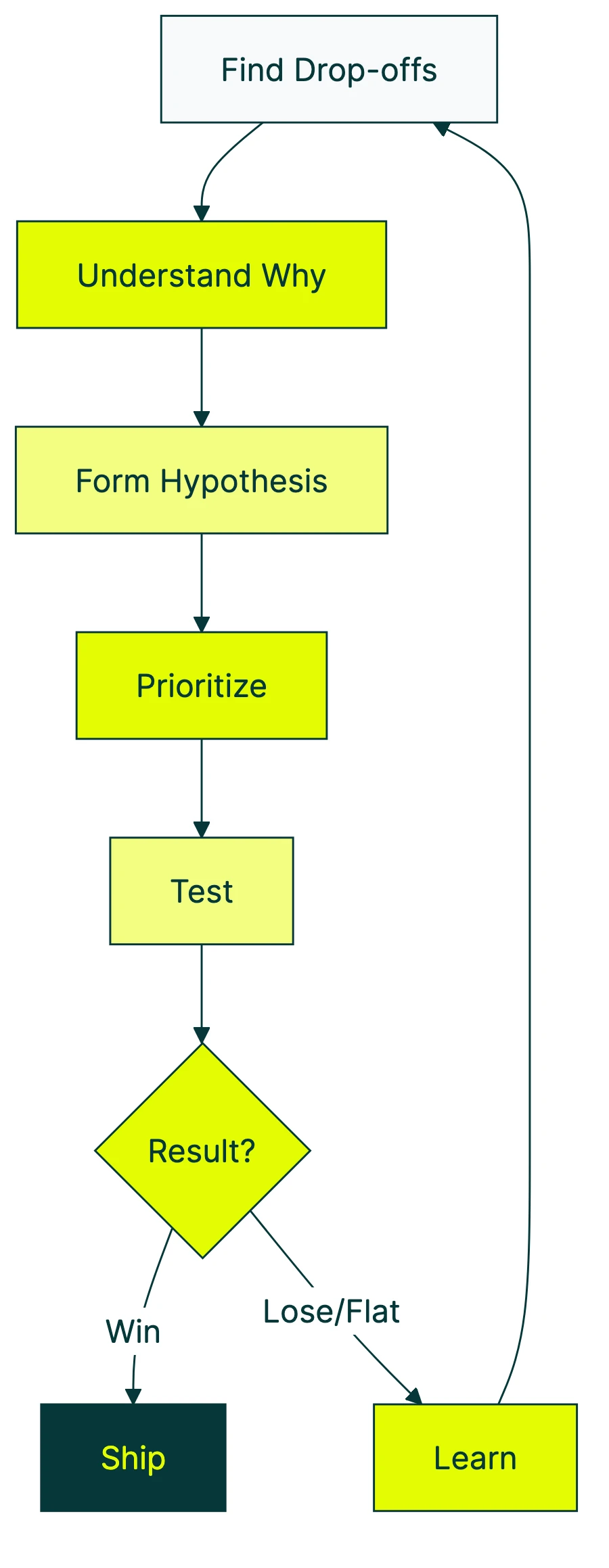
The UX-to-hypothesis framework: turning research into tests
Most testing programs fail for a boring reason: they test random things. Change a button colour. Try a new headline. Move the CTA. Without understanding why visitors behave the way they do, you’re buying lottery tickets.
Peep Laja, founder of CXL (one of the biggest CRO education platforms), nails it: “The hard part of CRO is testing the right things.”
The pipeline below is based on CXL’s ResearchXL model, simplified for smaller teams. Five steps from “something’s broken” to “we fixed it and proved it.”
1. Find out where people drop off. Look at your analytics: funnel reports, drop-off rates, scroll depth. You’re not looking for “why” yet. Just “where.” A CRO audit is a good starting point.
2. Figure out why. This is the UX research part. Watch session recordings. Run a quick usability test (even 5 people will surface major problems). For a deeper look at how these methods feed into live experiments, see our guide on A/B testing in UX workflows.
Read support tickets. Talk to customers who almost bought but didn’t. Find the real reason people leave at the spots you identified in step 1.
3. Form a testable idea. Structure it like this: “If we change [X] for [visitor group Y], [metric Z] will improve because [reason from research].” The “because” is what separates research from guessing.
4. Prioritise. You’ll have more ideas than time. Score them by potential impact, your confidence in the evidence, and how easy they are to build (industry folks call this ICE scoring). Pick the top 3.
5. Test it. Run an A/B test. Measure the result. If it works, ship it. If it doesn’t, feed what you learned back into step 2.
Every “failed” test teaches you something you didn’t know before.
A quick example. Your checkout page loses 40% of visitors at the shipping details step. Session recordings show people scrolling up and down, confused about delivery options.
Your testable idea: “Simplifying from 5 shipping options to 2 will reduce abandonment because visitors are overwhelmed.” Build it, test it, measure it. That’s the pipeline.
This connects directly to your broader conversion optimization strategy. The framework gives your testing program structure instead of randomness.
For a visual breakdown, Nielsen Norman Group covers how conversion rate connects to UX decisions:
5 UX changes that reliably improve conversions
Rather than the standard “make your CTA bigger” advice, here are five changes with real data behind them. Check the full list of CRO recommendations for more, but start here.
1. Cut your form fields. The Baymard Institute found that the average checkout has 23.48 form elements. The ideal is closer to 12.
Their research suggests large sites can gain a 35.26% improvement in conversion rate through checkout UX fixes alone. If your form asks for a fax number you don’t need, delete it today. Our web form UX design guide covers the full research on layout, labels, and validation patterns.
2. Treat page speed as a design decision. Every extra second of load time reduces conversions by 4.42%. A 0.1-second improvement can increase retail conversions by 8.4%.
Speed isn’t just a code problem. The images your designer picked, the custom fonts, the third-party chat widget: these are design choices. Own them.
3. Simplify choices (but know when not to). You’ve probably heard of the jam study. Researchers Iyengar and Lepper (2000) found that offering 6 jam flavours instead of 24 increased purchases tenfold.
It’s the most-cited study in CRO. And it’s more complicated than it sounds.
A 2010 meta-analysis of 63 studies (Scheibehenne et al.) found the average effect of reducing choices was basically zero. Choice reduction works for unfamiliar or high-stakes decisions.
It backfires when people know what they want. Test it on your audience.
4. Put trust signals everywhere, not just your homepage. Robert Deans from Credo Agency puts it well: “Companies pay attention to trust signals on the homepage and neglect them for the rest of the journey.”
Reviews, security badges, return policies. Visitors need these at the moment they’re deciding. That’s usually your product page or checkout, not your homepage.
5. Design for phones first. Baymard research shows 43.2% of smartphone shoppers abandoned during mobile checkout. 61% sometimes switch to their laptop to finish buying.
That switch is a conversion leak. Every time someone thinks “I’ll do it on my computer later,” a percentage of them never come back.
Why UX gains are shrinking (and what that means for your website)
Nielsen Norman Group tracked UX improvements across 99 case studies over more than a decade. Nobody in the top search results mentions what they found.
The average improvement dropped from 247% (2006-2008) to 75% (2020). That’s not a fluke. The difference is statistically reliable.
This doesn’t mean UX got worse. The industry grew up.
In 2006, plenty of websites had genuinely terrible interfaces. Making them usable produced massive jumps.
In 2026, most sites have fixed the obvious disasters. The low-hanging fruit is picked.
Generic advice (“improve your navigation,” “speed up page load”) still matters. It just won’t differentiate you anymore.
Your competitors already read the same tips. The advantage now comes from understanding your specific visitors through research.
Jakob Nielsen’s original research showed that spending roughly 10% of a project budget on usability “doubles usability.” Still true. But the easy doublings are taken.
The next round of gains requires the research-to-hypothesis pipeline from the section above.
And then there’s Jared Spool, one of the founding voices in UX. He demonstrated a site making $4 million per day at a 1.6% conversion rate. 20% of buyers generated 80% of revenue ($3.2 million daily).
Improving the overall conversion rate was almost irrelevant. The CRO metric that actually mattered was revenue per high-value customer.
Sometimes the metric everyone tracks isn’t the metric that matters. Worth remembering when someone tells you to “improve your conversion rate.” Improve it for whom?
How to measure whether UX changes actually improved conversions
Most businesses make a UX change, see conversions move, and call it a day. That’s not measurement. That’s coincidence-hunting.
Before-and-after comparisons are unreliable. Traffic changes week to week. Seasonality shifts demand.
A marketing campaign might have launched at the same time. You can’t untangle the variables.
If you changed your checkout page the same day your Facebook ad went viral, you can’t tell which thing moved the number.
The fix: run the old version and the new version at the same time. Split your traffic evenly. Half sees the original, half sees the change.
After enough visitors have been through both, you can see which one actually performed better. That’s A/B testing. It’s the only way to get a clear answer.
“Enough visitors” is the key phrase. With too few, you’re flipping a coin. You want at least 1,000 visitors per version before drawing conclusions.
If your site gets under 1,000 visitors a month, skip formal testing. Make changes based on research and common sense (the five changes above are safe bets).
For everyone else, confidence is the number to watch. It tells you the probability that the leading version is genuinely better, not just ahead by luck. Look for 95% or higher.
Kirro uses math that works with less traffic (called Bayesian statistics). You get reliable results faster, no statistics degree required.
Watch out for common A/B testing mistakes. Peeking at results too early is the biggest one. Be patient. The numbers need time.
If you’re just getting started with A/B testing and conversion rates, start small. Test one thing at a time. Your headline is usually the biggest lever. Takes about three minutes to set up.
FAQ
Is UX the same as CRO?
No. UX is a design discipline focused on making things easy and pleasant to use. CRO is a testing discipline focused on getting more visitors to take a specific action.
They overlap heavily. A confusing checkout hurts both usability and conversions. But they can conflict: a popup might annoy visitors but increase email signups.
Think of UX as the research arm and CRO as the validation arm. UX generates the ideas. CRO proves which ones work.
How does UX research feed into CRO?
Through the pipeline described above. UX research (usability tests, interviews, surveys, session recordings) identifies what’s broken and why.
Those findings become testable ideas: “if we fix this specific problem, this specific metric will improve.” A/B testing validates whether the fix actually works.
Without UX research, you’re testing random guesses. With it, you’re testing informed predictions. The win rate goes up.
What is conversion rate optimization UX?
It’s the practice of using UX design principles and user research to improve conversion rates. Instead of guessing which changes might help, you study how visitors actually behave on your site.
You find the friction points, understand why they exist, then test specific fixes. CRO with a research foundation instead of gut feel. See the full guide to what CRO is for the broader picture.
How can UX design improve conversion rates?
Three main ways. First, by removing friction: confusing navigation, slow pages, complicated forms, unclear pricing.
Second, by building trust: consistent design, transparency, trust signals at decision points (not just the homepage).
Third, by matching expectations: if your ad promises free shipping, the landing page should confirm it immediately.
The key is testing changes rather than assuming they work. In our experience, changes that “obviously” should help sometimes don’t. And ones that feel risky sometimes win big.
Can good UX actually hurt conversion rates?
Yes, and it happens more often than people admit. A major redesign can confuse returning visitors who knew where everything was.
Removing urgency cues (countdown timers, limited-stock indicators) in favour of “clean” design can reduce impulse purchases. Global e-commerce conversion rates dropped from 1.97% to 1.65% between 2023 and 2024. Part of the reason: aesthetic redesigns that ignored mobile performance and page speed.
The lesson: test every change, even the ones your designer says are “obviously better.” Build a CRO program that validates UX changes with data, not opinions.

Randy Wattilete
CRO expert and founder with nearly a decade running conversion experiments for companies from early-stage startups to global brands. Built programs for Nestlé, felyx, and Storytel. Founder of Kirro (A/B testing).
View all author posts