The best CRO recommendations to start with are headline clarity, CTA copy, and page speed. These three changes take hours, not weeks. They don’t need a developer. And they consistently produce the highest conversion lifts for the least effort.
That’s the short answer. But “fix your headline” isn’t exactly a plan. Most conversion rate optimization advice gives you 15 to 20 tips and no way to decide where to begin. That’s like handing someone a grocery list and calling it a cooking lesson.
This guide is different. Every recommendation is organized by impact and effort. Start with what matters most. Skip the time sinks. Actually see results before your boss asks “what happened with that CRO thing?”
For the full CRO strategy framework or a deeper look at the CRO process, start there. This post is the specific, tactical list of things to try. And the A/B testing ideas list gives you ready-to-run experiments filtered by page type and impact.
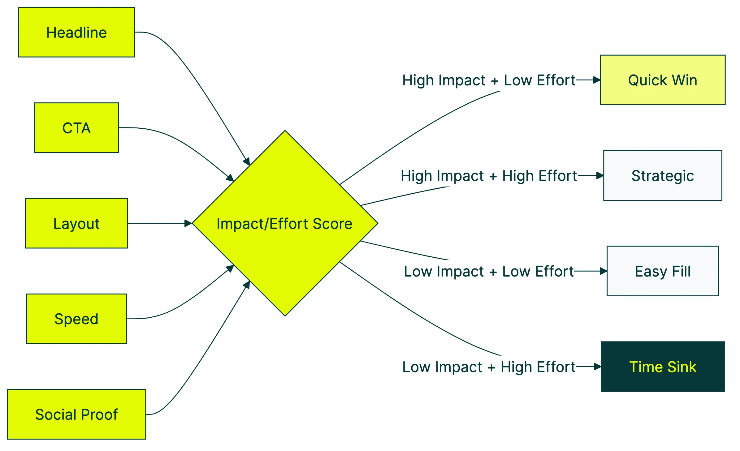
The CRO prioritization matrix: impact vs. effort
Most CRO articles hand you a flat list. Tip 1 through tip 19. No order, no context, no way to decide what to do on Monday morning.
A better approach: score every recommendation on two things. How much it usually improves conversions (impact) and how long it takes to implement (effort). Then sort them into four buckets.
| Low Effort | High Effort | |
|---|---|---|
| High Impact | Quick wins (do these first) | Strategic projects (plan these) |
| Low Impact | Easy fills (if you have time) | Time sinks (skip these) |
Typical conversion lifts by change type:
- Headline and value proposition tests: average 9% lift (MarketingLTB)
- CTA copy changes: average 12% lift
- Layout and page redesigns: 18 to 40% lift (Convert.com)
- Button color tests: average 6% lift
Notice the pattern? The biggest lifts come from changing what you say, not how things look. A new headline takes 10 minutes to write. A full page redesign takes weeks. Start with the words.
Our take: Button color tests are the “rearranging deck chairs on the Titanic” of CRO. They get talked about because they’re easy to explain, not because they move the needle.
Quick wins: high-impact recommendations that take hours, not weeks
Clarify your headline and value proposition
Your visitor decides whether to stay or leave in about three seconds. That’s roughly the time it takes to read one sentence. If that sentence doesn’t clearly explain what you do and why it matters, everything below it is wasted.
A vague headline like “Welcome to our platform” isn’t a headline. It’s a placeholder. Compare that to “Track your expenses in 30 seconds a day.” One tells you what the product does. The other tells you nothing.
Headline tests average a 9% conversion lift. And you can test different headlines on your site in about three minutes. Change the words, split the traffic, let the numbers decide.
For inspiration on what makes a strong headline, check out value proposition examples from real companies.
Rewrite your CTA copy
The button text matters more than the button color. A lot more.
CTA copy changes average a 12% lift. The best-performing pattern: first-person language. “Start my free trial” beats “Start your free trial.” “Get my report” beats “Download now.”
A small wording difference, but it makes the reader feel ownership.
The worst-performing CTA? “Submit.” Nobody wakes up excited to submit something. Tell them what they’re getting. “Get the checklist.” “See my results.” “Start testing.”
Tools like Kirro let you test CTA copy changes without touching code. Change the text in a visual editor, start the test. Done.
Fix your page speed
Every extra second of load time costs you about 4.4% of your conversions. That’s not a rounding error. On a site doing $100K a month, a 2-second slowdown is roughly $8,800 you’re leaving on the table.
It gets worse. Google and Deloitte studied 30 million sessions across 37 brands. A 0.1-second improvement in mobile load time increased retail conversions by 8.4%. A tenth of a second.
Quick speed fixes anyone can do:
- Run your site through Google PageSpeed Insights (it’s free, takes 10 seconds)
- Compress your images (TinyPNG or Squoosh)
- Remove scripts you’re not actually using
- Turn on browser caching if your host supports it
A surprising finding from Google’s research: sessions that converted had 38% fewer images than sessions that didn’t. More isn’t always better. Sometimes your page just needs to load.
Add or improve social proof
Social proof is just a fancy way of saying “show that other people have bought this and liked it.” Reviews, testimonials, customer logos, case study stats. Anything that signals “you’re not the first person to try this.”
Products with reviews convert 12.5% higher than products without them. Done well, the lift goes much higher. The Northwestern/Spiegel Research Center found lifts from 10% (basic reviews) to 270% (optimized, multi-format placement).
One study of 475,495 real users on an actual ecommerce platform found that social proof and reciprocity don’t just add up. They multiply. Showing reviews AND offering something valuable (a guide, a discount) beats either one alone.
The quick version: add two or three testimonials near your main CTA. Include real names and real results. If you sell products, show the review count.
For more ideas, see social proof examples that actually work.
Strategic wins: higher-effort recommendations with bigger payoffs
Redesign your checkout flow (ecommerce)
The average checkout has 23.5 form elements. The optimal number is 12 to 14. That gap is costing ecommerce sites an estimated $260 billion in recoverable abandoned orders.
The fixes are unglamorous but effective:
- Make guest checkout the default (not hidden behind “Create Account”)
- Remove fields you don’t actually need
- Show shipping costs early (48% of abandonment comes from unexpected costs)
- Add Apple Pay and Google Pay for mobile shoppers
Layout redesign tests produce 18 to 40% lifts. That’s the highest range of any CRO change. But these are projects, not afternoon tasks. Plan accordingly.
The Nielsen Norman Group tested something simple. Forms with labels above fields and single columns? 78% of people completed them on the first try. Forms that broke those guidelines? 42%. Peer-reviewed, published at CHI (the biggest conference in human-computer interaction). The form design does half the selling for you.
Build a mobile-first experience
Desktop visitors convert at roughly 4.3%. Mobile visitors convert at roughly 2.2%. That’s nearly half the rate, even though mobile drives the majority of traffic for most sites.
Mobile visitors are just as interested. Most sites just treat them as an afterthought. Buttons too small. Forms too long. Pages too heavy.
Three changes worth prioritizing:
- Touch-friendly buttons (at least 44 pixels tall, with space between them)
- Sticky CTAs that follow the scroll (so the action is always one tap away)
- Mobile payment options (Apple Pay, Google Pay) that skip the entire form
Walmart Canada saw a 20% conversion increase just from implementing responsive design properly. No new features. Just making the existing experience work on a phone. For a full breakdown of UX-driven conversion optimisation, that guide covers the research-to-test pipeline.
Start with simple personalization
Personalization sounds expensive and complicated. It doesn’t have to be. Our website personalization guide breaks down the full spectrum from simple to advanced.
Begin with returning visitor messaging. Someone visited your pricing page twice? Show them a case study on visit three instead of the same homepage hero.
69% of consumers actually appreciate personalization when it’s based on data they’ve intentionally shared. The key word is “intentionally.” Nobody likes creepy “we noticed you were looking at X” pop-ups. They like helpful “welcome back, here’s where you left off” nudges.
For more on how digital CRO channels work together with personalization, that post covers the full picture.
CRO recommendations by industry
This is where most CRO articles fall flat. They give you checkout tips when you run a SaaS company. Or form optimization advice when you sell products. If you’re selling to other businesses, our conversion optimization for B2B guide covers the specific tactics and benchmarks. Below are conversion rate optimization examples by business type. Skip to the one that applies to you.
Ecommerce CRO recommendations
Product photography matters more than you think. 56% of shoppers immediately explore product images on arrival. And only 25% of ecommerce sites provide sufficient image quality, according to Baymard’s benchmark of 327 sites. More photos from more angles, with zoom capability, consistently improves conversions.
Show shipping costs on the product page. Not at checkout. Not in the cart. On the product page. 48% of shoppers abandon because of unexpected costs. Kill the surprise.
Offer guest checkout. Forcing account creation before purchase causes 26% of abandonment. Let people buy first, then offer to save their info on the confirmation page. It’s the same data collection, just with better timing.
For a deep dive into this specific area, see the ecommerce CRO guide.
SaaS CRO recommendations
Reduce signup form friction. Every field you remove from a signup form improves conversion by 3 to 5%. Some SaaS companies saw 50 to 70% increases by cutting forms from seven fields to just email. Collect the rest during onboarding.
Your pricing page is where SaaS deals are won or lost. Customer logos, case study stats, “X companies already use this” counters. All of these reduce the “is this legit?” anxiety that hits right before someone enters their credit card.
Your visitor is comparing you to a competitor. (They always are.) Make it easy for them with a side-by-side feature table. Honest trade-offs build more trust than a page of checkmarks in your column and X marks in theirs.
Lead generation CRO recommendations
Cut your form fields aggressively. The research here is striking. Formstack data shows that reducing to four or fewer fields increases conversions by 160%. That’s not a typo.
“But I need all those fields for lead qualification.” You probably don’t. At least not upfront.
Use progressive profiling (fancy way of saying “ask for more info later”). Get the email first. Ask qualifying questions in a follow-up. Conversion rate up, lead quality maintained.
Test your form placement. Above the fold isn’t always best. Sometimes a short value pitch before the form performs better because the visitor understands why they should fill it out. This is worth split testing on your landing pages. For more landing page optimization tips, our dedicated guide covers form placement, headlines, and layout changes that move the needle.
Recommendations most businesses skip (but shouldn’t)
Run a CRO audit before testing
47% of CRO programs have no clear goals. They’re testing things, but they don’t know what success looks like. And generic CRO checklists only catch about 36% of actual issues, according to research from MeasuringU.
Before you test anything, do a proper CRO audit. Walk through your site like a customer. Check every step of your conversion path.
Note where things are slow, confusing, or broken. That audit will give you a better testing roadmap than any list of tips (including this one).
Track the right CRO metrics
Most teams track too many things and act on none of them. Pick one primary metric: conversion rate, segmented by traffic source. Then add a guard rail metric like revenue per visitor, so you’re not winning conversions but losing money.
Your overall conversion rate probably falls between 1.4% and 4.6%. Statista and IRP Commerce data show food and beverage at the top (4.6 to 6.2%), luxury fashion at the bottom (0.3%). Most businesses land around 1.8 to 2.5%.
Those numbers are almost useless without context, though. Traffic source matters enormously. Email converts at 3 to 5x the rate of social. Comparing your blended rate to a benchmark is like comparing your marathon pace to Usain Bolt’s 100-meter sprint.
For the complete metric stack, read CRO metrics worth tracking.
Don’t skip the boring fixes
Contentsquare’s 2026 benchmarks found that 40% of website visits are affected by visitor frustration. And conversion rates dropped 5.1% year over year across industries. Not because people stopped buying. Because websites are getting worse at the basics.
Broken links. Missing images. Confusing navigation. 404 pages. Not exactly exciting to fix. Nobody writes a case study about “we fixed our broken contact form.”
But 68% of small businesses have no CRO strategy at all. Fix the basic stuff that frustrates visitors and you’ll outperform most of them without running a single test.
As Peep Laja, founder of CXL, puts it: “80% of conversion optimization is research, gathering data, analyzing data. The other 20% is testing.” The boring work IS the work.
Our take: Companies spend $92 on getting traffic for every $1 spent on converting it. That ratio is insane. Fix your site before you buy more ads.
How to turn CRO recommendations into tests
Reading CRO recommendations is easy. Actually testing them is where most people stall. So turn every recommendation into a test with this formula.
The hypothesis formula: “If we [change], then [metric] will [improve] because [reason].”
Example: “If we rewrite the homepage headline to state our value proposition clearly, then signup rate will increase because visitors will understand what we do within three seconds.”
That’s it. No 12-page test plan. No committee approval. One sentence.
Prioritize with a simple scoring system. Rate each recommendation on three things, 1 to 10 (practitioners call this ICE scoring):
- Impact: How much will this change move the metric?
- Confidence: How sure are you this will work? (Use the lift data from above)
- Ease: How quickly can you implement this?
Multiply the three numbers. Test the highest-scoring ideas first. For a step-by-step look at the CRO process for prioritizing tests and moving from hypothesis to results, that guide walks through the full workflow. And if you want a prioritized conversion optimization plan that maps these recommendations to a clear execution sequence, we wrote that too. For ranked conversion rate improvements organized by what moves the needle most, that guide covers the full list.
One thing to know: Ron Kohavi at Microsoft ran more A/B tests than almost anyone alive. His finding? Roughly one-third of tests win. One-third are flat. One-third are negative. That’s at Microsoft, with massive traffic and expert teams.
Translation: most test ideas don’t work. That’s normal, not a sign that CRO is broken. It means prioritization matters. Starting from proven CRO best practices gives your hypotheses a stronger foundation than guessing from scratch. And if you need a structured document to organize all of this, our conversion optimization plan template walks you through it.
Run one test at a time. Wait for enough traffic. Let the data tell you what’s real.
If you want to avoid the most common pitfalls, read about A/B testing mistakes before your first test. And when you’re ready to start, set up your first test with Kirro. Kirro lets you pick a page, change the headline, and see what happens.
For more on picking the right tool, check out CRO software options and CRO tools. And if you’d rather have someone else handle it, here’s how to hire a CRO consultant.
FAQ
What does CRO stand for?
CRO stands for conversion rate optimization. It means getting more of your existing visitors to take action: buying, signing up, filling out a form. Instead of paying for more traffic, you make the traffic you have work harder.
For the full breakdown, see what is CRO.
What are the best CRO strategies?
It depends on your business type and current conversion rate. For most businesses, start with the quick wins: headline clarity, CTA copy, and page speed. These take hours and consistently produce the highest lift.
Then move to strategic projects like checkout redesign and mobile optimization. Read the full CRO strategy framework for a phased approach.
What is a CRO checklist?
A CRO checklist is a list of items to review on your site for conversion issues. Think of it as a pre-flight inspection. It works best as part of a broader CRO audit.
A checklist catches obvious problems (broken forms, missing CTAs, slow pages) but won’t tell you what to test first. That’s where the impact/effort matrix in this post helps.
What should I test first for CRO?
Test the element that gets the most visibility with the least effort to change. For most websites: the headline on your highest-traffic page. Headline tests average a 9% lift and take minutes to set up.
After that, move to CTA copy (12% average lift), then page speed, then social proof. Follow the quick wins section above.
How long does CRO take to show results?
Individual tests usually need two to four weeks, depending on your traffic. Low-traffic sites need longer. That’s why starting with high-traffic pages makes sense.
A structured testing program shows measurable revenue impact within two to three months. Companies that test monthly see 1.8x more annual revenue than occasional testers. The compound effect is real. If you want to build that consistency into your workflow, here’s how to set up a CRO program that keeps testing on track. Check how CRO and SEO work together to see how gains stack over time.

Randy Wattilete
CRO expert and founder with nearly a decade running conversion experiments for companies from early-stage startups to global brands. Built programs for Nestlé, felyx, and Storytel. Founder of Kirro (A/B testing).
View all author posts