Ecommerce CRO is the process of fixing the pages in your online store so more visitors buy something. Not “more traffic.” Not “better branding.” Just: more of the people already visiting your site actually completing a purchase.
This is a page-by-page checklist. Homepage, category pages, product pages, cart, checkout, and post-purchase. Each section gives you specific things to check, backed by research with real numbers. Not “improve your images” with no context. Actual data showing what works and by how much.
If you want the big-picture explainer on ecommerce conversion optimization, we wrote a separate guide. This post assumes you already know why conversion rate optimization matters. You’re here for the what-to-do-right-now list.
Where your ecommerce store is losing money right now
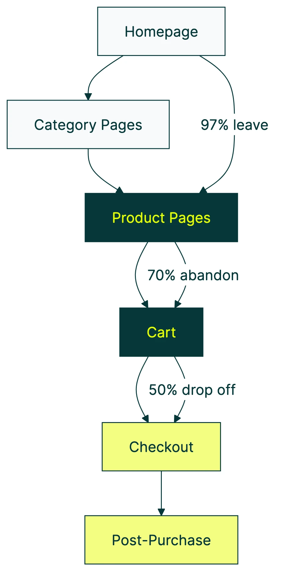
Think of your store like a bucket with holes in it. Visitors pour in at the top. But at every stage (browsing, adding to cart, starting checkout, paying) some of them leak out. The average ecommerce conversion rate is about 1.5%, according to IRP Commerce’s live market data. That means for every 1,000 visitors, roughly 15 buy something. The other 985? Gone.
Here’s where they’re leaking out. For every 1,000 visitors to a typical store:
- ~30 add something to their cart (that’s only 3%)
- ~15 start checkout
- ~11 actually buy
The biggest hole isn’t where most people think. It’s not checkout (though that’s bad too). It’s the gap between browsing and adding to cart. 97% of your visitors leave without putting a single item in their basket.
And it’s getting worse. Contentsquare’s 2025 benchmark (based on 90 billion sessions) found that conversion rates dropped 6.1% compared to the year before. At the same time, ad costs went up 9%. You’re paying more for visitors who are less likely to buy.
Our take: Most store owners throw money at ads when conversions dip. That’s like pouring more water into a leaky bucket. Fix the holes first. It’s cheaper and it works faster.
The rest of this checklist shows you exactly where those holes are, page by page.
This video from Conversion Rate Experts walks through how they increased ecommerce revenue by 25% in 90 days:
The ecommerce CRO checklist (page by page)
Work through each page type, check what applies to your store, and pick one or two tests to run first. You don’t need to fix everything at once. Start with the biggest leak (usually product pages or cart) and work from there.
If you need a full CRO audit process, we have a dedicated guide. For a step-by-step walkthrough tailored to online stores, run an ecommerce CRO audit before you start testing.
Homepage checklist
Your homepage has one job: get visitors to the right product as fast as possible. Nobody came to read your brand story. They came to find something to buy.
Value proposition above the fold. Can a stranger understand what you sell and why it’s worth buying within 5 seconds? If your headline says “Welcome to our store,” that’s not a value proposition. That’s a placeholder. See value proposition examples for e-commerce to understand what good looks like.
Search bar visibility. Baymard Institute’s research across 350+ ecommerce sites shows that stores with prominent search features convert better. People who search are often ready to buy. Make it easy for them.
Trust signals. A case study from ConversionTeam found that adding trust badges to a store increased conversions by 12.2% and revenue by 16.6%. Logos from payment providers, security seals, and “trusted by X customers” counts all help. But only if they’re real. Fake badges backfire.
Reviews count, customer photos, press mentions. Put social proof where people hesitate, not where they’re already convinced.
Test idea: Your homepage headline is usually the highest-impact, lowest-effort test you can run. Change it, split the traffic, and see which version gets more people to a product page. Three minutes of work, potentially weeks of better results.
Category and collection page checklist
Category pages are the bridge between “I’m browsing” and “I found something.” When they’re broken, visitors leave without ever seeing a product page.
Filter and sort usability. If your filters are confusing or buried, people can’t narrow down their choices. Baymard’s ecommerce UX research across thousands of user sessions found that poor filter design is one of the top reasons shoppers abandon category pages.
Show the essentials on each product card: price, star rating, availability. If someone has to click into every product to find the price, they’ll click into zero.
Pagination or infinite scroll? Neither is universally better. If your customers are comparing products (like electronics or furniture), pagination with sort controls wins. Endless scrolling works better for inspiration-based shopping (fashion, decor).
Test idea: Move filters from a sidebar to horizontal placement above results. Or simplify filter labels. Small changes to how people narrow choices can shift add-to-cart rates noticeably.
Product page checklist
This is where most of the buying decision happens. And where most stores get the details wrong. For the full design checklist, see our product page best practices guide.
Product images: quality beats quantity. Google and Deloitte’s study of 30+ million sessions found that sessions where people actually bought something had 38% fewer images than sessions where they didn’t. More images means slower pages. Slower pages mean fewer sales. Same study: every 0.1 second of speed improvement increased retail conversions by 8.4%.
Pick 3-4 strong images over 12 mediocre ones. Your product page will load faster and convert better.
Reviews: the first five matter most. Northwestern University’s Spiegel Research Center found that products with just 5 reviews are 270% more likely to be purchased than products with zero reviews. After 5, the impact per additional review drops sharply. If you’re spending energy getting reviews, focus on getting those first five for every product.
The star rating sweet spot is not 5.0. Same study, counterintuitive finding: purchase likelihood peaks at 4.0 to 4.7 stars. Not 5.0. Products with a perfect 5-star rating actually sell worse because shoppers think the reviews are fake. A few honest 3-star reviews mixed in make everything else more believable.
For higher-priced products, reviews matter even more. The purchase lift from reviews was +380% for expensive items versus +190% for cheaper ones.
And make the add-to-cart button obvious. Not “cleverly designed.” Not matching your brand palette so well it blends in. Big, contrasting, above the fold.
Test idea: Try changing your review display format. Show the rating distribution (how many 5-star, 4-star, etc.) instead of just the average. Or test reducing the number of product images from 10 to 4. For deeper tactics, see our product page optimization guide.
Cart page checklist
Baymard Institute’s meta-analysis of 50 studies puts the average cart abandonment rate at 70.22%. Seven out of ten people who put something in their cart never buy it. That’s $260 billion in recoverable revenue across the US and EU alone.
Most of that abandonment is fixable.
Show the total cost early. Including shipping, taxes, and fees. Baymard found that 39% of abandonment happens because of unexpected costs added at the end. Don’t surprise people with fees at checkout. Tell them upfront.
Hide the coupon field behind a link. This one’s sneaky. When shoppers see an empty “promo code” box, many leave to hunt for a code. Baymard documented that 66% of Cabela’s customers who saw the coupon field abandoned their cart to look for codes elsewhere. If you have a coupon field, tuck it behind a small “Have a code?” link. People with codes will find it. Everyone else won’t get distracted.
“Free shipping at $75. You’re $12 away.” Simple shipping threshold messaging like this increases average order value and gives people a reason to add one more item instead of abandoning.
Test idea: Test showing the total price (with shipping) on the cart page versus waiting until checkout. Or test different free shipping thresholds to find the sweet spot for your average order value.
Checkout checklist
Checkout is where you lose the most valuable visitors: the ones who already decided to buy.
Guest checkout. Baymard’s checkout usability research (4,000+ research hours, 200+ user sessions) found that 19% of shoppers abandon because they’re forced to create an account. Even worse: when sites do offer guest checkout, 60% of test subjects missed it because it wasn’t obvious enough. Make guest checkout the default path, not a tiny link buried under the sign-up form.
Cut form fields in half. The average checkout has 23.48 form elements. Baymard recommends 12 to 14. That’s almost half as many fields. Every field you remove reduces friction. Do you really need a “company name” field for a consumer store? Probably not. Remove it.
Add more payment methods. Stripe tested this across $1.4 trillion in transactions. Adding relevant non-card payment options increased conversions by 7.4% and revenue by 12%. Adding Apple Pay alone boosted conversions by 22.3%. These are massive, easy wins.
People want to pay the way they already pay. Credit card forms feel like work. Apple Pay or Google Pay feels like a tap.
55% of sites don’t offer address autocomplete, according to Baymard. Adding it reduces typos, speeds up checkout, and makes the whole experience feel smoother.
For a deeper look, see our checkout optimization guide and our list of checkout optimization best practices.
Test idea: Add a digital wallet option (Apple Pay, Google Pay, Shop Pay) if you haven’t already. Of all the tests on this checklist, payment method changes consistently deliver the biggest lifts with the least effort.
Our take: If you only do one thing from this entire checklist, add Apple Pay to your checkout. The Stripe data is ridiculous. +22% conversion from a single payment method. That’s not a tweak. That’s a different business.
Post-purchase checklist
The sale isn’t the end. It’s the beginning of the next sale. Most stores ignore everything after the “order confirmed” screen, and that’s a mistake.
Abandoned cart email sequences. Klaviyo’s benchmark data from 143,000+ flows found that 3-email sequences generated 6.5x more revenue than a single email. The average revenue per recipient was $3.65, with a 50.5% open rate. That’s money from people who already wanted to buy but got distracted.
One email is better than none. But three emails (spaced a few hours, then a day, then two days apart) dramatically outperform a single reminder.
When should you ask for reviews? PowerReviews’ year-long study found that the first 5 reviews have the biggest impact on conversion. Products with 50+ reviews converted at 4.6x the rate of products with zero. Ask while the excitement is fresh, usually 7 to 14 days after delivery.
Test idea: If you’re sending one abandoned cart email, test a 3-email sequence against it. The Klaviyo data suggests the revenue difference is substantial.
Ecommerce CRO case studies: real numbers from real tests
Advice without proof is just opinion. Here are real tests from real stores with specific numbers. (Want more? See our full roundup of ecommerce CRO case studies.)
| Company | What they changed | Result |
|---|---|---|
| Stripe (payment methods) | Added non-card payment options | +7.4% conversion, +12% revenue |
| Stripe (Apple Pay) | Added Apple Pay specifically | +22.3% conversion, +22.5% revenue |
| ConversionTeam client | Added trust badges | +12.2% conversion, +16.6% revenue |
| Zalora | Product page layout changes | +12.3% checkout rate |
| Hush Blankets | Fixed cart and product page usability | +23% revenue |
| EcoFoil | Redesigned purchase flow | +86% purchases |
Notice the pattern? None of these are genius-level innovations. Stripe found that people want to pay the way they already pay. ConversionTeam found that trust badges reduce the “is this site legit?” hesitation. Hush Blankets and EcoFoil just removed confusion.
Find the friction, remove it, measure the result. That’s the whole playbook.
How to prioritize your ecommerce CRO tests
You’ve got a list of things to test. But you can’t test everything at once. So where do you start?
The paid traffic trap. Contentsquare’s 2025 data tells an ugly story. Paid social drove 12% more traffic but bounce rates went up 9.2% and conversions dropped 10.6%. More visitors, worse results. Paying for traffic to a store that doesn’t convert is like turning up the faucet on a leaky bucket. More water, same holes.
Fix the store first. Then buy the traffic.
Start with the biggest dollar leak. That’s usually the gap between cart and checkout, between product page and add-to-cart, or your pricing structure itself. If pricing is the bottleneck, our guide on split testing for pricing shows how to test price points, tiers, and anchoring safely. Open your analytics, look at your conversion funnel, and find the step where the most people disappear. That’s your first test. For help tracking this, see our guide on ecommerce conversions in Google Analytics.
Use ICE scoring to pick tests. ICE stands for Impact, Confidence, and Ease. Rate each test idea from 1 to 10 on each, then average the three numbers. The test with the highest average goes first. It’s not scientific, but it keeps you from spending a week testing button colors when your checkout form has 30 fields.
Don’t test button colors. Seriously. CXL’s research shows that testing tiny elements leads to what’s called a “local maximum.” That’s a fancy way of saying: you found the best shade of blue for a button on a page that doesn’t work. You made the best version of a bad thing. Test headlines, layouts, and page structures first. Those move the needle.
Know when testing doesn’t work. Forrester research found that only 25% of businesses see a return from A/B testing. The main reason? Not enough traffic or testing the wrong things. If your store gets fewer than 10,000 visitors per month, focus on high-impact changes based on best practices rather than trying to run statistically valid tests.
Once you know where your biggest leak is, set up your first test. Kirro lets you pick the page, change a headline or button, and see results in plain English. No statistics degree needed. Set up a free split test and let the numbers decide.
For a deeper look at CRO testing methods and CRO strategy, we have dedicated guides. And for a roundup of the best CRO tools for online stores, we compared 12 options by price and ecommerce focus.
What to look for in ecommerce CRO services
Not every store needs an agency. If your traffic is under 50,000 monthly visitors and you have a few hours a week, DIY testing with a tool like Kirro gets you 80% of the way there. Most high-impact tests (headlines, CTAs, payment methods) don’t require a CRO specialist.
But if your store does millions in revenue and you’ve already picked the obvious fruit, a good CRO consultant or agency can find the non-obvious wins.
Red flags in CRO agency proposals:
- They guarantee specific lift percentages. Nobody can guarantee that.
- They don’t mention minimum traffic requirements. If they’ll run tests on a store with 500 monthly visitors, they’re not doing real CRO testing.
- They skip the audit phase and jump straight to testing. A good engagement starts with understanding your funnel, not guessing at fixes.
- They won’t share raw test data. If they only show you a summary slide, something’s off.
What a good engagement looks like: Audit your CRO metrics, form hypotheses, run tests with enough traffic, share the full results, and iterate. No magic. Just a structured process. For more on what makes a good partner, see our CRO services guide.
Questions to ask:
- What’s your minimum traffic threshold for running tests?
- Do you share raw test data and statistical confidence levels?
- How do you handle tests that don’t produce a clear winner?
- What’s your process for prioritizing which pages to test first?
Mobile ecommerce CRO: closing the conversion gap
Dynamic Yield’s benchmarks across 400+ brands show that mobile makes up 74 to 76% of ecommerce traffic. But mobile conversion rates lag behind. Shopify data puts mobile at about 1.2% versus desktop at 1.9%.
Average order values tell the same story. Desktop shoppers spend around $122 per order. Mobile shoppers: about $86. That’s a 30% gap.
The math is simple: most of your visitors are on mobile, and they’re buying less. Closing even part of that gap can change your revenue dramatically. For Shopify stores specifically, we have a conversion rate guide with platform-specific tips. If you want to increase your Shopify conversion rate, we wrote a tactical guide with specific fixes. And for the full strategic walkthrough of Shopify conversion rate optimization, we have a dedicated guide covering theme tweaks, checkout fixes, and app stack decisions. If you’re on a different platform, our guide to Magento and WooCommerce conversion optimization covers the platform-specific tactics that apply there.
Thumb-friendly buttons. If your “add to cart” button is tiny on mobile, people miss it. Make tap targets at least 44px tall (that’s roughly the size of an adult fingertip).
Every field you cut matters more on mobile. Typing on a phone is annoying. Auto-fill, address autocomplete, and shorter forms reduce the pain.
Digital wallets are non-negotiable on mobile. Apple Pay, Google Pay, Shop Pay. One tap to pay versus typing a 16-digit credit card number on a tiny keyboard. The Stripe data shows +22% conversion for Apple Pay. On mobile, that number is probably even higher.
Guest checkout is even more important on mobile. Baymard’s research found that 88% of mobile checkouts have layouts that risk people missing the guest checkout option. On a smaller screen, the “create account” form dominates, and the guest option gets squeezed out. Test your mobile checkout yourself. If you can’t find the guest option within 3 seconds, neither can your customers.
Our take: If you’re only going to run tests for one device, pick mobile. That’s where 3 out of 4 of your visitors are. And that’s where the CRO best practices are most likely to move the numbers.
FAQ
What is ecommerce CRO?
Ecommerce CRO (conversion rate optimization) is the process of improving your online store so more visitors become buyers. You test changes to your pages (headlines, buttons, layout, checkout flow) and keep what works. The goal: more revenue from the same traffic. Instead of buying more visitors, you make each visit worth more.
What is a good ecommerce conversion rate?
Average is about 1.5 to 2%, but it varies wildly by industry. Food and beverage stores average 6.7%. Luxury brands hover around 1.3%. Dynamic Yield’s benchmarks across 400+ brands give you industry-specific numbers. Shopify reports that the top 20% of stores hit 3.2% or higher. Comparing your rate to a generic “average” doesn’t tell you much. Compare to your industry and device type instead. See our guide on what a good conversion rate looks like for more detail.
How do you do CRO for ecommerce?
Start with data. Open your analytics and find where the biggest drop-off happens in your conversion funnel. Is it product pages? Cart? Checkout? Then build a test for that specific page. Run the test with enough traffic to get a clear answer (at least a few thousand visitors per version). Keep the winner. Test something else. That’s the whole process. You can track it using GA4 conversion rate reports and see our CRO recommendations for where to start.
What is CRO vs SEO?
SEO gets people to your store. CRO turns those visitors into buyers. They work together. More traffic without good conversion is just expensive. Better conversion without traffic is an empty store. The best ecommerce strategy uses both: SEO to attract the right visitors, CRO to make sure those visitors actually buy. For more on how A/B testing and conversion rates connect, we wrote a detailed breakdown.
How much does ecommerce CRO cost?
DIY with a tool like Kirro: starts at EUR 99/month. Hiring a CRO agency: typically $3,000 to $10,000/month. The right choice depends on your traffic volume and team capacity. If you’re getting under 50,000 monthly visitors, DIY makes more sense. You’ll learn your store better, and the high-impact tests (headlines, CTAs, payment methods) don’t need an expert. At higher traffic volumes, an agency can find the smaller wins that add up.

Randy Wattilete
CRO expert and founder with nearly a decade running conversion experiments for companies from early-stage startups to global brands. Built programs for Nestlé, felyx, and Storytel. Founder of Kirro (A/B testing).
View all author posts