You can increase your conversion rate on Shopify by fixing specific pages: product pages, collection pages, checkout, and your site speed. The average Shopify store converts at 1.4% (Littledata, 2,800 stores). The top 20% hit 3.2%. The difference isn’t magic. It’s a handful of changes you can make tonight without hiring anyone.
This guide covers the exact fixes, page by page. No strategy decks. No “it depends.” For the full conversion rate optimization approach, and our ecommerce CRO playbook, we’ve got separate guides. If you want the bigger-picture approach (which plan tier to be on, when to hire an agency, how your revenue stage changes the playbook), that’s our Shopify CRO strategy guide. Not on Shopify? Our guide to conversion optimization for Magento, WooCommerce, and BigCommerce covers the platform-specific playbook for those stores. This post is the tactical one.
What a realistic Shopify conversion rate looks like
That “2.5-3% average” floating around the internet? It comes from Shopify’s own enterprise blog. It either includes non-Shopify platforms or cherry-picks high performers. The Littledata benchmark, based on 2,800 actual Shopify stores, tells a different story:
| Shopify tier | Conversion rate |
|---|---|
| Average store | 1.4% |
| Top 20% | 3.2% |
| Top 10% | 4.7% |
| Mobile average | 1.2% |
| Desktop average | 1.9% |
Mobile gets 79% of your traffic but converts worse. Globally, ecommerce conversion rates averaged 1.51% in January 2026, down 5.64% year over year. If your store converts at 1.4%, you’re not broken. You’re average.
But there’s a variable most guides ignore: your conversion rate is mostly a reflection of your traffic source. Cold paid social traffic (someone who’s never heard of you seeing a Facebook ad) converts at roughly 1%. Branded search traffic (someone Googling your store name) converts at 5% or higher. If 80% of your visitors come from cold ads, your “low” conversion rate might just be your traffic mix, not your store.
Before you tear your site apart, check your ecommerce conversions in Google Analytics. Segment by traffic source. You might discover your organic visitors convert just fine and your ad targeting needs work instead.
Our take: A 1.4% conversion rate from cold paid traffic and a 1.4% rate from organic search are two completely different problems. Don’t let a single number panic you into redesigning everything.
For broader benchmarks across industries, see our conversion rate benchmarks guide.
For a full visual breakdown of Shopify conversion rate optimization, Davie Fogarty walks through his process:
Fix your product pages first (they’re where most sales die)
Baymard Institute’s product page research found that more than half of shoppers explore product images as their first action on a product page. Your images aren’t decoration. They’re your storefront.
Shopify-specific image fixes:
- Use all available image slots. Most stores upload 2-3 photos. Use 6-8. Show the product from every angle, in use, and next to something for scale.
- Enable image zoom in your theme settings (Dawn and most Shopify 2.0 themes support this).
- Mix lifestyle photos with product shots. A jacket on a white background shows the product. A jacket on a person walking through a city sells the product.
After images, focus on what’s written above the fold (the part of the page people see before scrolling). Lead with what the product does for the buyer, not specifications. “Keeps your coffee hot for 12 hours” beats “Double-walled vacuum insulation, 18/8 stainless steel.”
Put reviews near the add-to-cart button. PowerReviews analyzed 1.5 million pages across 1,200 sites and found that shoppers who interact with reviews convert at 108.6% higher rates. Customer photos boost that even further, at 168.2% higher.
Then add trust signals right on the product page: shipping timeline, returns policy, payment badges. (Our product page best practices for ecommerce guide covers the full design checklist.) Baymard found that 19% of shoppers abandon because of security concerns. A simple “Free returns within 30 days” line near the buy button helps more than you’d think.
Use Shopify metafields (custom data fields you set up once and they show on every product) to automate shipping and returns info across your entire catalog. Set it up once, forget about it.
The tricky part is knowing which change actually made the difference. Did the new photos help? Or was it the review placement? The only way to know is to test one change at a time. Change the hero image, run a split test, and let the numbers tell you.
Speed up your store without removing features
Seriously. Deloitte and Google’s “Milliseconds Make Millions” study found that tiny speed improvements have outsized effects on buying behavior. Portent’s research confirms it: a site loading in 1 second converts 2.5x more than one loading in 5 seconds.
Google’s mobile data shows 53% of mobile visitors abandon sites that take longer than 3 seconds to load. More than half your mobile traffic, gone before they see a single product.
On Shopify, the biggest speed lever is your theme. Shopify publishes theme performance data showing how well each theme passes Core Web Vitals (Google’s way of scoring how fast your page loads, how stable the layout is, and how quickly buttons respond). Dawn, Shopify’s default theme, scores an 85.1% pass rate. The worst themes drop to 17.2%. That’s a massive gap from just picking the wrong theme.
Speed fixes that don’t require apps or developers:
- Compress images before uploading (not after). Shopify’s CDN helps, but starting with a 5MB photo is still slow.
- Enable lazy loading in your theme settings. This means images below the fold only load when someone scrolls to them.
- Remove apps you’re not using. Every installed app can add scripts that slow your pages down.
- Check your theme’s actual score at performance.shopify.com. If it’s below 50%, consider switching themes.
Our take: Most Shopify speed problems come from two places: too many apps and uncompressed images. Fix those before you pay someone to rewrite your Liquid code.
Simplify your checkout (what Shopify actually lets you change)
The Baymard Institute’s meta-analysis of 50 studies puts the average cart abandonment rate at 70.22%. The top reasons people leave:
- Extra costs (shipping, tax, fees) too high: 39%
- Slow delivery: 21%
- Security concerns: 19%
- Forced account creation: 19%
- Checkout too long or complicated: 18%
Most of these are fixable in your Shopify admin right now.
Start with guest checkout. Go to Settings > Checkout > Customer accounts and set it to optional. Forcing people to create an account costs you 19% of potential buyers. Nearly one in five.
Then turn on express payment options: Shop Pay, Apple Pay, Google Pay. Shop Pay claims up to 50% higher conversion compared to regular guest checkout (Shopify-commissioned study, so take that with some scrutiny). Even a smaller lift is worth the 30 seconds it takes to enable.
Show the full cost early, too. Don’t surprise people with shipping fees on the last screen. If you offer free shipping above a threshold, say so on the product page and in the cart.
And cut unnecessary form fields. The average US checkout has 23.48 form elements. The sweet spot is 12-14. Every extra field is a chance for someone to think “this isn’t worth the hassle” and close the tab.
Fair warning: checkout customization is limited on Basic, Shopify, and Advanced plans. You can change your logo, colors, and fonts. That’s about it. Custom fields, conditional logic, and trust badges in the checkout flow require Shopify Plus at $2,300+/month. For the full breakdown of what each plan allows, see our Shopify CRO guide by plan tier.
For a deeper dive on checkout flows specifically, our checkout optimization guide covers the topic end to end. And if you want to optimize your Shopify checkout with proven design patterns, we have a dedicated best practices guide.
Stop ignoring your collection pages
We checked the top 5 ranking articles for this topic. All of them skip collection pages entirely. They jump from homepage to product page to checkout, as if shoppers teleport directly to the thing they want to buy.
They don’t. Most shoppers land on a collection page (or navigate to one) and browse. It’s the bridge between “I’m interested” and “I found the thing.” If that bridge is broken, it doesn’t matter how good your product page is.
Start with filtering. Enable filtering by the attributes people care about: size, color, price range, material. Shopify’s native filtering works with metafields, so you can create custom filters without an app.
Your product cards should show more than a thumbnail and a title. Display review stars, price, and at least one key detail (like “Free shipping” or available colors). Give people enough information to decide whether to click through.
Don’t bury products below a massive banner, either. Some stores use collection pages as billboard space, with a huge hero image pushing everything below the scroll. Products above the fold get clicked. Products below it get ignored.
Sort order matters more than most people think. “Best selling” or “Recommended” outperforms “Newest first” for most stores. Your new arrivals might excite you, but your bestsellers are bestsellers for a reason.
Collection page layout is one of those things that’s easy to test with a visual editor. Change what shows on your product cards, rearrange the layout, and see which version leads to more people clicking through to product pages.
Build real trust instead of faking urgency
Most Shopify conversion guides still recommend countdown timers, “limited stock” alerts, and exit-intent popups as standard advice. In 2026, that advice is outdated. And potentially illegal.
The FTC’s “Bringing Dark Patterns to Light” report (September 2022) explicitly identifies fake scarcity as a deceptive practice. This isn’t theoretical. Fashion Nova was fined $9.3 million for deceptive practices including fake urgency tactics.
The research agrees. A peer-reviewed study published in Taylor & Francis (2023) found that scarcity cues (things like “Only 2 left!” when there are actually plenty) create “negative impacts on perceived benevolence.” Plain English: people feel manipulated, not persuaded. They trust you less.
What about popups? Sleeknote’s benchmark of 26,270 popup campaigns found that entry popups (the ones that appear the moment someone arrives) average a 4.13% email capture rate. Sounds decent. But 10-20% of visitors may bounce immediately because of them, making the net impact negative.
Exit-intent popups (ones that appear when someone moves their cursor toward the close button) perform much better at 17.12% conversion.
What to do instead:
- Show real inventory counts, but only when they’re genuinely low
- Display real shipping timelines: “Order by 2pm for next-day delivery”
- Feature customer photos and verified review counts
- If you use a free shipping threshold, be aware that 7Learnings research found padding products added just to hit the threshold get returned at higher rates, eating into your margins
The trust section of your ecommerce CRO checklist matters more than any urgency hack. Real trust converts. Fake urgency bounces.
Our take: If you need a countdown timer to sell your product, the problem isn’t urgency. It’s the product page. Fix the page first. If it genuinely sells out fast, the real inventory count will create all the urgency you need.
Test one change at a time (so you know what actually worked)
The most common mistake in ecommerce conversion optimization: a store owner reads an article like this one, changes the product images, rewrites the copy, moves the reviews, turns on Shop Pay, and adds a free shipping threshold all in one weekend. Sales go up 15% the next month.
Great. But which change did it? Was it the images? The copy? Shop Pay? All of them? If sales dip next quarter, which change do you undo? You don’t know. You can’t know.
A/B testing (showing Version A to half your visitors and Version B to the other half) is the only way to isolate what works. Change one thing, measure the difference, keep what wins. That’s it. No guessing.
The reality check for small stores: if you get fewer than 5,000 visitors per month, you probably don’t have enough traffic for reliable split tests. Focus on the high-impact changes in this article first (guest checkout, site speed, product images). Test when your traffic supports it.
For stores with the traffic, here’s how it works with Kirro: paste a small script on your site. Open the visual editor. Pick a product page. Click on the element you want to change (a headline, a button, an image). Make your change. Set your conversion goal (add-to-cart clicks, purchases, whatever matters to you). Hit start. Kirro splits your traffic and tracks which version gets more conversions.
No developer needed. No code. Three minutes, and you know whether that new hero image actually sells more product or just looks prettier.
Since August 2024, Shopify’s checkout extensibility update killed traditional script-based testing in checkout. Most “checkout A/B test results” you’ll find online are actually before-and-after comparisons, not real split tests. They’re comparing two different time periods, not two simultaneous versions. Take those results with a grain of salt. For more on choosing the right testing approach, see our A/B testing tools guide and our breakdown of A/B testing and conversion rates.
If you want to run your first test today, start with the product page hero image. In our experience, it’s the single most impactful element to test on a Shopify store. Change it, let it run for two weeks, and see what happens.
FAQ
What is a good conversion rate for Shopify?
The average Shopify store converts at 1.4%. The top 20% hit 3.2%, and the top 10% reach 4.7% (Littledata, 2,800 stores). But “good” depends entirely on your context. A store selling $500 items from paid social traffic converting at 0.8% may be performing well. A store selling $20 items from organic search converting at 1.5% might be underperforming. Always compare within your traffic source and price point, not against a generic benchmark. See our full guide on what counts as a good conversion rate.
What are the quickest Shopify conversion fixes?
Five settings changes you can make in under 30 minutes: enable guest checkout (Settings > Checkout > Customer accounts > optional), turn on Shop Pay, Apple Pay, and Google Pay, compress your product images before re-uploading, check your theme’s Core Web Vitals score at performance.shopify.com, and add shipping and returns info to your product pages using metafields. None of these require a developer or a new app.
How do I improve my Shopify product page?
Start with images. Use all available slots, enable zoom, mix lifestyle photos with product shots. Then write benefit-focused copy above the fold (“keeps coffee hot for 12 hours” beats a spec list). Place reviews near the add-to-cart button, since shoppers who read reviews convert at 108% higher rates. Finally, display shipping timelines and return policies on every product page. For the full framework, see our product page optimization guide.
What Shopify theme settings affect conversion rate?
The biggest one is theme speed. Check your theme’s score at performance.shopify.com. Dawn scores 85.1% on Core Web Vitals. Some themes score below 20%. Beyond speed: enable lazy loading for images, turn on predictive search, enable product image zoom, set up collection page filtering, and make sure your theme is mobile-responsive. All Shopify 2.0 themes give you section-based customization without code. Follow CRO best practices when configuring your theme.
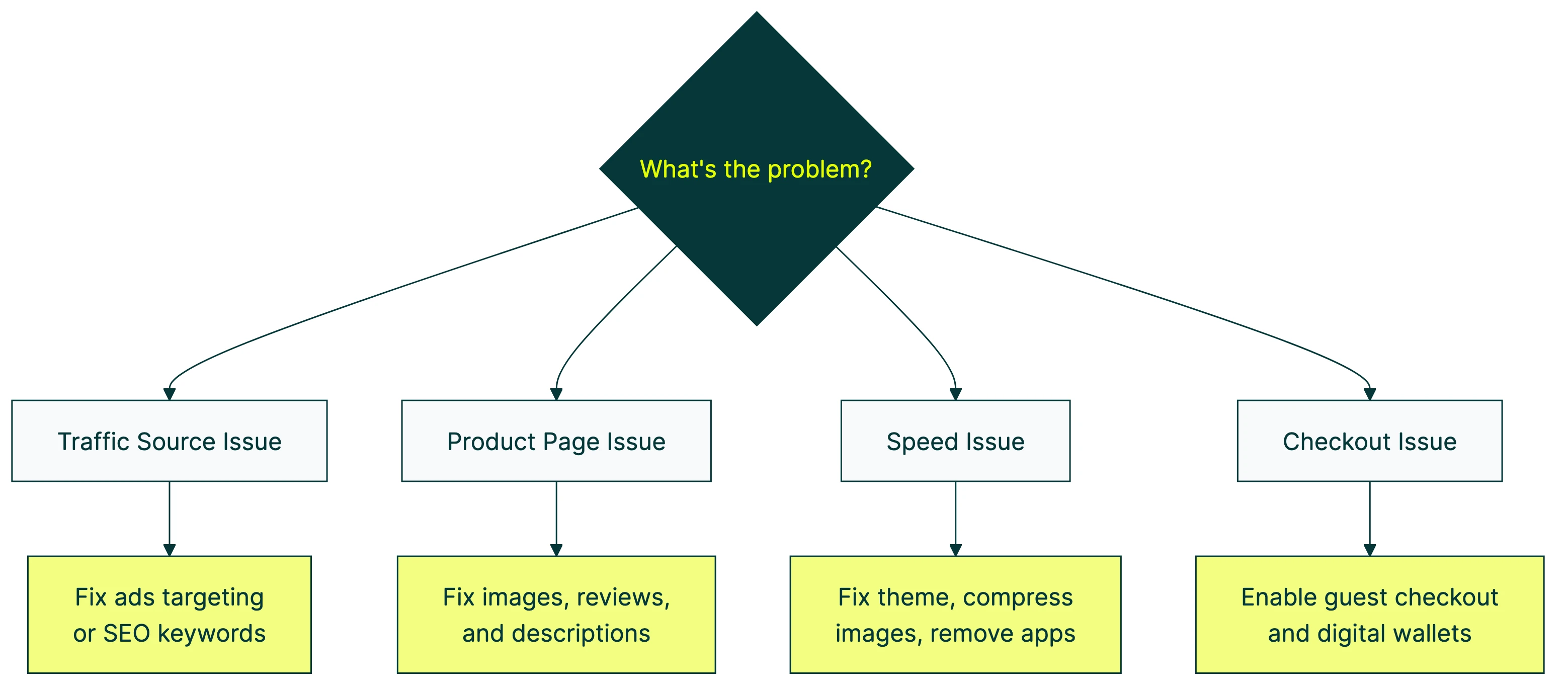
Why is my Shopify conversion rate so low?
The most common causes: slow page load (check Core Web Vitals), poor product images, forced account creation at checkout, hidden shipping costs that surprise people at the last step, and traffic quality. That last one is the hidden variable. Cold paid social traffic converts at roughly 1%. Organic search converts much higher. If most of your traffic comes from cold ads, your store might be fine and your targeting might need work. Diagnose by comparing conversion rate by traffic source in GA4. Then run a CRO audit to find your specific bottlenecks. Our Shopify CRO audit guide walks through the process with ecommerce-specific checks. Understanding your full conversion funnel helps you see where people actually drop off.

Randy Wattilete
CRO expert and founder with nearly a decade running conversion experiments for companies from early-stage startups to global brands. Built programs for Nestlé, felyx, and Storytel. Founder of Kirro (A/B testing).
View all author posts