Checkout optimization is about removing friction between “add to cart” and “order confirmed.” It’s one of the highest-impact things you can do for an online store. Baymard Institute found that the average large ecommerce site can gain 35% more conversions through checkout design improvements alone. And yet 65% of top sites still perform “mediocre or worse” at checkout.
That’s a gap you can walk right through.
This guide covers why shoppers abandon checkout, a framework for finding your specific revenue leaks, and 9 strategies that work. For a full funnel optimization guide that covers every stage from landing page to purchase, start there. For broader site-wide tactics, check out our ecommerce CRO guide or the ecommerce CRO checklist. This post is checkout-specific. Every recommendation is about what happens after someone clicks “buy.” For a comparison of the best checkout optimization tools by price and ecommerce focus, see our tools roundup.
What checkout optimization actually means
Think of checkout like a hallway between your store and the register. Every extra door, every confusing sign, every unexpected speed bump gives shoppers a reason to turn around and leave.
The numbers back this up. The average checkout has 11.3 form fields, but Baymard’s research shows you only need 8. That’s three extra fields standing between you and revenue. Three fields nobody wants to fill out.
Checkout optimization is about finding those unnecessary friction points and removing them. Not redesigning your whole store. Not rebuilding from scratch. Just making the buying part easier. It sits inside the broader world of conversion rate optimization. But it’s focused on one specific moment: someone has already decided to buy.
Our take: Most stores spend weeks tweaking their homepage and ignore the checkout page entirely. That’s like remodeling the lobby while the cash register is broken.
Why shoppers abandon checkout (the real reasons, with data)
The overall cart abandonment rate is 70.19% globally, based on Baymard’s meta-analysis of 48+ studies. That number varies by industry. Luxury goods hit 82.84%, fashion sits at 78.53%, and food comes in around 63.62% (Dynamic Yield data).
But the cart abandonment rate includes people who were just browsing. The checkout-specific abandonment rate (people who actually started checking out, then quit) is closer to 50-60%. That’s the number you should care about.
Here’s why they leave:
- Unexpected costs (shipping, taxes, fees) are the #1 reason, by a wide margin
- Required account creation causes 26% of shoppers to abandon (Baymard)
- Checkout too long or complicated accounts for 18%
- Security concerns push away shoppers who don’t trust the payment form
This is the stat that reframes everything. Zuko Analytics tracked when people actually leave during checkout. The median abandonment time? One minute and five seconds. People who quit do it almost immediately.
So the problem isn’t that your checkout is too long. It’s what hits shoppers in the first few seconds: surprise fees, account creation prompts, or a layout that looks confusing. Fix the entry, and you fix most of the exits.
There’s a device gap too. Bold Commerce analyzed 3 million checkout sessions. Desktop shoppers complete checkout at 52.5%. Mobile shoppers? Just 42.4%. Mobile generates 70% of checkout starts but only about 50% of orders. That’s a lot of revenue walking out the mobile door.
Single-page vs multi-step checkout: what the data actually shows
This is one of the most common questions in ecommerce. Should your checkout be one long page or multiple steps? The internet has strong opinions. Most of them are wrong.
Bold Commerce analyzed 3 million checkout sessions (the largest public study available). The result? Single-page and multi-step checkouts tied at 48.4% completion. A dead heat.
Baymard’s usability research supports this. They found that “users had relatively few problems navigating between multiple checkout steps.” The friction wasn’t caused by having too many steps. It was caused by what the customer had to do at each step.
So where do those dramatic case studies come from? You know the ones: “We switched to one-page checkout and saw a 257% conversion lift.” Almost always, those studies compared an unoptimized multi-step checkout against a well-optimized single-page version. That’s not testing the layout. That’s testing good design against bad design. Of course the good design won.
Multi-step does have one real advantage: if you capture the email at step 1, you can send abandoned cart recovery emails. That’s harder with single-page because you might not have their email until they’re done. And a good conversion funnel recovery sequence can bring back 5-15% of abandoned carts.
Our take: Stop debating pages. Focus on what’s inside the checkout. Cut unnecessary fields. Show costs upfront. Make guest checkout the default. Then, if you want, test the layout. But it’s the last thing to test, not the first.
The checkout audit framework: find your biggest revenue leaks
Most checkout articles throw 15 tips at you and hope something sticks. That’s like a doctor listing every medication ever made and saying “try some.” You need a diagnosis first.
For a visual walkthrough of how to reduce shopping cart abandonment, Shopify breaks down the key strategies:
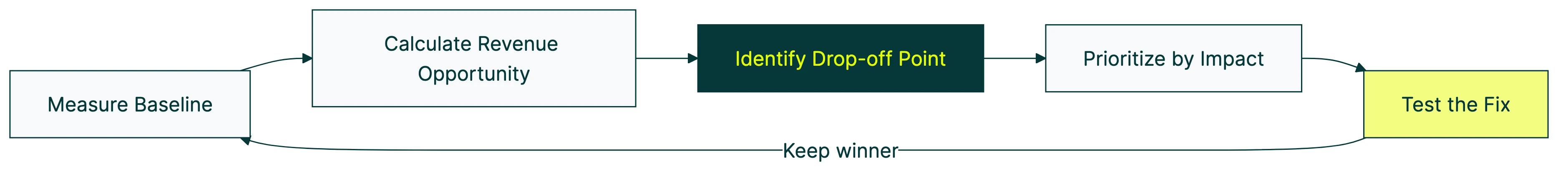
Here’s a simple framework you can use today:
Step 1: Measure your baseline. Your checkout completion rate is the number of sessions that reach checkout divided by completed orders. If 1,000 people start your checkout and 420 finish, your completion rate is 42%. Bold Commerce found that top-performing stores hit 73.2% on desktop and 65.3% on mobile. Where do you land?
Step 2: Calculate the revenue opportunity. Quick math. Say 5,000 visitors reach your checkout each month, your completion rate is 40%, and your average order value is $75. That’s 2,000 orders ($150,000).
If you matched the top quartile at 65%, you’d complete 3,250 orders ($243,750). That’s $93,750 per month sitting in your checkout waiting to be collected. Worth benchmarking against what is a good conversion rate for your industry.
Step 3: Identify the drop-off point. Where in the flow do people leave? Google Analytics 4 (GA4) has a funnel exploration report that shows which step loses the most shoppers. For field-level data (which specific form field causes problems), tools like Zuko can help. Remember that 65-second stat? Your biggest leak is probably at the very top of the checkout.
Step 4: Prioritize by impact. Fix the highest-drop-off step first. If 30% of shoppers leave at the account creation step, fixing that will do more than tweaking your confirmation page. Track the right CRO metrics so you know what’s actually moving.
Step 5: Test the fix. Don’t just change things and hope. A/B test the change so you know it actually worked. Tools like Kirro let you test checkout changes without touching your site’s code, which means you don’t need a developer to run the test.
Most checkout guides skip straight to tips. Tips without diagnosis is guesswork. Start here instead.
9 checkout optimization strategies that actually move the needle
These are the changes with the strongest data behind them. If you ran through the audit framework above, start with whatever matches your biggest leak. Not sure where to start? Work through them top to bottom. For a focused look at checkout design best practices, we put together a companion guide. And if you want a broader view, our guide on how to increase your conversion rate covers strategies beyond checkout. For product page optimization, landing page optimization, and optimizing your pricing through A/B tests, we have separate guides.
1. Show all costs before checkout
The #1 reason people abandon checkout is unexpected fees. Not a slow page. Not too many fields. Just “I didn’t know shipping cost that much.”
Bold Commerce found that every 10% increase in shipping fees as a percentage of order value leads to a 6.3 percentage point decline in desktop completion. That’s enormous.
The fix is simple: show estimated shipping and tax in the cart, before the checkout page. If someone sees “$47 + $8.99 shipping” in the cart, they’ve already accepted it by the time they start checking out. If that $8.99 shows up as a surprise at the last step, they feel tricked.
2. Make guest checkout the default
26% of shoppers abandon when they’re forced to create an account (Baymard). And yet 62% of sites fail to make guest checkout the most prominent option.
PayPal’s research found that 43% of consumers prefer guest checkout. Even more telling: 72% said they’d use guest checkout even if they already have an account at your store.
Let people buy first. Offer account creation after the order is confirmed (“Want to save your info for next time?”). That way you get the sale and the signup.
3. Cut form fields to 8 or fewer
The average checkout has 11.3 fields. You need 8. Here’s what to cut:
- Address line 2: hide behind a “Add apartment, suite, etc.” link
- Company name: hide unless you’re B2B
- Coupon code field: hide behind a “Have a promo code?” link (visible coupon fields make people without codes feel like they’re overpaying)
- Full name: one field instead of separate first/last name fields
- City: auto-detect from postal code
- Billing address: default to “same as shipping”
Phone number fields alone reduce completion by 5-8% (Baymard). If you don’t need a phone number for delivery, don’t ask for one. For the full picture on checkout form design (labels, validation, autofill), see our research-backed guide. For form field optimization data across different form types, see our dedicated benchmarks.
4. Add digital wallets and local payment methods
Stripe’s experiments across their $1.4 trillion transaction volume found that adding one relevant payment method beyond credit cards lifts conversion by 7.4% on average. Apple Pay alone: +22.3%.
If you sell internationally, the gains get bigger. iDEAL in the Netherlands lifted conversion by 39%. BLIK in Poland: 46%. Pix in Brazil: 31%.
But don’t go overboard. Showing 12 payment options creates decision fatigue. Surface 2-3 of the most relevant options based on device and location. Someone on an iPhone should see Apple Pay first. Someone browsing from the Netherlands should see iDEAL.
5. Fix mobile checkout
Desktop shoppers complete purchases at roughly 2x the rate of mobile shoppers. Given that most traffic is mobile, this is a big deal.
Specific fixes that help:
- Use text inputs instead of dropdowns for things like state and card expiry date. NNGroup’s research (350+ sites tested) found that dropdowns are slower on mobile than just typing
- Support browser autofill. Properly labeled form fields let Chrome and Safari auto-fill name, address, and card details in one tap
- Set correct input types. Use
telfor phone fields,emailfor email. This gives shoppers the right keyboard on mobile - Speed matters. Google found that a 1-second delay reduces conversion by 20%. A 0.1-second speed improvement lifts it by 8.4%
6. Handle errors gracefully (the gap nobody covers)
Every checkout optimization article says “reduce friction” and “simplify forms.” Almost nobody talks about what happens when something goes wrong during checkout. And things go wrong all the time.
Zuko’s data shows the average field return rate is 3.04. That means shoppers revisit form fields more than 3 times on average to correct errors.
Here’s how to handle common error scenarios:
- Card declined: show a clear message (“This card was declined. Try another card or double-check the details”). Don’t clear the form. Nobody wants to re-enter everything
- Address validation failure: suggest corrections inline (“Did you mean 123 Main St?”). Don’t reject the entry and force them to start over
- Promo code failure: explain why it failed (expired, wrong product category, minimum not met). “Invalid code” with no explanation makes people give up
- Real-time validation: show errors at the field level as people type. Don’t wait until they hit “Submit” to tell them their email address is missing an @
Good error handling won’t show up in your checkout optimization tips listicle. But it’s where real money is lost, quietly, one frustrated shopper at a time.
7. Use progress indicators
If you use a multi-step checkout, show people where they are. A simple numbered step indicator (“Step 1 of 3: Shipping”) reduces anxiety. It answers the question every shopper is thinking: “How much longer is this going to take?”
You don’t need anything fancy. Numbered steps or a simple progress bar works. The point is to set expectations.
8. Add trust signals near the payment form
Put security badges and payment logos near the card input fields, not in the header. That’s where the shopper’s eyes are when they’re deciding whether to type in their credit card number.
SSL padlock, recognized payment logos (Visa, Mastercard, PayPal), and a brief return policy statement all help. But don’t go overboard. A wall of 15 trust badges looks desperate, not trustworthy. Pick 3-4 that matter most.
9. Enable cart saving and abandonment recovery
Not everyone who leaves is gone for good. Some are comparing prices. Some got interrupted by their kid. Some need to ask their partner.
If you capture email early in the checkout (remember the multi-step advantage from earlier?), you can send recovery emails. A simple three-email sequence (1 hour, 24 hours, 72 hours after abandonment) can recover 5-15% of abandoned checkouts.
Cart saving helps too. Let shoppers come back and pick up where they left off. That one feature removes the biggest excuse for not buying: “I’ll do it later” actually becomes possible.
How to A/B test checkout changes
Every article about checkout optimization says “test your changes.” Almost none explain how. Testing checkout pages comes with challenges you don’t face on other pages.
Lower traffic volume. Only a fraction of your total visitors reach checkout. If your site gets 50,000 visitors a month but only 3,000 start checkout, your test needs to work with that smaller number. This is where math that works with less traffic (experts call this Bayesian A/B testing) becomes important. Traditional A/B testing methods need huge visitor counts. Bayesian methods give you confident answers faster.
Higher stakes per visitor. A checkout visitor is worth more than a homepage visitor. They’ve already decided to buy. A bad test could cost you sales, so don’t change too many things at once.
What to test first. Go back to your audit framework. The step with the highest drop-off is your first test. If 25% of people leave at account creation, test making guest checkout the default. If they leave at the payment step, test adding Apple Pay.
And whatever you do, don’t change the payment flow and the form layout in the same test. You won’t know which change made the difference. One change per test.
How to measure. Checkout completion rate is your primary metric. Average order value is secondary (some changes, like removing upsells, might increase completion but decrease order size). Track both through ecommerce conversion tracking in GA4 and your testing tool.
With Kirro, you can test checkout page elements using the visual editor. No code changes needed. Point at the element you want to test, create a version, and let the test run. The A/B testing and conversion rate connection is direct here: small changes to checkout can move your overall CRO testing results more than anything else.
If you want to try it, you can set up a free test in about three minutes. Pick the checkout page element you think is causing the most friction and test a simpler version.
Checkout optimization by platform
| Platform | Checkout control | Guest checkout | Digital wallets | A/B testable? |
|---|---|---|---|---|
| Shopify (standard) | Limited (settings only) | Yes (toggle) | Shop Pay, Apple Pay, Google Pay | With external tools |
| Shopify Plus | Full (Checkout Extensibility) | Yes | All major wallets | With external tools |
| WooCommerce | Full (plugins or code) | Yes (built-in) | Via payment plugins | With external tools |
| Custom / headless | Maximum | Whatever you build | Stripe handles this | Build your own or use tools |
Shopify
Shopify limits checkout customization unless you’re on Shopify Plus. Standard stores can’t modify the checkout template. But you can still change settings: enable guest checkout, adjust shipping display, and turn on Shop Pay (Shopify’s accelerated checkout).
Shopify rolled out its one-page checkout in 2023, and Shop Pay users convert at significantly higher rates than standard checkout. If you haven’t enabled Shop Pay yet, do it today. It’s free and it’s one of the easiest conversion wins available.
For deeper Shopify-specific tactics, see our guide on Shopify conversion rate optimization. It covers the full picture beyond just checkout. And for specific Shopify conversion rate fixes, we have a tactical companion guide.
WooCommerce
WooCommerce gives you full control. You can modify checkout fields, change the flow, add or remove steps, and customize every element. Plugins like WooCommerce Checkout Field Editor make this manageable without code.
The downside of full control: it’s on you. There’s no default “best practice” checkout. You need to build (or choose) a good one. The strategies in this guide apply directly to WooCommerce, and you can test changes with Kirro’s visual editor without editing your theme files.
Custom or headless
If you’ve built a custom checkout or use a headless commerce setup, you have maximum flexibility. Stripe Checkout or Stripe Elements give you a pre-built, well-tested payment form. Card inputs, wallets, local payment methods, all handled.
The trade-off: more flexibility means more maintenance. Every update to payment standards, new wallet types, or accessibility rules falls on your team. For most small stores, a hosted checkout (Shopify, Stripe Checkout) beats a custom build. The gains from customizing are usually smaller than the effort to maintain it.
FAQ
How do I optimize my checkout page?
Start with a diagnosis, not a redesign. Measure your checkout completion rate (sessions reaching checkout divided by completed orders), identify where shoppers drop off, and fix the highest-impact issue first. The most common quick wins are showing all costs upfront, enabling guest checkout, and reducing form fields to 8 or fewer. Then test the changes to confirm they actually helped.
What is a good checkout conversion rate?
The average checkout completion rate is about 42-52% depending on device (Bold Commerce, 3 million sessions). Top-performing stores hit 65-73%. If you’re below 40%, you likely have a significant friction point worth fixing. Mobile tends to run about 10 percentage points lower than desktop.
Single-page or multi-step checkout: which converts better?
Neither, consistently. Bold Commerce analyzed 3 million checkout sessions and found both formats tied at 48.4% completion. What matters more is what’s in each step, not how many pages the checkout spans. Focus on reducing fields, showing costs upfront, and enabling guest checkout before worrying about the layout.
What is the average cart abandonment rate?
About 70% globally (Baymard meta-analysis of 48+ studies). But that includes people who were just browsing, not actively trying to buy. The checkout-specific abandonment rate (people who started checkout and quit) is closer to 50-60%. That’s the number worth tracking.
Does adding more payment methods improve checkout conversion?
Yes, up to a point. Stripe’s experiments show adding one relevant payment method beyond cards lifts conversion by 7.4% on average. But showing too many options can cause decision fatigue. Surface 2-3 of the most relevant methods based on the shopper’s location and device.

Randy Wattilete
CRO expert and founder with nearly a decade running conversion experiments for companies from early-stage startups to global brands. Built programs for Nestlé, felyx, and Storytel. Founder of Kirro (A/B testing).
View all author posts