Landing page optimization is the process of changing elements on a page so more visitors do the thing you want. Buy, sign up, request a demo. Whatever “converting” means for your business. Most guides give you a list of 47 tips and call it a strategy. That’s not a strategy. That’s a buffet with no plates. (Not sure if you need a landing page or a full website? Start with our landing page vs website comparison.)
Whether you’re evaluating landing page optimization services or doing it yourself, the real question isn’t “what should I change?” It’s “what should I change first, given my traffic, my page type, and where my conversion rate optimization sits right now?” If you want the complete list of landing page design best practices before diving into optimization, start there. This guide covers the decision framework. A CRO framework for landing pages that helps you pick the right move, not just any move. (If you’re focused on getting your landing pages to rank in search results first, see our landing page SEO guide.)
What is landing page conversion rate optimization?
Audit your page with the landing page optimization checklist to find the biggest wins fast. You can also run your URL through a landing page analysis tool to get an instant read on what’s working and what’s not. Landing page CRO means studying how people behave on a specific page and making changes to get more of them to take action. Think of it as detective work. You look at the clues (analytics, recordings, feedback), form a theory about what’s broken, fix it, and test whether you were right.
How big is the opportunity? The average landing page converts at 2.35%. The top 25% hit 5.31%. The top 10% reach 11.45% (WordStream, 2024 benchmark data).
If you’re at 2%, the best pages in your industry convert five times better than yours. That gap is money sitting on the table.
And it’s getting harder. Contentsquare’s 2025 benchmark found conversion rates dropped 6.1% year over year, even though ad spend went up 13.2%.
Companies are paying more to send traffic to pages that convert worse. Landing page optimization isn’t a nice-to-have anymore. It’s defense.
The Unbounce 2024 Conversion Benchmark Report puts the median conversion rate across all industries at 6.6%, based on 57 million conversions. That’s a useful starting point. For a full breakdown of typical landing page conversion rates by industry, traffic source, and page type, we compiled the benchmarks separately. If you’re below the median, you’ve got structural problems to fix. If you’re above it, you’re into testing territory.
Want to track exactly which conversion metrics matter for your page? Start there before changing anything.
The landing page optimization decision framework
This is where most guides fall apart. They hand you the same tips regardless of whether you get 200 visitors a month or 200,000. Those are completely different problems.
This framework accounts for your situation.
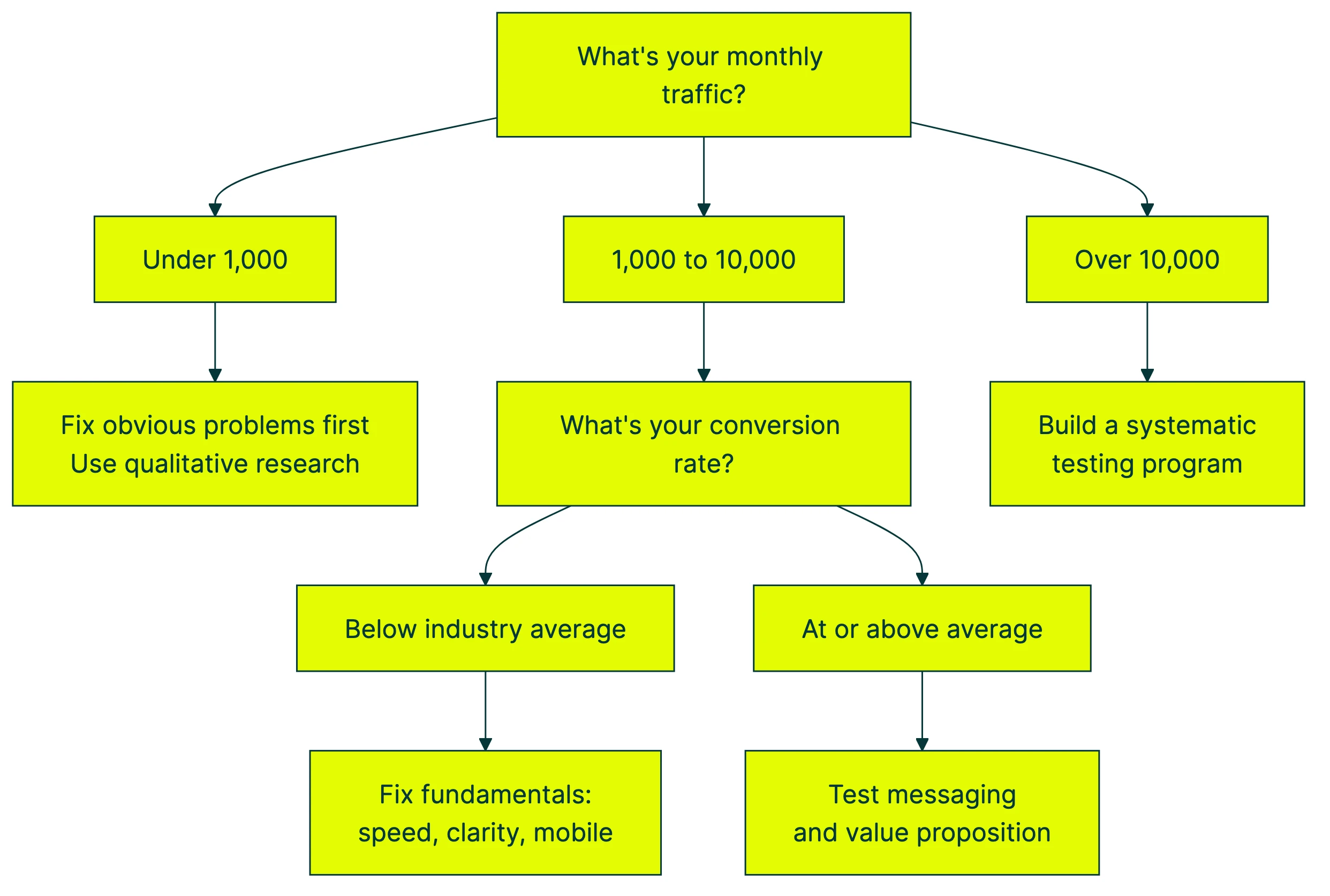
Variable 1: Traffic volume. This determines how you gather evidence. Under 1,000 visitors per month? Forget A/B testing for now. You don’t have enough visitors for the math to work. Instead, watch session recordings, read survey responses, and fix obvious problems. Between 1,000 and 10,000? Run targeted A/B tests on your highest-impact elements. Above 10,000? You can build a systematic CRO testing program with multiple tests running at once.
Variable 2: Page type. A lead generation form, a product page, and a SaaS free trial signup have completely different conversion mechanics. A lead gen landing page might need trust signals and shorter forms (see our guide on improving lead conversion rates for what moves the needle). A product page needs clear pricing. A trial signup needs to minimize perceived risk. The same “best practice” can work perfectly on one and fail completely on another.
Variable 3: Current conversion rate. Below your industry average? Fix the fundamentals first (clarity, speed, mobile experience). At the average? Test your messaging and value proposition. These strong value proposition examples can help you benchmark yours. Already above average? You’re into micro-optimizations (button copy, form labels, social proof placement).
Peep Laja, who ran CXL for over a decade, puts it simply: “The biggest mistake in CRO is jumping straight to A/B testing without understanding why visitors aren’t converting.” A CRO audit almost always comes first.
Our take: If you have less than 1,000 visitors a month, don’t buy an A/B testing tool yet. Fix the five things a first-time visitor would obviously complain about. Then test.
Once you’ve identified what to test, you need a way to run the test. A visual editor (like Kirro) lets you change headlines, buttons, and images without writing code. Paste a script, pick what to change, and let it run. Three minutes, tops.
The framework as a decision tree:
The point of this framework isn’t to slow you down. It’s to make sure you’re doing the right work. Running A/B tests on a page with broken fundamentals is like A/B testing paint colors on a house with a leaking roof. Fix the roof first.
Pair this framework with a broader CRO strategy and process and you’ll know exactly where landing page work fits in your bigger plan.
Landing page optimization best practices (and when they backfire)
You’ve read the standard advice a hundred times. Clear headline. One call-to-action. Social proof. Trust badges. Fast load times. These are table stakes, and they’re good starting points. But they’re not universal laws, and following them blindly can hurt you.
What the data actually says, with the caveats nobody mentions.
Clear headline above the fold. Nielsen Norman Group eye-tracking studies show 57% of viewing time happens above the fold. The area just 100 pixels above the fold gets 102% more views than the area just below it. Your headline matters more than almost anything else on the page.
Single call-to-action. Oli Gardner’s research found that pages with a 1:1 ratio (one link per one conversion goal, what he calls “attention ratio”) convert 31-40% better than pages with multiple competing links. If your page has six buttons pointing in six directions, it’s a choose-your-own-adventure, not a landing page.
Simpler copy wins, usually. Unbounce’s 2024 data shows pages written at a 5th-to-7th grade reading level convert 56% better than pages written at a professional level. That correlation is 62% stronger than it was in 2020. Simpler is winning harder over time.
Page speed matters more than you think. Google and Deloitte found that a 0.1-second improvement in load time increased retail conversions by 8.4%. Portent’s research looked at 100 million page views. Every additional second of load time (0 to 5 seconds) costs 4.42% in conversion rate.
Social proof, with a warning. Adding testimonials and customer logos helps. But HubSpot’s research on negative social proof shows that highlighting how common a problem is can actually normalize the problem behavior. The Petrified Forest theft study is the classic example: signs saying “many visitors steal wood” doubled theft. Show what people should do, not what they shouldn’t. See our social proof examples for landing pages for what works and what backfires.
Trust signals need context. Nielsen Norman Group finds visitors form trust judgments in under 50 milliseconds. But trust signals aren’t one-size-fits-all. PPC Hero’s A/B tests showed “Secure Checkout” language hurt an established brand’s conversions but helped an unknown brand (+6.79%). If people already trust you, reassuring them can feel suspicious. (“Why are they insisting it’s secure? What’s wrong?”)
That last point is the big one. Every best practice here has context where it backfires. Reducing form fields is “best practice,” but Michael Aagaard found that removing the wrong fields caused a 14% conversion drop. When he changed the labels instead, conversions went up 19.21%. Our guide on designing your form for conversions digs into the research behind field count, layout, and validation.
Check out more examples like these in our CRO best practices breakdown, which covers when conventional wisdom fails across an entire site. And if you want to avoid the testing mistakes that invalidate results, here’s our list of common A/B testing mistakes.
Our take: “Best practices” is industry-speak for “worked for someone else.” Test them on your own pages before trusting them. That’s literally the point of A/B testing.
Landing page optimization checklist
Most checklists dump 30 items on you with no sense of priority. Here’s a better version, grouped by effort level so you can start with the quick wins.
Quick wins (copy and messaging, do these first):
- Headline matches the ad or link that brought visitors here. If your ad says “Free SEO Audit” and the page says “Welcome to Our Marketing Services,” you’ve lost them.
- One clear call-to-action per page. One button. One goal. Not three buttons doing three things.
- Benefits before features. “Get more leads” beats “AI-powered lead scoring engine.”
- Frame savings as avoiding a loss, not gaining a discount (psychologists call this loss aversion). “Save $200/month” converts about 24% better than “Get $200 off” in research. People hate losing more than they love gaining.
- Reading level: aim for 5th-to-7th grade. Shorter sentences. Smaller words. No jargon.
Medium effort (design and layout):
- Social proof near the call-to-action. Not buried in a footer. Right next to the button.
- Form fields reduced to the minimum you actually need. But test which fields to remove. Cutting the wrong ones can hurt (the Aagaard case again).
- Visual hierarchy: the most important thing is the biggest, most colorful element. Everything else is smaller, quieter.
- Limit choices to 4-7 options (Miller’s Law, the concept that working memory holds about 7 items). More than that and people freeze.
High effort (technical):
- Page loads in under 3 seconds. Compress images, defer scripts, use a CDN.
- Mobile experience is actually good, not just “responsive.” More on that in the mobile section below.
- Forms work on every device and browser. Test this yourself, on a real phone.
After identifying your highest-priority change from this list, set up a test. Paste Kirro’s script on your site, use the visual editor to create your version B, pick your conversion goal, and let it run. You’ll know if the change worked within a few weeks.
For more structured CRO recommendations across your entire site, not just landing pages, we’ve got a full guide.
Landing page optimization examples and case studies
Reading level matters more than most people think. Unbounce analyzed over 41,000 landing pages and found that copy written at a 5th-to-7th grade level converted 56% better. Not marginally better. 56%. All those fancy words you worked so hard on? They’re costing you money.
More form fields can mean better leads. This goes against every “reduce form fields” tip you’ve read. MarketingExperiments tested a 15-field form against a shorter version. The longer form produced a 109% increase in lead quality and overall uplift. More fields meant the leads who did fill it out were serious. Context matters.
Multi-step forms can convert shockingly well. VentureHarbour documented a form with 30+ questions across 4 steps that hit a 53% conversion rate. The trick? Each step felt small and progress was visible. The total length didn’t scare people because they only saw a few questions at a time.
Links are leaks. Oli Gardner tested pages with a 6:1 attention ratio (six links per one conversion goal) against pages with a 1:1 ratio. The focused pages converted 40%+ better. Every extra link on your landing page is a potential exit.
And removing form fields can backfire. Michael Aagaard removed fields from a form, following standard best practice advice. Conversions dropped 14%. When he tried a different approach and changed the field labels instead, conversions jumped 19.21%. The lesson? The number of fields isn’t always the problem. The clarity of the fields might be.
Want to run your own landing page test? Set up a free split test and let the numbers tell you what works. You can measure the results with clear A/B test conversion rate data instead of guessing.
For more examples of pages that convert well and why, check out our guide to high converting landing pages.
PPC landing page optimization
If you’re running Google Ads or Facebook ads, landing page optimization isn’t optional. It’s the difference between profitable campaigns and expensive ones.
The concept is called “message match” (or sometimes “ad scent”). When someone clicks an ad that says “Free Website Audit,” they should land on a page that says “Free Website Audit” in the headline. Not “Welcome to Our Agency.” Not “Our Services.” The exact message from the ad.
This matters for three reasons.
First, visitors decide in seconds whether they’re in the right place. If the page doesn’t match the ad, they leave.
Second, Google Ads rates how well your page matches the ad (they call this Quality Score). Better match means lower cost per click.
Third, different campaigns attract different people with different needs. Sending them all to the same generic page is wasting money.
The practical fix: build different landing page versions for different ad groups. Your “pricing” ad gets a pricing-focused landing page. Your “free trial” ad gets a trial-focused page. One page per intent.
This is where A/B testing becomes really powerful. You can test which landing page version converts best for each campaign, then send all traffic to the winner. If you’re spending real money on ads, even a small conversion lift pays for itself in days.
For the specific methods of running tests on landing pages, including how long to run them and how to read results, see our guide to split testing your landing pages. If your paid traffic comes from Google, our guide to testing your Google Ads landing pages covers how to run ad experiments and page tests together.
Mobile landing page optimization
Desktop visitors convert 8% better than mobile visitors overall. In professional services, desktop converts 40% better despite getting four times less traffic (Unbounce 2024 data). Read that again.
Most guides will tell you this is a responsive design problem. Make buttons bigger. Reduce form fields. Add click-to-call. Those things help, but they miss the bigger picture.
Mobile visitors often aren’t trying to convert. They’re researching. Comparing. Bookmarking for later. They’re on the bus, between meetings, lying in bed at 11pm. The intent is different from someone sitting at a desk with a credit card nearby.
Contentsquare’s 2025 data backs this up: paid social traffic (which is heavily mobile) has 9.2% higher bounce rates and 10.6% lower conversions than other channels. People scroll, they don’t click.
This gives you two strategic choices. Option one: simplify the mobile experience so conversion is as easy as possible. Fewer fields, bigger buttons, sticky headers, click-to-call instead of forms. Make the path so short that even a distracted person on a train can complete it.
Option two: treat mobile as a warming channel. Accept that most mobile visitors won’t convert on that visit. Instead, capture their email, retarget them, and close the deal on desktop. Sounds counterintuitive. But for high-consideration purchases (B2B services, expensive software, big-ticket e-commerce), it’s often the smarter play.
Our take: If your product costs more than $50, most people aren’t buying on their phone. Design mobile to warm them up, not close the deal.
SEO landing page optimization
SEO and CRO want opposite things on a landing page. CRO says: strip away navigation, remove distractions, focus everything on the single conversion goal. SEO says: add content depth, include internal links, give Google something to index.
Both are right. And yes, they can coexist on the same page. It just takes some planning.
The trick is vertical separation. Above the fold: pure CRO. Clear headline, value proposition, one call-to-action. No navigation menu leaking visitors to other pages.
Below the fold: content that supports SEO. FAQs, details, supporting information, internal links. Google indexes the whole page, but most visitors only see what’s above the fold unless they’re actively researching.
On-page SEO basics for landing pages: target keyword in your title tag, meta description, H1, and first paragraph. Related keywords in H2s. Descriptive alt text on images. Internal links from related content. You know the drill.
For the full deep-dive on making SEO and CRO work together instead of fighting each other, read our guide on balancing CRO and SEO. And for SEO-specific landing page tactics, see landing page SEO.
Landing page optimization tools and software
Landing page optimization tools fall into a few clear categories, and you probably don’t need all of them. Here’s when each type makes sense.
A/B testing tools let you show two versions of a page to different visitors and see which one converts better. This is the core of landing page optimization. Kirro fits here. It’s got a visual editor so you can change headlines, images, and buttons without touching code. The script is 9KB (your page won’t slow down), and it uses math that works with less traffic (Bayesian statistics). Full disclosure: this is us. €99/month, no per-visitor pricing. Compare that to competitors charging $299+ for similar features. For a full comparison, check out our list of A/B testing tools.
Heatmap and session replay tools show you where visitors click, how far they scroll, and where they get stuck. Use these when you need to understand why a page isn’t converting. Good for the “detective work” phase before you run tests.
Page builders like Unbounce or Leadpages let you create landing pages without a developer. Useful if you’re running multiple campaigns and need lots of page variants quickly.
Speed testing tools (PageSpeed Insights, GTmetrix) tell you how fast your page loads and what’s slowing it down. Given the data on speed and conversion rates (every second costs 4.42% conversion rate), this is worth checking quarterly.
For a broader look at CRO tools across your whole website, not just landing pages, we’ve got that covered too.
When to hire a landing page optimization agency
Not everyone needs an agency. If you have a handful of pages and enough curiosity to run a few tests, you can start testing yourself and learn a lot.
But there are signs it’s time to bring in help. You’ve been testing for months with no wins. Your traffic is too low for tests to finish in a reasonable time. Your pages involve complex funnels with multiple steps (our guide on optimizing your full conversion funnel covers that scenario). Or the pages are high-value enough that a 2% conversion improvement means serious money.
What to look for in landing page optimization services or a CRO agency: a data-driven process (not just opinions), transparent reporting you can actually understand, and a test-first approach. If an agency promises specific conversion lifts before they’ve seen your data, that’s a red flag. Nobody knows what will work until it’s tested.
For smaller budgets, a CRO consultant might be a better fit. They can audit your pages, build a test backlog, and hand it off for you to execute.
The DIY vs. agency decision maps to your traffic volume. Under 10,000 visitors/month? DIY with a simple tool. You’ll learn faster than any agency can teach you. Over 10,000? An agency might accelerate results, especially if you’re spending heavily on ads and every percentage point of conversion matters.
For a visual breakdown, Unbounce walks through 8 landing page optimization tips with real examples:
FAQ
What is landing page optimization?
Landing page optimization is the process of improving the elements on a landing page to increase the percentage of visitors who take a desired action. That action could be filling out a form, clicking a button, buying a product, or signing up for a trial.
It’s not just design tweaks. It includes copy, offers, forms, page speed, trust signals, and testing.
The goal is to get more value from the traffic you’re already paying for. A page converting at 3% instead of 2% means 50% more leads from the same visitors.
How do you improve your landing page?
Start with data, not guesses. Look at your analytics for the biggest drop-off point. Watch a few session recordings to see what’s confusing visitors. Read any feedback or survey responses.
Then form a theory about what’s causing the problem. Make one change based on that theory. Test it. Measure whether it actually helped. Repeat. Use the decision framework above to decide which approach fits your traffic level. For a ranked list of ways to increase landing page conversion rate, that guide covers the changes with the biggest impact.
What are the 7 principles of conversion?
Clarity (visitors understand what you offer in seconds), relevance (the page matches what brought them here), value (the offer is worth their time or money), urgency (there’s a reason to act now), trust (you look legitimate and safe), simplicity (the path to conversion is short and obvious), and testing (you verify what works instead of assuming).
These aren’t magic. They’re the basics. Most pages fail on clarity alone. If a visitor can’t explain what your page offers within 5 seconds of landing, you’ve got a clarity problem. Fix that before worrying about urgency or trust signals.
What should be avoided in a well-optimized landing page?
Multiple competing calls-to-action (pick one goal per page). Slow load times (every second costs conversions). Generic stock photos that add nothing. Walls of text with no visual breaks. Hidden pricing (visitors leave to find it elsewhere, and they don’t come back). Navigation menus that let visitors wander off to other parts of your site.
The common thread? Anything that distracts from the single conversion goal. A landing page isn’t a homepage. It has one job.
How many landing pages should a business have?
More than you think. HubSpot data shows companies with 40+ landing pages generate 12x more leads than companies with 5 or fewer. More pages means more targeted messaging for different audiences and traffic sources.
Each ad campaign, each audience segment, and each offer should ideally have its own landing page. The goal is message match. When the page speaks directly to the visitor’s intent, conversions go up. One generic page trying to serve everyone usually serves no one well.
That said, don’t create pages for the sake of it. Every page needs traffic and a clear purpose. Forty great pages beats a hundred mediocre ones.

Randy Wattilete
CRO expert and founder with nearly a decade running conversion experiments for companies from early-stage startups to global brands. Built programs for Nestlé, felyx, and Storytel. Founder of Kirro (A/B testing).
View all author posts