A lead generation landing page is a standalone page with one job: get a visitor’s contact information. Name, email, maybe a phone number. In exchange, you give them something valuable. A checklist, a demo, a free trial, a webinar spot.
That’s it. No navigation bar pulling them elsewhere. No “about us” section competing for attention. One page, one offer, one form. Unlike your homepage (which is a different thing entirely), a lead gen landing page exists to capture leads and nothing else.
Most guides on this topic give you a checklist of design tips. “Use a clear headline.” “Add social proof.” Helpful, sure. But landing page design tips without conversion rate optimization strategy are like decorating a house with no foundation. The five elements below are that foundation. They determine whether your page converts at 2% or 20%, regardless of how pretty it looks. (Check your page against the landing page optimization checklist for a quick audit.)
What makes a lead generation landing page work
Every lead gen page, from a simple email signup to a complex demo request, runs on the same five elements. Get these right and a plain-looking page will outperform a gorgeous one. Get them wrong and no amount of design polish will save you.
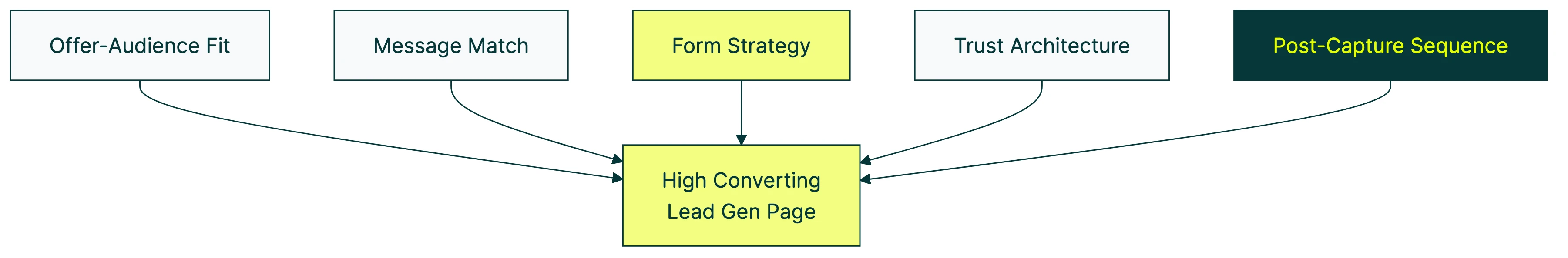
1. Offer-audience fit
The offer has to be worth what you’re asking for. An ebook in exchange for an email address? Fair trade. An ebook in exchange for a phone number? That feels off, and your visitors will bounce.
Oli Gardner, co-founder of Unbounce, has reviewed more landing pages than most people will ever build. His rule is simple: balance the size of the prize with the friction required to get it.
A checklist for an email is low friction. A consultation for name, email, company, role, and budget is high friction, but a real consultation is worth it.
2. Message match
Your landing page has to continue the conversation that brought the visitor there. If your ad says “Free SEO checklist,” your landing page headline better say “Free SEO checklist.” Not “Welcome to our marketing hub.” Not “We help businesses grow.”
This sounds obvious. But run a landing page optimization audit on most small business sites and you’ll find the ad says one thing, the landing page says another, and the visitor says goodbye.
3. Form strategy
The internet has been telling you to “use fewer form fields” for a decade. That advice is incomplete and sometimes flat-out wrong. More on this in the dedicated section below, because it deserves its own space.
4. Trust architecture
Trust signals need to match the size of the ask. Asking for an email? A couple of customer logos or a short “join 5,000 subscribers” line is enough. Asking for a phone number and company details? You need named testimonials, recognizable brand logos, and possibly a short video.
Think of it as a hierarchy: raw numbers (“10,000+ customers”) beat logos, logos beat unnamed quotes, named quotes beat anonymous ones, and video testimonials beat everything. Follow CRO best practices and stack trust signals proportional to what you’re asking visitors to give up.
5. Post-capture sequence
Most guides stop at the form. As if the job is done once someone hits “submit.” It isn’t.
What happens in the 60 seconds after submission determines whether that lead becomes a customer or forgets you exist. The thank-you page, the confirmation email, the follow-up sequence. These are part of your conversion funnel, not an afterthought.
A thank-you page that just says “Thanks, we’ll be in touch” is a wasted opportunity. Use it to set expectations (“We’ll email you within 24 hours”), offer a next step (“While you wait, check out our guide to…”), or reinforce the value of what they just signed up for.
Our take: Most lead gen advice obsesses over the form and ignores everything after it. The thank-you page is the highest-intent page on your entire site. Someone just raised their hand. Don’t waste that moment with a generic “thanks.”
How to build a lead generation landing page (step by step)
This isn’t a “design your page” tutorial. There are plenty of those. This is the strategic sequence that determines whether your page actually generates leads worth following up on. For a deep dive into the form itself (what fields to include, examples, and the field-count myth), see our lead generation form guide.
Step 1: Choose your offer based on where visitors are in their journey.
Someone who just heard about you (cold traffic) wants a free resource. A checklist, a template, a short guide. Low commitment. Someone who’s been on your site three times this week wants a demo or consultation. Match the offer to the warmth of the visitor.
Step 2: Write the headline.
Lead with the benefit, not the format. “Get 50 proven headline formulas” beats “Download our ebook.” Nobody wakes up wanting an ebook. They want what’s inside it. If you’re building on WordPress, starting with lead generation landing page templates gives you a proven layout so you can focus on getting the copy right.
Something most guides skip: simpler words convert better. Unbounce’s analysis of 41,000+ landing pages found that copy written at a 5th-to-7th-grade reading level converted at 11.1%, compared to 5.3% for professional-level copy. That’s more than double. Use short words. Short sentences. Your reader isn’t dumb. They’re busy.
Step 3: Build the form.
Match the number of fields to the value of your offer. Email signup? Name and email. Demo request? Name, email, company, role. The form strategy section below has the full breakdown, including why “fewer fields” isn’t always the answer.
Step 4: Add trust signals proportional to the ask.
Light ask (email for a checklist) = light trust (subscriber count, a few logos). Heavy ask (phone number for a consultation) = heavy trust (named testimonials, case study results, brand logos).
Step 5: Remove distractions.
HubSpot tested this across five high-traffic landing pages. Removing navigation links from pages where visitors already knew the brand (warm traffic) increased conversions 16-28%. But for cold traffic pages where visitors were still getting oriented? The lift was only 0-4%.
The takeaway: if your traffic is warm (email subscribers, retargeting, repeat visitors), strip the navigation. If your traffic is cold (paid search, social ads), leaving some navigation might actually help, because those visitors need context to trust you.
Step 6: Make it work on phones.
Over 80% of landing page traffic comes from mobile devices (Unbounce 2024 data). But desktop still converts significantly better for most industries, sometimes 40% better. That gap isn’t because mobile visitors are less interested. It’s because most landing pages are still designed for desktop first. Fix the mobile experience and you’re improving your conversion rate where most of your traffic actually lives.
Fast pages also rank better in search. If you’re relying on organic traffic to feed your lead gen pages, page speed and SEO for landing pages matter just as much as what’s on the page.
Step 7: Set up tracking before you launch.
You need to know your lead generation conversion rates from day one. Set up form submission tracking in your analytics tool before the page goes live. Not after. If you don’t measure from the start, you won’t know what “normal” looks like when it’s time to improve.
Form strategy: why “fewer fields” is oversimplified advice
Every guide on lead gen landing pages says the same thing: “Use fewer form fields.” It’s become a rule that nobody questions. But the data tells a more interesting story.
The test that broke the rule
Conversion optimizer Michael Aagaard ran a test for a client. He did what everyone recommends: removed three fields from a 9-field form to make it simpler. Six fields instead of nine. Fewer fields, more conversions. Right?
Wrong. Conversions dropped.
So he tried something different. He put all nine fields back, but rewrote the labels to explain why each field was needed. The result: a 19.21% increase in conversions compared to the original. The 9-field form with better labels outperformed the 6-field form.
The lesson: people don’t abandon forms because there are “too many fields.” They abandon forms because they don’t understand why you need the information.
What the data actually shows
HubSpot analyzed 40,000 landing pages and found something that most guides ignore: the type of field matters way more than how many you have.
- Single-line text fields (name, email, company name) barely hurt conversion rates as you add more of them
- Multi-line text areas (“Tell us about your project”) have a strong negative effect on conversions
- Multiple dropdown menus also drag down conversion rates
So a form with six single-line text fields might convert better than a form with three fields that includes a textarea and two dropdowns. The type of field, not the number, is what actually predicts whether someone finishes the form.
The multi-step middle path
Marcus Taylor at VentureHarbour tested switching from a single-step form to a multi-step form (breaking the questions across multiple screens). The conversion rate went from 0.96% to 8.1%. That’s a 743% increase.
Why does this work? Two reasons. First, the first screen only asks for easy, non-threatening information (like “What type of project?”). By the time the visitor reaches the email field, they’ve already invested time and feel committed. Second, a progress bar makes the form feel manageable even when it has many questions.
Our take: “Use fewer fields” is the A/B testing world’s biggest oversimplification. What actually matters is field type, label clarity, and form structure. We’ve seen forms with 8+ fields outperform 3-field forms. The only way to know what works for your audience is to test it.
The quality-volume trade-off
More fields means fewer submissions but higher-quality leads. Fewer fields means more submissions but more tire-kickers. Neither is universally “right.”
If you’re selling a high-ticket B2B service (see our B2B conversion rate optimization guide), adding qualification fields like “company size” and “budget range” might cut your form submissions in half but double your pipeline value. The math works differently for a $50,000 contract than for a $29/month subscription.
Lead gen landing page examples by type
This is where most guides fall short. They show you a handful of pretty landing pages and say “do this.” But a page designed to collect email addresses has almost nothing in common with a page designed to book sales demos. The offer is different. The form is different. The trust signals are different. Even the benchmarks for what counts as a good conversion rate are different.
Here’s what works for each type, plus lead conversion rate benchmarks so you know where you stand.
| Lead type | Typical form | Conversion benchmark | What seals the deal |
|---|---|---|---|
| Email signup | Name + email | 5-15% | Lead magnet preview |
| Demo request | 4-6 fields | 2-5% | Customer logos + short video |
| Content download | 2-3 fields | 10-20% | Table of contents or key stat |
| Free trial | Email only | 5-15% | “No credit card required” |
| Webinar | 2-3 fields | 20-40% | Speaker credentials + date/time |
Email signup
What you’re offering: Newsletter, content upgrade, free resource, or exclusive access.
Form: Name + email. That’s it. Every additional field you add needs to earn its place. Most don’t.
Conversion benchmark: 5-15% is typical. Pages with a strong, specific lead magnet (not “subscribe to our newsletter” but “Get the 27-point homepage checklist”) can push above 15%.
What makes it work: Show a preview of what they’ll get. A screenshot of the ebook cover, a peek at the checklist, a sample of the email content. Visitors need to see that the thing behind the form is real and worth their email address.
What to test first: The headline. Benefit-focused (“Get the checklist that helped 500+ marketers”) vs. curiosity-focused (“The one thing your competitors test that you don’t”).
Demo request
What you’re offering: A personalized walkthrough, usually with a salesperson.
Form: Name, email, company, role, and possibly company size. 4-6 fields is standard. More than 6 and you’d better have a very compelling offer.
Conversion benchmark: 2-5%. Demo request pages convert lower because the commitment is higher (the visitor is agreeing to a live conversation).
What makes it work: Heavy trust signals. Recognizable customer logos, named testimonials with specific results (“increased signups by 34%”), and a short video showing what the demo experience looks like. This is where you need to prove you’re worth 30 minutes of someone’s time.
What to test first: The CTA button text. “Book a demo” vs. “See it in action” vs. “Get a personalized walkthrough.” The framing changes the perceived commitment level.
Content download
Ebooks, whitepapers, reports, research studies. The form is light (name, email, maybe company name) and conversion rates hit 10-20% when the content is genuinely valuable.
The difference between a content download page that converts and one that doesn’t? Specificity. “Download our whitepaper” converts terribly. “This report covers the 2026 benchmarks from 41,000 landing pages” gives people a reason to hand over their email.
Show them what’s inside. A table of contents preview, a teaser stat, a sample page. And if conversions are low, test a different lead magnet before you redesign the page. Sometimes nobody wants the thing you’re giving away.
Free trial
What you’re offering: Access to your product for a limited time.
Form: Email only, or email + password. The fewer barriers, the better. Every field you add reduces trial starts.
Conversion benchmark: 5-15% for pages without a credit card requirement. “No credit card required” is a trust signal that consistently lifts conversions. Free trial conversion rates vary widely by whether you gate with a credit card.
What makes it work: A product screenshot or short demo video showing what they’ll get access to. And those four magic words: “No credit card required.”
What to test first: The CTA. “Start free trial” vs. “Try it free” vs. “See it for yourself.” Small wording changes can move conversion rates by 10-20%.
Webinar registration
Webinar pages are the overachievers of lead gen. Conversion rates of 20-40% are common, partly because the value is obvious (learn specific things on a specific date) and partly because scarcity is built in (“limited spots” or “live on March 25”).
Keep the form short (name, email, maybe company). The page sells itself if you get three things right: speaker credentials that prove expertise, a “what you’ll learn” list with 3-5 specific bullets (not 15 vague ones), and the date/time front and center.
Worth knowing: webinar registrants tend to have the highest downstream conversion to sales calls. So the 20-40% conversion rate on the page is just the start.
How to test your lead generation landing page
You’ve built the page. It’s live. Leads are coming in (or they’re not). Now what?
What to test, in this order
- Headline. The biggest lever on any landing page. It’s the first thing visitors read and the main reason they stay or leave.
- CTA button. The text, the color, the placement. “Get the checklist” vs. “Download now” is a real test worth running.
- Form. Field count, field type, single-step vs. multi-step, required vs. optional fields.
- Social proof. Which testimonials, how many logos, where they’re placed.
- Layout. Form position, image placement, overall page structure.
This order isn’t random. Headline changes can move conversion rates by 20-50%. Layout changes typically move them by 5-10%.
How to actually run the test
Say you want to test whether adding a “company name” field helps or hurts. Version A: name + email. Version B: name + email + company name. Split your traffic so half sees each version.
With Kirro, you’d open the visual editor and click on the form. Add the field to Version B, set form submissions as the conversion goal, and you’re running. Three minutes, no code. Kirro tells you which version gets more leads and whether the difference is real or noise. You can set up a free test and see for yourself.
One thing most testing guides skip: track lead quality downstream, not just form submissions. If Version B (with the company field) gets 20% fewer form fills but those leads close at 2x the rate, Version B actually wins. Look at your full pipeline, not just the form. For more on measuring A/B test results, check our dedicated guide.
For the full testing playbook, including how long to run tests and what traffic you need, see our guide to split testing your landing page.
Common mistakes that kill lead gen landing pages
If your lead gen landing page isn’t converting, run a CRO audit with these mistakes in mind. They’re the ones we see most often.
Wrong offer for the audience. Offering a demo to someone who just learned you exist. Offering a generic ebook to someone who’s ready to buy. The offer has to match where the visitor is in their buying journey. Cold traffic wants free resources. Warm traffic wants conversations.
Ignoring where the traffic comes from. Unbounce’s 2024 benchmark data shows that email traffic converts at 19.3%, the highest of any channel. Cold paid traffic converts far lower. A page that works beautifully for your email subscribers might flop for Google Ads traffic. Those visitors don’t know you yet. They need more persuasion.
Too many distractions. Navigation bars, footer links, sidebar banners. Only 16% of landing pages are free of navigation bars, according to Unbounce co-founder Oli Gardner. That means 84% of landing pages are giving visitors an escape route. If you want someone to fill out a form, don’t give them 17 other things to click on instead.
Slow page load. Portent’s study of 100M+ page views found that B2B lead gen sites loading in 1 second convert at 3x the rate of sites loading in 5 seconds. A Deloitte/Google study showed that even a 0.1-second improvement in mobile speed increases conversions by 8.4%. Speed isn’t a nice-to-have. It’s a conversion factor.
Writing above your audience’s reading level. Landing page copy written at a 5th-to-7th-grade reading level converts at 11.1% vs. 5.3% for professional-level copy (Unbounce 2024). This isn’t about dumbing things down. It’s about respecting your reader’s time. Simple words process faster. Faster processing means less friction. Less friction means more form submissions.
No mobile experience. Most of your traffic is on a phone. If the form is tiny, the button is hard to tap, and the page scrolls forever on mobile, you’re losing the majority of your potential leads.
Stopping at the form. No thank-you page strategy. No confirmation email. No follow-up sequence. The form submission isn’t the finish line. It’s the starting line for turning a lead into a customer.
FAQ
What makes a good lead generation landing page?
Five elements working together: an offer worth trading contact info for, a headline that matches whatever brought the visitor to the page, a form that asks only what’s needed, trust signals proportional to the ask, and a post-submission sequence that nurtures the lead. The best-performing pages aren’t the prettiest. They’re the ones where every element reduces friction and builds confidence. For broader conversion principles, see our guide to high-converting landing pages.
How many form fields should a lead gen page have?
There’s no universal answer, despite what most guides claim. HubSpot studied 40,000 landing pages and found that field type matters more than field count. Single-line text fields barely hurt conversions as you add more. Multi-line text areas and multiple dropdowns tank them. A 9-field form with clear labels can outperform a vague 4-field form. For email signups, start with name + email. For demo requests, 4-6 fields is typical. The only way to know what’s right for your audience is to test it.
What is a good conversion rate for a lead gen landing page?
The median landing page conversion rate across all industries is 6.6% (Unbounce 2024, based on 41,000+ pages). But that number hides massive variation. Email signup pages can hit 15%+. B2B demo request pages average 2-5%. Webinar registration pages often reach 20-40%. And traffic source matters as much as page type: email traffic converts at 19.3%, while cold paid traffic converts much lower. Don’t compare your demo request page to someone else’s email signup benchmark. For more context, see our guide to lead generation conversion rates and what counts as a good conversion rate.
Should I remove navigation from my landing page?
It depends on your traffic. For warm traffic (people who already know your brand, email subscribers, retargeting audiences), yes. HubSpot tested this and found that removing navigation increased conversions 16-28% on pages with warm traffic. For cold traffic (paid search, social ads from people who’ve never heard of you), the lift was only 0-4%. Cold visitors sometimes need navigation to orient themselves and build trust before committing. If you want to know which approach works for your audience, test both versions and let the data decide.
Do videos on landing pages increase conversions?
Wyzowl’s annual survey found that websites with video convert at 4.8% compared to 2.9% without. But context matters. A 30-second product demo on a free trial page helps. A 10-minute company overview does not. Use video to show what the visitor gets after submitting the form, not to explain your company history.
Alex Cattoni breaks down why one landing page converts at 79% — and every element maps to the lead gen principles in this post:

Randy Wattilete
CRO expert and founder with nearly a decade running conversion experiments for companies from early-stage startups to global brands. Built programs for Nestlé, felyx, and Storytel. Founder of Kirro (A/B testing).
View all author posts