A high converting landing page turns visitors into customers at a rate well above your industry average. The median across all industries is 6.6%, according to Unbounce’s 2024 Conversion Benchmark Report (41,000 pages, 57 million conversions). Top performers hit 11% or higher. The gap between 3% and 11% isn’t magic. It comes down to conversion rate optimization choices in copy, structure, and design.
This guide breaks down those choices with real data. Not “best practices” pulled from thin air. Not big-brand examples you can’t replicate. Actual research showing which landing page elements move the number, which ones don’t, and why the same page converts completely differently depending on who visits it.
If you’re looking for conversion rate optimization advice that goes beyond “add a testimonial,” you’re in the right place. Use the landing page checklist to audit your own page against these principles.
What is a high converting landing page?
A landing page is any page built for one job: get the visitor to take a specific action. Sign up. Buy. Book a demo. Download something. Unlike a regular homepage or a full website, a landing page strips away distractions and focuses everything on that one goal. For the full rundown on best practices for landing page design, we wrote a separate guide.
“High converting” means the page does this job better than most. But better than most compared to what? That’s where people get confused.
A page converting at 5% might be underperforming in one industry and crushing it in another. An email signup page converting at 25% and a $5,000 demo request page converting at 3% can both be “high converting.” Context matters more than the raw number.
Our take: Stop comparing your landing page to some generic “average.” Compare it to pages in your industry, with your traffic source, asking for a similar action. That’s the only comparison that means anything.
What is a good landing page conversion rate?
Every article you’ll find cites a different “average” conversion rate. FormAssembly says 2.35% (from older WordStream data). Shopify says 6.6%. Mailchimp somehow cites both 9.7% and “2 to 5%” in the same article without explaining the contradiction.
They’re all technically correct. They’re just measuring different things.
Think of it like comparing gas mileage. A pickup truck getting 25 MPG is great. A hybrid getting 25 MPG is terrible. The number means nothing without the category.
The benchmarks disagree for three reasons:
- Different sample sizes. Unbounce analyzed 41,000 pages. WordStream looked at Google Ads accounts. First Page Sage tracked 80+ clients. Bigger samples smooth out outliers.
- Different conversion definitions. Some count email signups. Others count purchases. First Page Sage measures marketing qualified leads (people who showed real buying interest). That puts rates between 1% and 3.4%. Of course that number is lower.
- Different traffic sources. A page that mostly gets email traffic will look like a conversion machine. A page running cold Facebook ads will look much worse. Same page, different audience.
See how different the numbers look depending on who’s counting:
| Source | Reported “average” | What they measured |
|---|---|---|
| Unbounce 2024 | 6.6% median | 41,000 landing pages, all conversion types |
| WordStream | 2.35% median | Google Ads landing pages |
| WordStream (top 10%) | 11.45%+ | Best-performing Google Ads accounts |
| First Page Sage | 1.0–3.4% | Marketing qualified leads only |
The most reliable recent benchmark: Unbounce’s 2024 report puts the median at 6.6% across industries. WordStream’s data shows the top 10% of pages hitting 11.45% or higher. If you want to know where you stand, those are the two numbers to compare against.
And if you want to know what is a good landing page conversion rate for your specific situation, the honest answer is: it’s whatever you’re improving from. A page at 2% that you push to 4% just doubled its results. That’s a real win, no matter what any benchmark says. For the broader picture across all business types, see our guide on what is a good conversion rate.
The anatomy of a high converting landing page
Not all elements are equal. Some will double your conversion rate. Others barely move the needle. Ranked by impact, based on real research:
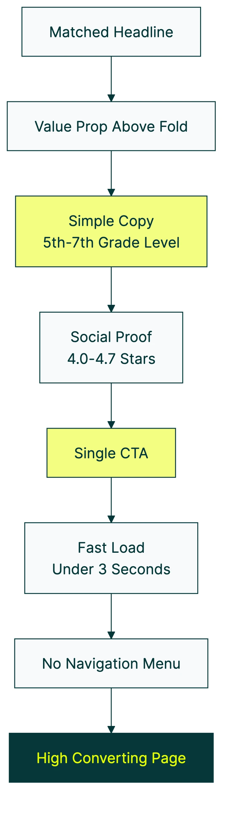
Headline that matches the visitor’s intent
If someone clicks an ad that says “Free SEO audit,” they should land on a page with a headline about a free SEO audit. Not your company story. Not your mission statement. This is called message match, and it can lift conversions by up to 25%.
Most pages fail here. The ad promises one thing. The page talks about something else. The visitor bounces in three seconds because the page didn’t answer the question they clicked for.
Value proposition above the fold
Nielsen Norman Group research found that 57% of viewing time happens above the fold (the part of the page you see without scrolling). Another 17% goes to the second screenful. That’s 74% of attention before anyone scrolls twice.
Your value proposition needs to live there. Not buried after three paragraphs of company history. If visitors can’t answer “what’s in it for me?” within five seconds, you’ve already lost most of them.
Simple copy at a 5th to 7th grade reading level
This is the single most underused conversion lever we’ve found. And somehow, almost nobody talks about it.
Unbounce’s 2024 data shows that landing pages written at a 5th to 7th grade reading level convert at 11.1%. Pages written at an 8th to 9th grade level? 7.1%. Professional-level writing? 5.3%.
That’s a 2x difference based purely on how simply you write.
In practice:
Professional level (5.3% conversion rate): “Our platform provides an integrated approach to conversion rate optimization, enabling marketing professionals to implement data-driven strategies.”
5th grade level (11.1% conversion rate): “We help you test your website and find what makes more people buy.”
Same idea. Different words. One converts twice as often.
And this gap is growing. Unbounce found the correlation between complex words and lower conversions was 62% stronger in 2024 than in 2020. Simple copy isn’t just nice to have. It’s becoming more important every year.
Our take: Write like you’re explaining something to a friend at dinner. Not dumbed down. Just clear. If you have to re-read a sentence to understand it, your visitors definitely will too. Use the Hemingway Editor (free) to check your reading level. It takes two minutes.
Social proof that feels real
Adding reviews matters. Spiegel Research Center at Northwestern found that displaying five reviews makes a product 270% more likely to be purchased compared to zero reviews.
And perfect 5-star ratings actually hurt conversions. Trust peaks at 4.0 to 4.7 stars. Shoppers are suspicious of perfection. Verified buyer reviews outperform anonymous testimonials by 15%.
So don’t hide your 4-star reviews. They’re doing more work than your 5-star ones.
A single, specific call to action
Pages with one call to action convert 371% better than pages with multiple competing options. One button. One link. One thing you want them to do.
The wording matters too. NN/G research found that vague button text like “Get Started” underperforms specific text like “Start Your Free Trial.” One SaaS company saw a 104% lift switching from “Sign Up For Free” to “Trial For Free.”
Be specific. Tell people exactly what happens when they click.
Fast load speed
Portent analyzed 100 million+ page views and found: pages that load in 1 second convert at 3.05%. Pages that load in 4 seconds? 0.67%. That’s a 4.5x difference.
Google’s own research shows 53% of mobile visitors leave if a page takes more than 3 seconds to load. Not 10 seconds. Three.
Speed isn’t a nice-to-have. It’s a conversion killer.
No navigation menu
This one surprises people. VWO ran a case study where Yuppiechef removed their navigation menu from a landing page. Conversions doubled. Went from 3% to 6%. HubSpot found a 16% to 28% lift when removing navigation from middle-of-funnel pages.
Yet only 16% of landing pages remove their navigation. Every link that isn’t your call to action is an exit door. Close the doors.
Why the same page converts differently depending on where traffic comes from
Almost nobody writes about this. Which is strange, because the data is hard to ignore.
Unbounce’s 2024 data shows massive differences by traffic source:
- Email traffic: 28.6% median conversion rate (ecommerce)
- Instagram: 17.9%
- Facebook: 13%
- Google paid search: 11.3%
That’s a 2.5x spread between email and paid search. The same page, shown to different audiences, converts at wildly different rates.
Think of it like a restaurant. A regular who comes every Tuesday already trusts the food. They sit down, order quickly, and leave happy. A first-timer who found you on Google? They need to read the menu, check reviews on their phone, and ask three questions before ordering.
Your landing page works the same way.
Cold traffic (paid ads to strangers) needs more social proof, longer explanations, and risk reversal (like money-back guarantees or free trials). These visitors don’t know you yet.
Warm traffic (your email list, retargeting ads) needs less explanation and a more direct call to action. They already trust you. Don’t over-explain.
Organic search traffic needs the answer to their question first. Then the pitch. If someone Googled “how to improve my landing page,” give them the answer before asking for anything.
The practical takeaway: don’t compare cold ad traffic to someone’s email campaign numbers. You’ll always feel like you’re failing. Match your page to your primary traffic source. Everything else is noise.
This is also why “we redesigned our landing page and conversions dropped” happens so often. The page didn’t get worse. The traffic source changed. Maybe you shifted budget from email to paid ads, or your organic rankings improved and brought in colder visitors. Always check the traffic mix before blaming the page.
If you’re working on the UX and conversion optimization of your pages, traffic source should be the first filter you apply.
Long-form vs. short-form landing pages
The internet loves arguing about this. Should landing pages be short and punchy, or long and detailed?
The data says both are right. Crazy Egg increased conversions 30% by making their page 20 times longer. 37signals (now Basecamp) increased conversions 102.5% with a shorter page.
So who’s right? Both. Because length isn’t the variable. The audience is.
Use short-form pages when:
- Your visitors already know you (warm traffic)
- The offer is simple and low-commitment (free trial, email signup)
- The price is low
Use long-form pages when:
- Your visitors are strangers (cold traffic)
- The offer needs explanation (complex products, high-ticket items)
- The price is high and people need convincing
And there’s a middle ground: multi-step forms. Instead of showing one long form or one short page, break the process into steps. BrokerNotes saw a 35% increase. Vendio saw 59%. One company saw a 214% increase.
One more myth to bust: “fewer form fields always means more conversions.” MarketingExperiments found that a 15-field form outperformed an 11-field form by 109%. The right fields matter more than fewer fields. If a field helps you qualify the lead, it might actually increase conversions. Someone willing to fill in their company size is probably more serious than someone who bounces at that question.
Long doesn’t always beat short. Short doesn’t always beat long. Page length is a design decision, not a best practice. Match it to your situation. And if you’re not sure, test both versions and let your visitors decide for you. For lead generation landing pages specifically, multi-step forms almost always outperform single-step ones.
How to build a high converting landing page
This isn’t theory. It’s a step-by-step process you can follow this afternoon. Each step builds on the last.
Step 1: Define one conversion goal. Not two. Not “sign up OR book a demo OR download the ebook.” Pick one action. Everything on the page points to that action. If you can’t decide, pick the one closest to revenue.
Step 2: Write the headline first. Match it to the traffic source. If the visitor clicked a Google ad about “affordable CRM software,” your headline should be about affordable CRM software. Not your company’s 15-year history.
Step 3: Write copy at a 5th to 7th grade reading level. Use the Hemingway Editor to check. Replace long words with short ones. Cut sentences in half. If your copy reads like a college essay, your conversion rate is paying for it.
Step 4: Add social proof. Five reviews minimum (that’s the Spiegel Research Center threshold for the 270% lift). Don’t chase perfect ratings. Include a mix of 4 and 5 star reviews. Real names and photos if you can get them.
Step 5: Remove navigation and external links. Close the exit doors. Every link that isn’t your call to action is a leak in your conversion funnel.
Step 6: Make it fast. Under 3 seconds on mobile. Compress images. Remove scripts you’re not using. Run Google PageSpeed Insights and fix the red items first. If you’re using a page builder, starting with high converting Elementor landing page templates can save you time and give you a proven structure to work from.
Step 7: Test it. Everything above is based on averages. Averages don’t run your business. Your specific audience might behave differently. The only way to know what works for your visitors is to split test your landing page and let the data tell you.
Kirro makes that test a three-minute setup. Try it free for 30 days. Change a headline, swap a button, try a different hero image. No developer needed.
What to test first on your landing page
Not everything is worth testing. Testing the wrong thing first wastes weeks. Before you start testing, analyze your landing page to pinpoint what needs attention. Priority order, based on findings across multiple studies:
- Headlines. The biggest single lever. If your headline doesn’t match the visitor’s intent or clearly state the value, nothing else on the page can save it.
- Call to action text and placement. Specific wording beats vague wording. “Start your free trial” beats “Get started.” Placement matters too.
- Social proof. Type, position, and format of testimonials. Try video vs. text, named vs. anonymous, or adding star ratings.
- Form fields. Number, order, and type. Try multi-step forms vs. single forms. Our lead generation form guide covers which fields to include and when more fields actually help.
- Images and video. Hero images, product photos, explainer videos.
The surprising stat: only 17% of marketers use A/B testing to improve their landing pages (HubSpot). Companies spend $1 on conversion rate optimization for every $92 they spend on getting traffic (Invesp). That’s like spending $92 on gas and $1 on steering.
Less than 0.11% of websites use any kind of testing tool at all.
Which means if you test even one thing, you’re already ahead of 99.9% of websites. That’s a real competitive edge, not a nice-to-have.
One more thing: make sure you’re not cannibalizing your own keywords by creating multiple landing pages that target the same search term. Test on the existing URL instead.
Once you know what to test, you need something that makes testing simple. Kirro lets you change a headline, button, or image on your live site. Then it shows you which version converts better. No code. No developer ticket. Pick what you want to change, make the change, and let the numbers decide. Try it free for 30 days.
If you want to go deeper on testing methodology, check out our guides on A/B testing conversion rates, CRO best practices, how to design a marketing experiment, and CRO testing.
FAQ
What makes a landing page high converting?
Matching the page to the visitor’s awareness level and traffic source. A page built for email subscribers needs different elements than one for cold ad traffic. The universal elements are: simple copy (5th to 7th grade reading level), a clear call to action, real social proof, fast load speed, and no competing navigation links. But fit between page and audience matters more than any checklist.
What is a good landing page conversion rate?
It depends on your industry, what you’re counting, and where traffic comes from. The overall median is 6.6% across all industries (Unbounce 2024). Top performers hit 11% or higher. But an email landing page converting at 25% and a cold-traffic page at 5% can both be “good.” Compare yourself to your own previous performance and your specific industry benchmarks, not generic averages.
How do I create a high converting landing page?
Start with one clear goal. Write a headline that matches your traffic source. Use 5th grade reading level copy. Add five or more real testimonials. Remove your navigation menu. Get load time under 3 seconds on mobile. Then test it. The testing part matters because averages don’t run your business. What works for someone else’s audience might not work for yours. For a full walkthrough, see our landing page optimization guide. And if you want to improve how your page ranks in search engines, that’s a separate topic covered in landing page SEO.
Does removing navigation from a landing page really help?
Yes. Yuppiechef saw a 100% increase when they removed their nav menu (VWO case study). HubSpot found 16% to 28% lifts on middle-of-funnel pages. The reason is simple: every link that isn’t your main call to action is an exit opportunity. Close the exits.
How long should a landing page be?
Match length to audience warmth and offer complexity. Short for warm traffic and simple offers. Long for cold traffic and high-commitment purchases. The “shorter is always better” advice is a myth. Crazy Egg saw 30% more conversions with a page 20x longer. Multi-step forms are a strong middle ground that can lift conversions by 35% to 214%. Test both lengths and let your specific audience decide.

Randy Wattilete
CRO expert and founder with nearly a decade running conversion experiments for companies from early-stage startups to global brands. Built programs for Nestlé, felyx, and Storytel. Founder of Kirro (A/B testing).
View all author posts