Product page optimization is the process of improving every element on your ecommerce product page so more visitors buy. Not more traffic. More conversions from the traffic you already have. And 82% of ecommerce sites have serious product page UX problems, according to Baymard Institute’s research across hundreds of stores.
That means most product pages are actively losing sales. The good news? Fixing them isn’t complicated. It just requires knowing which elements matter most and tackling them in the right order. It’s one of the highest-impact pieces of conversion rate optimization you can do.
This guide ranks every product page element by measured impact. Not opinions. Not “best practices” that someone made up. Real data from real studies. Think of it as your ecommerce CRO guide checklist, but zoomed in on the single page where purchases happen. (If you’re new to ecommerce conversion optimization, start there for the big picture.)
What a high-converting product page actually looks like
Most product page guides give you a list of 11 things to fix and wish you luck. That’s like handing someone a bag of car parts and saying “good luck building a vehicle.” (If you want that list first, our ecommerce product page best practices guide covers what to include. This guide is about how to optimize what you already have.)
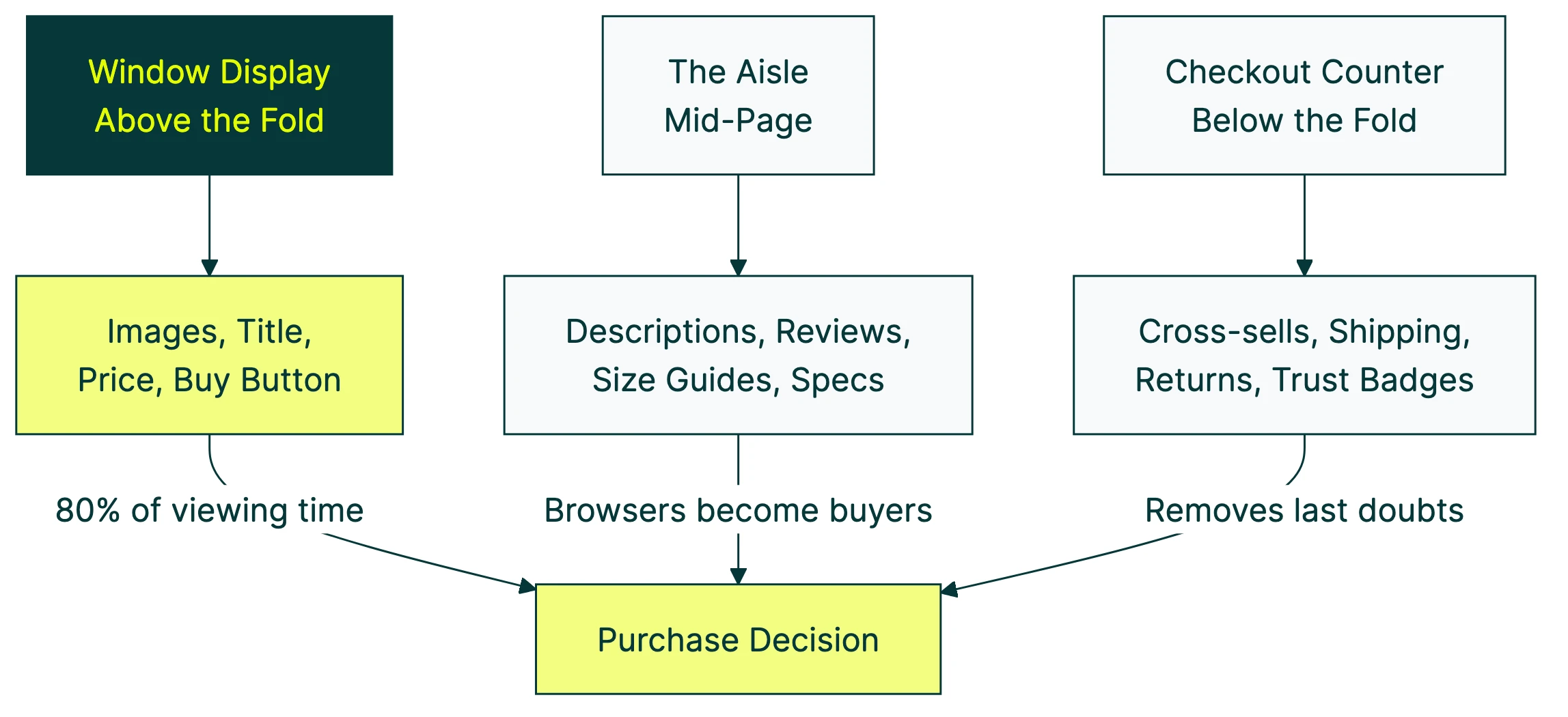
A product page is a system. Every element connects to the others. Think of it like a physical store:
- The window display (above the fold): product images, title, price, and the buy button. This is what 80% of viewing time is spent on, according to Nielsen Norman Group. If this zone doesn’t work, nothing below it matters.
- The aisle (mid-page): descriptions, reviews, size guides, specs. This is where browsers become buyers. They’re interested enough to scroll. Now convince them.
- The checkout counter (below the fold): cross-sells, shipping info, return policies, trust badges. These remove the last doubts before someone clicks “add to cart.”
The global average ecommerce conversion rate is just 1.6% (Statista, Q3 2025). 98 out of 100 visitors leave without buying. If you can increase your conversion rate even slightly, you’re making more money from the same traffic.
Here’s how each element stacks up, ranked by measured impact:
| Element | Impact evidence | Fix difficulty |
|---|---|---|
| Product images | 56% of shoppers look here first (Baymard) | Easy |
| Reviews & ratings | 270% higher purchase likelihood with 5+ reviews (Northwestern) | Medium |
| Pricing transparency | 48% of cart abandonment from surprise costs (Baymard) | Easy |
| Page speed | 2.5x conversion gap between 1s and 5s load (Portent) | Medium |
| Product descriptions | 71% returned items that didn’t match listing (Salsify) | Easy |
| Cross-sells | 10x purchase difference with fewer options (Iyengar & Lepper) | Easy |
The rest of this guide breaks down each one.
Our take: Every other guide treats product pages like a collection of independent parts. They’re not. Your product images affect whether someone reads the description. Your description affects whether they trust the reviews. Your reviews affect whether the price feels fair. Fix the whole system, not just one element.
Product images and video: the highest-impact element
When someone lands on a product page, they don’t read the description first. They look at the pictures. Baymard Institute found that 56% of visitors start by exploring product images. It’s the first thing they do.
Think of product images as the online version of picking something up in a store. Shoppers want to turn it around, check the size, see the details. Your images need to do that job.
What the data says works:
- Multiple angles. Front, back, side, detail. Not just one hero shot. 28% of sites fail to show products at a realistic scale (Baymard), which leads to returns.
- Lifestyle photos next to product shots. A jacket on a white background tells you what it looks like. A jacket on a person in a coffee shop tells you how it feels to own it.
- Variant-linked images. If someone picks the blue version, show the blue version. Sounds obvious. Plenty of stores get this wrong.
- Mobile pinch-and-zoom. 40% of sites still don’t support basic zoom gestures on mobile (Baymard). Three-quarters of your traffic is probably on a phone. Let them zoom in.
And video? Visitors who watch a product video are 144% more likely to purchase compared to those who don’t (Stacks and Stacks case study). Ariat, the boot brand, saw a 160% higher conversion rate for video viewers.
You don’t need a Hollywood production. A 30-second clip showing the product in use, from a couple of angles, is enough.
Product descriptions that sell without sounding salesy
There’s a difference between a feature and a benefit. Features describe the product. Benefits describe what the customer gets.
Quick example:
- Feature: “100% organic cotton, pre-shrunk, 180 GSM.”
- Benefit: “Soft enough to sleep in. Won’t shrink in the wash.”
Both are true. One makes you want to buy it. Baymard found that 10% of ecommerce sites have descriptions so thin they can’t answer basic shopper questions.
A few things most descriptions miss:
Shipping and return info, right in the description area. 67% of shoppers check the return policy before buying (UPS survey). If they have to go hunting for it on a separate page, some of them just leave.
Founder or creator knowledge. Rishi Rawat from Frictionless Commerce makes a good point here: the people who made the product usually know things about it that no customer survey would uncover. Why was this specific material chosen? What problem did it solve? That kind of narrative turns a description into a story.
Collapsible tabs for longer content. Don’t force the reader to scroll past 800 words of specs to find the buy button. Tabs keep the page clean while making details available for the people who want them.
One more thing: 71% of shoppers have returned a product because the listing didn’t match what arrived (Salsify 2025 Consumer Research). Bad descriptions don’t just lose sales. They create returns, which cost even more.
Reviews and social proof: why imperfect ratings beat perfect ones
This is where most guides get it wrong. They tell you “add reviews” and move on. It’s more interesting than that.
Northwestern University’s Spiegel Research Center studied this rigorously. A product with five reviews has a 270% higher purchase likelihood than a product with zero. For higher-priced products, that number jumps to 380%.
The surprising part? Purchase likelihood peaks at 4.0 to 4.7 stars, then drops as ratings approach 5.0. Consumers don’t trust perfection. All five-star reviews feel fake. A few three-star complaints (“runs a little small”) actually build credibility.
PowerReviews found that shoppers who read one-star reviews convert 108.8% higher than average visitors. They’re not turned off. They’re doing due diligence. The serious buyers.
What to do with this:
- Display your review count prominently. Near the product title, not buried at the bottom.
- Don’t hide negative reviews. They build trust. 96% of consumers say reviews are the most influential purchase factor (PowerReviews 2024 survey).
- Add verified buyer badges. The Spiegel study found these increase purchase odds by 15%. People trust other buyers more than they trust you.
- Use review snippets in the hero zone. A short “customers love the fit” note near the buy button borrows trust from the mid-page and puts it where decisions happen.
For more on how to use customer proof on your pages, check out our guide to social proof examples. And if you want to see which review layout actually converts better, you can test it with a free split test and let real visitors decide.
Our take: A 4.5-star product with 50 reviews will outsell a 5-star product with 3 reviews every time. Stop chasing perfection. Chase volume.
Pricing, shipping, and the hidden conversion killers
You can nail your images, descriptions, and reviews. Then lose the sale because shipping was $12 more than expected.
Baymard Institute’s cart abandonment research puts “extra costs too high (shipping, tax, fees)” as the number one reason people abandon carts, at 48%. Not “just browsing.” Not “found it cheaper elsewhere.” Surprise costs.
The UPS Pulse of the Online Shopper survey backs this up. 77% of shoppers say free shipping is the most important option. And 41% have abandoned a cart specifically because delivery cost exceeded expectations.
What works:
- Show shipping costs (or free shipping) on the product page itself. Not just at checkout. If it’s free over $50, say so right under the price.
- Display the total cost as early as possible. Tax estimates, expected delivery dates. No surprises.
- Buy now, pay later options. Shop Pay, Klarna, Afterpay. For a $200 product, “4 payments of $50” feels much more manageable. Nobody’s being tricked. You’re just removing price friction.
- Return policy as a trust signal. 81% of shoppers say easier returns make them more likely to buy. Put a short “free 30-day returns” note near the buy button.
Once you’ve sorted your checkout flow and applied checkout flow optimization best practices, the product page pricing display becomes the last major friction point in your conversion funnel. If you want to go deeper on how to A/B test your pricing, we have a dedicated guide covering price presentation, tier structures, and anchoring experiments.
Page speed: the invisible conversion tax
This one doesn’t get the attention it deserves. A Portent study analyzing over 100 million page views found a 2.5x conversion gap between pages loading in one second versus five seconds. Every additional second costs roughly 0.3 percentage points.
Smartphones make this worse. They account for over 75% of ecommerce visits but only about two-thirds of purchases. Part of that gap is slow loading on mobile networks.
Quick wins that actually help:
Start with images. Your product photos don’t need to be 4MB each. Tools like TinyPNG or Squoosh can cut file size by 60-80% with no visible quality loss.
Next, lazy-load anything below the fold. The cross-sell section and footer don’t need to load until someone scrolls there. Then audit your third-party scripts. Every chat widget, analytics tool, and popup adds load time. Haven’t used it in three months? Remove it.
Want to see what’s actually slow? Open any product page, press F12, click “Performance.” That waterfall chart tells you everything.
The irony? Many page speed problems come from apps and tools that were supposed to improve conversion. Sometimes the best product page optimization is removing things.
Cross-sells, upsells, and the paradox of choice
“You might also like” sections can increase average order value (how much each customer spends per purchase). But there’s a limit. And most stores blow right past it.
The “jam study” by Iyengar and Lepper proved it. Shoppers shown 24 jam options bought 3% of the time. Six options? 30% bought. Ten times more purchases from fewer choices.
In ecommerce, this plays out everywhere:
- JustThrive simplified their product variants and saw an 85% increase in subscriptions and 54.77% revenue increase.
- Taloon.com ran an A/B test removing social share buttons from product pages. Result: 11.9% more add-to-cart clicks. The share buttons weren’t helping. They were just clutter.
The principle is simple: every element on your product page should earn its place. A “related products” section with 3-4 genuinely complementary items? Helpful. A grid of 12 loosely related products? Overwhelming.
Same goes for product variants. If you sell a t-shirt in 47 colors, consider showing the top 6 with a “see all colors” option. Don’t dump the full rainbow on someone who just wants a black tee.
Our take: If you’re not sure whether an element is helping or hurting, test it. The Taloon.com example is a perfect case. Everyone assumed share buttons helped. Nobody tested it. When they did, removing them won by nearly 12%.
How to A/B test your product pages
You know what to fix. But how do you know your changes actually worked?
Split your traffic between two versions of a page and measure which one gets more purchases. That’s A/B testing. Simple concept, but most people overcomplicate it.
Peep Laja, founder of CXL, puts it well: “80% of CRO is research, 20% is testing.” In plain English: understand why visitors aren’t buying before you start changing things. Look at your analytics. Read your reviews. Watch where people drop off. Then test a specific fix.
A practical workflow:
- Pick the highest-impact element. Based on the data in this guide, start with images or your main headline. These affect the most visitors.
- Change one thing. Not five things at once. Change the headline, the image, the button, and the price display all together? You’ll have no idea which one moved the needle.
- Run the test long enough. Low traffic? You need patience. There’s math that works with smaller visitor counts (Bayesian statistics), but you still need real data.
- Measure purchases, not clicks. Button clicks feel good. Revenue is what matters.
With Kirro, you can test product page elements visually. Click on a headline, change it, and start a test. No code, no developer. That’s particularly useful for product pages, where you might want to test image order, description copy, or button text quickly.
For a list of other options, see our A/B testing tools comparison. And if you’re on Shopify specifically, our guide on Shopify product page optimization covers platform-specific fixes, or see the full Shopify conversion rate optimization guide.
One more tip: visitors from different sources behave differently. Someone arriving from Google Shopping already knows the price and saw the image. Someone from Instagram might be seeing the product for the first time. Consider segmenting your tests by traffic source if your tool supports it.
If you want to run your first product page test, set up a free account and try it. Three minutes, and you’ll see why the simple stuff works.
FAQ
What is product page optimization?
It’s the process of improving each element on an ecommerce product page (images, descriptions, pricing, reviews, buttons) so more visitors buy. The goal is making the page work harder, not getting more traffic. If your conversion rate is below 2%, there’s almost certainly room to improve.
How do I start optimizing my product page?
Start with images (your highest-impact element), then reviews, then pricing transparency. That’s the priority order based on the research in this guide. If you want a broader starting point, run a CRO audit to find where visitors are dropping off. Follow CRO best practices and tackle the biggest leak first.
What is the most important element on a product page?
Research says images are the first thing shoppers engage with (56% explore images before anything else, per Baymard). But reviews have the largest measurable conversion impact (270% lift from just five reviews, per Northwestern). Both matter. If you can only fix one thing today, fix your images. Then get more reviews.
How do I A/B test product pages?
Pick one element to change (headline, hero image, buy button). Create a second version. Split your traffic so half sees each version. Measure which gets more purchases. Tools like Kirro let you do this visually, without code. Start with the element that gets the most attention (usually the main image or headline) and work your way down.
What is a good product page conversion rate?
The global average is 1.6% (Statista, Q3 2025). Top-performing product pages convert at 3-5%. If you’re below 2%, the fixes in this guide should move the needle. If you’re already at 3%+, you’re doing better than most, but testing landing page optimization techniques and CRO testing methods can still find gains. See our breakdown of CRO case studies with real numbers for what realistic improvements look like.

Randy Wattilete
CRO expert and founder with nearly a decade running conversion experiments for companies from early-stage startups to global brands. Built programs for Nestlé, felyx, and Storytel. Founder of Kirro (A/B testing).
View all author posts