Most conversion rate optimization case studies are cherry-picked success stories. They come from the same companies selling you CRO tools and CRO agencies, and they never mention the tests that failed. This collection is different. We rated each case study on how trustworthy the evidence actually is. And we included the research that shows why most published results are inflated.
Here are 12 real examples of conversion rate optimization, grouped by what was tested, with a methodology score for each one.
12 conversion rate optimization case studies (with real numbers)
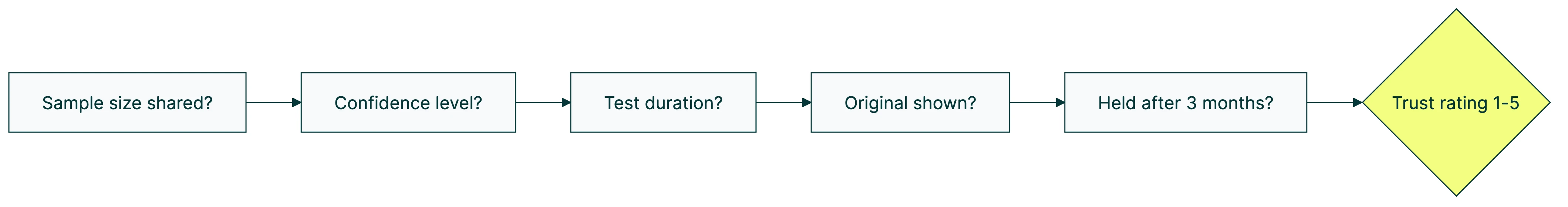
Every case study below gets a trust rating based on five questions. Did they share the number of visitors? Did they report how confident they were in the result? Did they say how long the test ran? Did they show what the original looked like? Did the result hold after three months?
Most published case studies score 2 out of 5. That should tell you something.
| Company | What they tested | Result | Trust rating |
|---|---|---|---|
| Baymard Institute | Checkout redesign | +35.26% conversions | ★★★★★ |
| Expedia | Removing one form field | +$12M annual profit | ★★☆☆☆ |
| PayU | Removing email from checkout | +5.8% conversions | ★★★☆☆ |
| WallMonkeys | Search bar instead of slider | +550% conversions | ★★☆☆☆ |
| Hubstaff | Homepage redesign | +49% visitor-to-trial | ★★★☆☆ |
| Going | 3-word button text change | +104% premium trials | ★★★☆☆ |
| Warner Music | One-word copy swap | +32% conversions | ★★★☆☆ |
| Michael Aagaard | ”Get” in button copy | +14.79% conversions | ★★★★☆ |
| Kareo Marketing | Fewer form fields on landing pages | +31% conversion rate | ★★★☆☆ |
| Yuppiechef | Removed navigation from landing page | +100% conversions | ★★★★☆ |
| WikiJob | Added customer testimonials | +34% conversions | ★★☆☆☆ |
| Express Watches | Customer review widget | +58.29% sales | ★★☆☆☆ |
Our take: The cases with the biggest numbers tend to have the weakest evidence. That’s not a coincidence.
Checkout and form changes
The simplest pattern in ecommerce conversion optimization: remove stuff from your checkout page. Fewer fields, more sales.
Baymard Institute studied over 200,000 hours of checkout behavior across 60+ websites. Their finding: the average checkout has 23 form fields. The ideal number is 12 to 14. Companies that redesigned their checkout to hit that range saw a 35.26% conversion lift. This is the most rigorous example of conversion rate optimization we’ve found. Trust rating: ★★★★★.
Expedia removed a single form field (company name) and made $12 million more per year. It’s a famous case, but it’s from around 2012. No sample size published. No confidence level shared. The number gets repeated everywhere because it sounds amazing. Trust rating: ★★☆☆☆.
PayU removed the email field from their checkout page and got 5.8% more conversions. Documented through VWO with test parameters visible. Not the flashiest number, but more believable. Trust rating: ★★★☆☆.
Homepage and hero section tests
Your homepage is usually your highest-traffic page. It’s also usually the one nobody’s tested.
WallMonkeys replaced their homepage image slider with a search bar. The result: 550% more conversions. That number gets attention, and it should, but with some skepticism. No sample size. No baseline conversion rate. No test duration. It’s a Crazy Egg case study, which means the company selling you heatmaps is telling you heatmaps helped. Trust rating: ★★☆☆☆.
Hubstaff redesigned their entire homepage and saw 49% more visitors start a free trial. Documented through VWO with more detail than most cases in this list. Trust rating: ★★★☆☆.
Homepage tests tend to produce dramatic numbers partly because most homepages are terrible. When the bar is low, small changes look huge.
Button text and copy changes
Changing a few words on a button can outperform a full redesign. It sounds too simple, but the evidence backs it up.
Going (formerly Scott’s Cheap Flights) changed three words on their call-to-action button and saw 104% more premium trial signups. They tracked it month-over-month, which gives the result more weight than a one-week snapshot. An A/B test on their conversion rate that paid for itself in days. Trust rating: ★★★☆☆.
Warner Music swapped one word in their copy. One word. 32% more conversions. VWO case with documented parameters. Trust rating: ★★★☆☆.
Michael Aagaard’s research tested the word “Get” in button copy across multiple sites. Using “Get your free template” instead of “Download your free template” produced 14.79% more conversions. This is published practitioner research with documented methods, not a vendor case study. Trust rating: ★★★★☆.
The simple stuff works. Seriously.
Landing page and design changes
Kareo Marketing reduced form fields on their landing pages and hit a 31% conversion rate, adding $1.56 million in annual revenue. When you’re optimizing your landing pages, start by counting form fields. If you have more than five, ask yourself which ones you actually need.
Yuppiechef removed the navigation menu from their landing page and doubled their conversions. That’s 100% more people doing the thing the page was built for. The logic is simple: fewer places to click means fewer ways to leave. This is one of the most well-documented VWO cases, with clear before-and-after data. Trust rating: ★★★★☆.
Trust signals and social proof
People buy from businesses they trust. Social proof (customer reviews, testimonials, trust badges) helps visitors feel safe enough to click “buy.”
WikiJob added customer testimonials to their page and saw 34% more conversions. Express Watches added a customer review widget and got 58.29% more sales. These numbers are widely cited but neither case shares sample size or test duration. They point in the right direction, but take the exact percentages with a grain of salt. Trust rating: ★★☆☆☆ for both.
What the best case studies have in common
Four patterns keep showing up across the strongest cases:
Removing friction beats adding features. Expedia, Baymard, PayU, Kareo, Yuppiechef. Every one of them improved conversions by taking something away. Fewer form fields. Less navigation. Shorter checkouts. If you’re following CRO best practices, start by asking what you can remove.
Copy changes punch above their weight. Going changed three words. Warner Music changed one. Aagaard proved that swapping “Download” for “Get” matters. These tests are cheap, fast, and often outperform expensive redesigns.
Trust signals compound over time. WikiJob, Express Watches, and dozens of studies we didn’t include here show the same thing. Testimonials and reviews don’t just help one page. They improve how people feel about your entire site.
The biggest wins come from the simplest changes. Ronny Kohavi ran experiments at Microsoft. The single most valuable change Bing ever shipped? An ad headline tweak, worth over $100 million per year. Not a new feature. Not a redesign. A headline.
If you’re building a CRO strategy, these patterns are where to start. The CRO testing process doesn’t need to be complicated.
How to read a CRO case study without getting fooled
This is the section nobody else will write. Every article ranking for “CRO case studies” is published by a tool vendor or an agency showcasing their own clients. They have no reason to tell you that most published results don’t hold up.
We do.
The 80% problem. Martin Goodson, a researcher at Qubit, found that “at least 80% of winning test results are completely worthless.” The reason? Early results almost always look better than they actually are. Think of a basketball player on a hot streak that doesn’t last. If you stop a test too early and declare a winner, you’re probably looking at a hot streak, not a real improvement.
Why agencies cherry-pick results. If you sell CRO services, you publish your best wins. You don’t publish the 8 out of 10 tests that failed. Clients hire agencies based on case studies, so the pressure to show big numbers is real. Those reported improvements? Often “nowhere to be found in the business bottom-line.” Knowing the common A/B testing mistakes helps you spot this.
The shrinking returns reality. Nielsen Norman Group tracked UX improvement rates over 14 years. The average improvement dropped from 247% in 2006-2008 to 75% by 2020. That’s a 69% decline across 99 real-world cases. The pattern is clear. The viral case studies you see online? Most come from an era when websites were genuinely terrible. Those easy wins are mostly captured now.
Real win rates. Only 10-20% of experiments at Google and Bing generate positive results, according to Ronny Kohavi’s research at Microsoft. Booking.com runs 25,000 tests per year. About 90% of them fail. That’s not a sign that testing doesn’t work. It’s a sign that honest companies admit most ideas don’t pan out.
Five-point checklist for evaluating any case study
Before you trust a CRO case study, ask these five questions:
- Did they share the number of visitors? Without this, you can’t tell if 100 people or 100,000 people saw the test.
- Did they share the confidence level? A 60% confidence result and a 99% confidence result look identical in a case study. Only one means something.
- Did they say how long the test ran? Tests stopped after three days are almost always wrong.
- Did they show the original version? If you can’t see what was there before, you can’t judge how meaningful the change was.
- Did the result hold after three months? Most case studies are snapshots. People click new things just because they’re new, and that excitement fades. The best results survive that initial curiosity.
Our take: If a case study scores 2 out of 5 on this checklist, treat the numbers as directional, not factual. Most of the cases in this very article score 2 out of 5. We included them because they’re widely cited, but we want you to know the difference.
The numbers behind successful CRO programs
Individual case studies tell you what worked once. Industry-wide data tells you what works in general. Here’s what the research says about the metrics that matter for CRO.
The budget imbalance is absurd. Companies spend $1 on CRO for every $92 on customer acquisition. Imagine spending $92 bringing people to your store but only $1 making sure they don’t walk out empty-handed. That’s what most businesses do with their marketing budget.
And almost nobody tests. Only 0.11% of websites use CRO tools, according to BuiltWith data. Of the companies that do test, only 44.6% use a documented process (CXL’s State of Conversion Optimization survey). Nearly 1 in 5 has no process at all.
Companies running monthly tests see 1.8x annual revenue increase, per Invesp’s research. Not from any single win. Small improvements stack up. That’s what tools like Kirro are built for. Making it easy to keep testing, not just run one test and stop.
In-house teams find a 10%+ lift in 1 out of every 7.63 tests. That’s from CXL’s analysis of 28,304 experiments. A 13.1% hit rate. Not glamorous, but honest.
Then there’s Booking.com. They run about 25,000 tests per year with roughly 1,000 going at the same time. Most fail. But their conversion rate runs 2-3x the industry average. Volume and consistency beat any single brilliant idea.
How to run your own CRO test
Reading case studies is useful. Running your own tests is better. Here’s where to start if you want to follow a real CRO testing process.
Pick the right page. Open your analytics. Find the page with the most visitors and the worst conversion rate. That’s your biggest opportunity. If you’re not sure where to look, running a CRO audit can help you find it.
Form a hypothesis. (Or in plain English: write down what you think will happen.) “If I change the headline to focus on the benefit instead of the feature, more people will sign up.” That’s it. Nothing fancy.
Don’t stop the test early. Run it for at least 2 to 4 weeks. This is where most people go wrong. You see a nice number after three days and want to call it. Don’t. Early results are unreliable (remember the 80% problem from above).
You need enough visitors. If your page gets 50 visits a day, a test needs more time to give you a reliable answer. If it gets 5,000 visits a day, you’ll know faster. Use a sample size calculator to figure out how long your test actually needs.
Use a tool that gives you a straight answer. The best tools tell you “Version B wins” or “not enough data yet” in plain English, not in statistics jargon. Kirro is built for this. Set up your first test in about three minutes. It uses math that works with less traffic (experts call this Bayesian statistics). You don’t need Booking.com-level visitor numbers to get answers you can trust.
Start simple. Test the headline. Or the button text. Or the hero image. The case studies in this article prove that simple changes produce real results. Save the fancy stuff for later.
Pick one of the patterns from the case studies above and try it on your own site. Going changed three words and doubled their trial signups. Your version of that experiment is waiting.
FAQ
What is an example of conversion rate optimization?
Going (formerly Scott’s Cheap Flights) changed three words on their signup button and saw 104% more premium trial signups. That’s CRO in action. You test small changes to headlines, buttons, and page layouts. Then you measure which version gets more people to act. Most big wins come from changes that take minutes, not months.
What is a good CRO conversion rate?
The median landing page conversion rate is 6.6% across all industries (Unbounce’s 2024 benchmark, 464 million visitors). But “good” depends on your industry. SaaS averages 1.1%. Some industries hit 11%+. For a deeper breakdown, see our guide on what counts as a good conversion rate.
How does CRO work?
Pick a page. Change one thing (a headline, a button, an image). Show the original to half your visitors and the new version to the other half. Measure which one wins. That’s the core of it. The full CRO process covers more steps, and what is CRO has the complete picture.
How to do a CRO case study?
Document five things: what you changed, why you changed it, how many visitors saw each version, how long the test ran, and whether you hit a meaningful confidence level. Include what you learned even if the test failed. Especially if it failed. Most published case studies skip this documentation, which is why most score 2 out of 5 on our trust checklist.
How many A/B tests should I run per month?
Start with 1-2 per month. Booking.com runs 1,000+ simultaneously, but they have enormous traffic. What matters is consistency. Testing monthly beats testing once per quarter. Companies that test monthly see 1.8x annual revenue growth. Not from any single home run. Small wins compound over time. Check out CRO tools that help you keep that pace.

Randy Wattilete
CRO expert and founder with nearly a decade running conversion experiments for companies from early-stage startups to global brands. Built programs for Nestlé, felyx, and Storytel. Founder of Kirro (A/B testing).
View all author posts