What are conversion rate metrics?
Conversion rate metrics aren’t one number. They’re a system.
The headline number is simple: what percentage of visitors completed a desired action? That action could be a purchase, a form submission, a signup, a download. The formula is (conversions / total visitors) × 100. If 50 out of 1,000 visitors buy something, your conversion rate is 5%.
But that headline number by itself is like checking the final score without watching the game. You know whether you won or lost. You don’t know why.
That’s where the rest of the system comes in. The smaller rates feeding into the big number. The companion metrics that keep you honest. And the traps that make the number lie to you.
One thing to decide upfront: are you counting people or visits? A site with 10,000 sessions from 8,000 actual people will show different rates depending on which you divide by. Google Analytics 4 now gives you both (session key event rate and user key event rate). Neither is wrong. Just pick one and stick with it.
For the full abbreviation breakdown, CVR is the shorthand you’ll see everywhere. And if you’re tracking broader CRO metrics like bounce rate and revenue per visitor, those live next door to conversion rate but serve a different job.
This post goes deep on conversion rate specifically.
Why is conversion rate important?
The math is compelling. If your site gets 10,000 visitors a month and converts at 2%, that’s 200 conversions. Bump it to 3%? Now it’s 300 conversions. Same traffic, 50% more results. You can run the numbers yourself for your own site.
That’s why conversion rate matters. Improving it is almost always cheaper than buying more traffic. You’ve already paid to get those visitors.
Bryan Eisenberg (one of the early conversion rate optimization voices) compares conversion rate to body temperature. It tells you something important about overall health. But knowing your temperature doesn’t tell you what’s wrong or how to fix it.
Avinash Kaushik, probably the most-cited analytics expert alive, puts it bluntly: “You can literally go bankrupt increasing your conversion rate.” Sounds dramatic. But picture this: you run a 50% off sale. Conversion rate doubles. Revenue per visitor drops.
You feel smart but your margins say otherwise.
Peep Laja, who built CXL into the biggest CRO training platform, calls conversion rate a “short-sighted metric” when tracked alone. Kaushik’s rule is that every metric needs a best friend. For conversion rate, that friend is average order value (the average dollar amount per purchase).
Together they tell the full story. Apart, either one can make bad decisions look good.
Our take: Conversion rate is a diagnostic metric, not a north-star KPI. It’s incredibly useful for spotting problems and measuring improvements. But it’s dangerous as the only number your team watches. Pair it with revenue per visitor and you’ll avoid the discount trap that catches most teams at least once.
If you want to know what counts as a good conversion rate, that’s a separate question with very different answers by industry and channel. Our conversion rate benchmarks break it down by vertical.
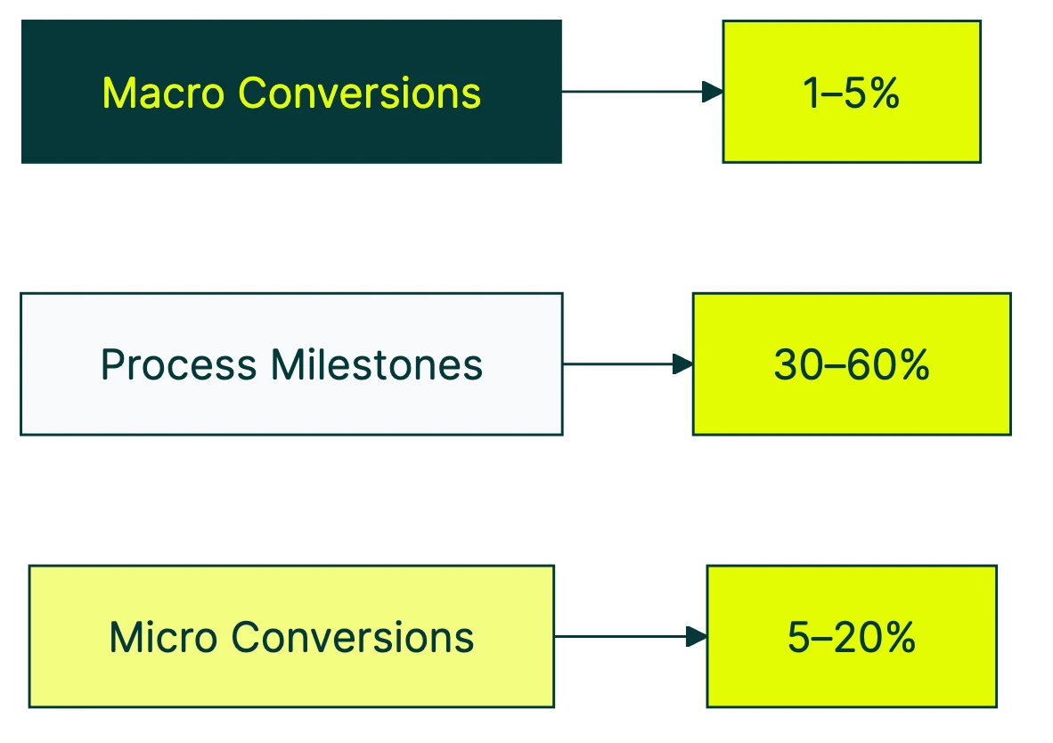
The conversion rate metrics hierarchy: macro vs micro conversions
Most articles about conversion rate metrics hand you a flat list of 15 things to track. That’s not helpful. It’s a grocery list without a recipe.
The better way to think about it: a hierarchy. Some metrics are lagging indicators (they tell you what already happened). Others are leading indicators (they tell you what’s about to happen).
The Nielsen Norman Group published the clearest framework for this in 2024. It breaks into three layers.
Macro conversions are the big wins. The actions directly tied to revenue: a purchase, a lead form submission, a paid subscription. These are lagging indicators. By the time this number moves, the cause already happened days or weeks ago.
Micro conversions (process milestones) are the sequential steps that lead to a macro conversion. Add to cart, begin checkout, create account. Each one has its own conversion rate, and each one can break independently.
Micro conversions (secondary actions) are engagement signals that predict future macro conversions. Newsletter signup, wishlist addition, video view, PDF download. Someone who does these things is more likely to convert later, even if they don’t buy today.
Why does the hierarchy matter? Say your overall site conversion rate drops from 2.1% to 1.8% this week. With just that one number, you’re guessing.
But if add-to-cart rate is fine (3.4%) while checkout completion rate tanked (41% down to 28%), you know exactly where to look. Maybe checkout broke on mobile. Maybe a new shipping cost appeared.
The macro rate told you something went wrong. The micro rates told you where.
A simple funnel example:
| Step | Visitors | Conversion rate |
|---|---|---|
| Product page views | 10,000 | - |
| Add to cart | 800 | 8.0% |
| Begin checkout | 400 | 50% of carts |
| Complete purchase | 200 | 50% of checkouts |
| Overall site rate | 200/10,000 | 2.0% |
That 2% hides everything happening inside. A 50% drop between add-to-cart and checkout in your conversion funnel is a different problem than a 50% drop between checkout and purchase.
Same overall rate. Very different fixes.
One more thing from the NN/G research that nobody else mentions. For mandatory actions with no alternative path, conversion rate isn’t even the right metric.
If the only way to buy is through your checkout, the rate will be whatever it is. What you should measure instead is ease-of-use and error rate. How many people struggle? How many hit errors?
Those tell you whether the experience is good. The conversion rate just tells you how many people wanted to buy badly enough to push through.
For click-level conversion metrics, the same hierarchy applies. Every click has a rate. The question is which clicks matter most to your business.
Which conversion rate metrics to track at each funnel stage
Not all conversion rate metrics carry the same weight. The ones that matter most depend on where you’re looking in the conversion funnel.
Top of funnel (awareness)
These metrics move first when something shifts. Broader ad targeting, different paid search keywords, a spike of social traffic. These numbers react before anything else does.
- Landing page conversion rate: percentage of visitors who take any action on the page (not just bounce)
- CTA click-through rate: percentage who click your main button or link (the thing you want them to click). For channel-specific numbers, see our CTR benchmarks by industry and platform.
- Email opt-in rate: percentage who give you their email address
Think of these as your early warning system. A drop here means your traffic quality changed or your first impression isn’t landing. Worth watching weekly.
Middle of funnel (consideration)
This is where interest turns into intent. People aren’t just browsing anymore. They’re considering whether to commit.
- Product page conversion rate: visitors who view a product and move toward buying
- Free trial signup rate: visitors who start a trial
- Demo request rate: visitors who fill out a contact or demo form
- Content download rate: visitors who grab a whitepaper, guide, or resource
For lead generation conversion rates specifically, middle-of-funnel rates are where most B2B teams spend their energy.
Bottom of funnel (decision)
These rates tell you whether your closing process works. High traffic and strong middle-of-funnel rates with weak bottom-of-funnel rates? Your checkout, pricing, or sales process is the bottleneck.
- Checkout completion rate: people who start checkout and actually finish
- Cart-to-purchase rate: carts that turn into orders
- Trial-to-paid rate: free trials that become paying customers
- Proposal-to-close rate: proposals sent vs. deals won
Baymard Institute’s meta-analysis puts the average cart abandonment rate at 70.19%. That’s not a typo. Seven out of ten carts never become orders.
Their research shows that just fixing checkout UX recovers about 35% of those lost sales. No new traffic needed.
For SaaS conversion benchmarks, free trial conversion rate benchmarks by model, or goal-based conversion tracking, the same stage-by-stage thinking applies.
Per-channel conversion rates
Not all traffic converts the same way. Organic search visitors might convert at 2.5% while social media traffic converts at 0.8%. Averaging them together hides the real picture.
Wolfgang Digital studied 143 million sessions and €447 million in revenue. Paid search traffic correlates with higher conversion rates (people clicking ads have stronger intent). But organic search correlates with higher average order values. Different channels, different strengths.
Worth tracking: organic search, paid search, social, email, and direct each have different baseline rates. If you see your Facebook ads conversion rate drop, that might not mean your site is worse. It might mean your targeting got broader.
Device-level conversion rates
Mobile drives the majority of web traffic. IRP Commerce’s 2026 data shows mobile accounts for 62.2% of ecommerce revenue. But mobile conversion rates are typically much lower than desktop.
Klipfolio benchmarks put it at: desktop 1.8%, tablet 1.37%, mobile 0.61%. That’s a 3x gap. If your mobile rate is way below your desktop rate, that’s not normal user behavior. That’s a UX problem worth fixing. For mobile apps specifically, app store conversion rate benchmarks show an even wider range by category.
| Funnel stage | What to measure | Why it matters |
|---|---|---|
| Top | Landing page rate, CTA click rate | Early warning system |
| Middle | Trial signups, demo requests | Shows consideration intent |
| Bottom | Checkout completion, trial-to-paid | Shows closing effectiveness |
| Per channel | Rate by traffic source | Prevents averaging apples and oranges |
| Per device | Mobile vs desktop rate | Catches UX problems |
How to build a conversion metrics dashboard
The most common dashboard mistake? Tracking 15 metrics with equal weight. You log in, see a wall of numbers, and close the tab. Dashboard blindness.
A dashboard that actually works has four slots:
One primary metric. Your headline conversion rate. The macro conversion. For ecommerce, that’s purchase rate. For SaaS, trial-to-paid. For lead gen, form submissions.
Pick one. Just one.
Two or three leading indicators. These are micro-conversion rates from earlier in the funnel. They’ll move before your primary metric does, giving you time to react.
If your CTA click rate drops on Monday, you have time to fix it before Friday’s revenue takes a hit.
One companion metric. This is the “best friend” that keeps your primary metric honest. For most businesses, that’s average order value or revenue per visitor.
If your conversion rate goes up but revenue per visitor goes down, you’re running a clearance sale, not growing.
How often to check each one:
- Daily: headline conversion rate (watch for anomalies, not trends)
- Weekly: funnel stage conversion rates (spot real trends)
- Monthly: segment-level breakdown (device, channel, new vs returning)
Why segmentation matters more than you’d think
Jakob Nielsen once shared a story about NN/G’s own website. A viral article about cats (yes, really) drove massive traffic one week. Their overall conversion rate dropped by half.
Zero change in actual sales. Same number of courses sold, same revenue. But the aggregate rate looked terrible because thousands of cat-article visitors came, didn’t buy a usability course (surprise), and left.
That’s not a hypothetical. That’s real data from one of the most respected UX research firms in the world.
Our take: If you check your conversion rate and don’t segment by traffic source, you’re reading fiction. Any traffic spike, viral post, or seasonal surge will contaminate your rate. Segmented data tells the real story. Always.
The GA4 thing you should know
Google renamed “Conversions” to “Key Events” in March 2024. Now GA4 shows two rate metrics: session key event rate (percentage of sessions with a conversion) and user key event rate (percentage of people who converted).
They give different numbers because one person can have multiple sessions. Know which one your dashboard uses. Full setup details in our GA4 conversion rate guide.
When you’re running A/B tests, Kirro shows your test’s conversion rate alongside secondary metrics in one view. You can see whether a “winning” version is actually improving conversions or just shifting traffic patterns around.
Catching that before you make a change permanent saves a lot of “wait, why did revenue drop?” conversations.
Common conversion rate metric traps (and how to avoid them)
You won’t find this section in any other article about conversion rate metrics. Every competitor lists metrics to track. None warn you how those metrics can mislead you.
Trap 1: the denominator switch
Sessions, visitors, and events produce wildly different conversion rates from the exact same data. 10,000 sessions from 8,000 unique visitors? That’s 2.5% (sessions) or 3.1% (visitors) for the same 250 purchases.
Neither number is wrong. But comparing a session-based rate to a visitor-based rate is meaningless. Pick one denominator, document it, and never compare across different ones.
Trap 2: the traffic quality trap
Your conversion rate goes up. Congratulations? Maybe.
If it went up because you narrowed your ad targeting, you might be filtering out future buyers. The rate looks better. Your total revenue might be lower.
Forrester published a contrarian finding: falling lead conversion rates can actually be a good sign. When your lead qualification gets stricter, fewer leads pass through. But the ones that do are better.
The rate drops. The revenue goes up.
Watch total conversions and revenue alongside the rate. If the rate climbs but total conversions shrink, something is filtering people out.
Trap 3: Simpson’s Paradox
This one is genuinely sneaky. Your aggregate conversion rate can show a clear winner when the “winner” actually loses in every individual segment. It’s a real phenomenon, not a theoretical one.
HomeAway’s engineering team documented it happening in a real production A/B test.
Simple example: you run a test. Version B wins overall, 4.2% vs 3.8%.
But split by device, version A wins on mobile (2.1% vs 1.9%) AND on desktop (5.5% vs 5.2%). How? Version B sent more traffic to desktop, where rates are naturally higher. The mix changed, not the performance.
The fix: always check segment-level results. Don’t declare a winner from the aggregate alone. More testing pitfalls like this in our A/B testing mistakes guide.
Trap 4: the discount trap
Run a 40% off promotion. Conversion rate spikes. Everyone celebrates.
Then someone checks revenue per visitor and it’s down 15%. You converted more people at much lower margins.
This is Kaushik’s “go bankrupt increasing your conversion rate” scenario. It happens to real companies every holiday season. Always pair conversion rate with revenue per visitor or average order value.
They’re best friends for a reason.
Trap 5: ignoring whether the change is real
Your conversion rate moved from 2.1% to 2.4%. Is that real improvement or just noise?
With a small number of visitors, rates bounce around naturally. Flip a coin 20 times and getting 12 heads doesn’t mean the coin is rigged. You just didn’t flip enough.
This is where sample size (the number of visitors in your test) matters. Before calling any rate change a win, make sure you had enough traffic to trust the result.
Kirro uses math that works with less traffic (Bayesian statistics, in technical terms). It tells you when results are reliable vs when you need more data. No statistics degree required.
For more on running tests that produce trustworthy results, check our guide on A/B testing and conversion rate.
FAQ
What is a KPI for conversion rate?
Conversion rate itself is a KPI (a key performance indicator, meaning a number you track to measure business health). The specific action depends on your business: purchases for ecommerce, form submissions for lead gen, signups for SaaS.
The best setup pairs your headline conversion rate with micro-conversion KPIs from earlier funnel stages. Think add-to-cart rate or CTA click rate. That way you see both the result and the leading indicators.
What are the five types of conversion rate metrics?
The five most common: (1) overall site conversion rate, (2) landing page conversion rate, (3) funnel step conversion rates (also called micro-conversions), (4) channel-specific rates (organic, paid, email, social), and (5) device-specific rates (mobile vs desktop). For B2B teams, lead conversion rate is another critical metric that tracks how leads progress through the sales funnel.
Some teams add a sixth: new visitor vs returning visitor conversion rate. Returning visitors almost always convert higher because they already know you.
What metrics affect conversion rate?
Page load speed has the strongest correlation. Wolfgang Digital’s study across 143 million sessions found speed has 3x stronger correlation with conversion rate than engagement metrics like time on site.
Beyond speed: button clarity, form length, trust signals (reviews, security badges), mobile UX, and traffic quality all directly influence your rate. External factors matter too. Seasonality, competitor pricing, and market conditions can move your rate without you changing anything.
How do you measure conversion rate in Google Analytics 4?
In GA4, go to Reports, then Engagement, then Events. Find the event you marked as a key event (Google renamed “conversions” to “key events” in March 2024).
GA4 gives you two rates. Session key event rate: what percentage of sessions included a conversion. User key event rate: what percentage of people converted. Session rate is usually higher because one person can visit multiple times.
Our GA4 conversion rate guide walks through the full setup.
What is a good conversion rate?
Ecommerce averages range from 1-5% (IRP Commerce 2026 puts the overall average at 1.51%). B2B runs 2-7% (HubSpot: median 2.9% across 100M+ data points).
But “good” depends on your funnel stage, traffic source, and business model. A SaaS free trial page converting at 8% is strong. A cold traffic landing page at 3% is healthy.
The better question: is your conversion rate improving month over month? See our full conversion rate benchmarks for your industry.
Why is conversion rate important?
Because improving it costs almost nothing compared to buying more traffic. Spending $5,000/month on ads and converting at 2%? Getting to 3% gives you 50% more results from the same spend.
That’s the efficiency argument. The diagnostic argument is just as strong: conversion rate tells you whether your website is doing its job. If it’s dropping, something changed. If it’s rising, something worked.
Just don’t track it alone. Pair it with revenue per visitor so a flashy discount doesn’t fool you into celebrating a loss. You can test what actually works on your own site in a few minutes.

Randy Wattilete
CRO expert and founder with nearly a decade running conversion experiments for companies from early-stage startups to global brands. Built programs for Nestlé, felyx, and Storytel. Founder of Kirro (A/B testing).
View all author posts