A lead generation form is a web form that collects contact details (name, email, phone) in exchange for something valuable. A free guide, a demo, a quote, a newsletter. That’s the whole idea: visitor gives you their info, you give them something worth it. If your website gets traffic but you’re not capturing leads, this is probably the missing piece.
This guide covers what a good lead form looks like and which fields actually matter. You’ve heard “use fewer fields” everywhere. That advice is only half the story. We’ll back it up with data from 93 million form sessions, not opinions.
What is a lead generation form?
A lead generation form is the point where a website visitor becomes a lead. They type in their name and email. You give them an ebook, a product demo, a free trial, or a price quote. Both sides get something.
It’s different from a contact form (which is just “send us a message”) or a checkout form (which processes a payment).
A lead form sits in the middle. The visitor isn’t buying yet. They’re raising their hand.
You’ll find lead forms everywhere. On landing pages, inside blog posts, as popups, in chatbots, even baked into social ads. LinkedIn’s Lead Gen Forms are a big example. The format changes. The job doesn’t: capture the lead and start the conversation.
Not sure how your forms stack up? Check your form conversion rate benchmarks to see where you stand. And if you’re doing checkout optimization, that’s a different playbook entirely.
Our take: The form itself isn’t the hard part. The hard part is giving people a good enough reason to fill it out. A bad offer with a perfect form still gets ignored.
Lead generation form examples that actually convert
Most articles about lead generation form examples just show screenshots. That’s not very useful. What matters is why each form works (or doesn’t), and what trade-off it’s making.
Here are lead form examples grouped by type.
Newsletter signup (1-2 fields)
The simplest lead form. One email field, one button. Morning Brew built a massive list with exactly this approach. The promise is crystal clear: “Get smarter in 5 minutes.” No name field. No company. Just email.
Why it works: The ask matches the offer. A free newsletter doesn’t earn you the right to ask for a phone number.
Gated content download (2-3 fields)
Name, email, and sometimes company. You’re offering a report, a checklist, or a template. The visitor has to want it enough to type in two fields.
What makes or breaks it: How specific your offer is. “Download our guide” is weak. “Get the 2026 SaaS pricing benchmark report” gives people a reason to fill it out.
Demo request (4-6 fields)
Name, email, company, role, and maybe company size. This is where lead forms get interesting. You need enough info for your sales team to prepare, but not so much that visitors bail.
HubSpot uses a company size dropdown to route leads to the right sales rep. That extra field isn’t friction. It’s qualification. The form works harder so the sales team doesn’t have to.
Our take: If your sales team complains about lead quality, the answer isn’t fewer form fields. It’s better fields. Ask things that help you qualify, not things that pad a spreadsheet.
Free trial signup (varies)
Some trial forms ask for just an email. Others want a credit card. The choice depends on your business model. Low-friction signups get more volume. Credit card forms get more serious people.
A pattern that works: start with email only, then collect more details gradually inside the product. Marketers call this progressive profiling (asking a little at a time instead of all at once). It gets people in the door fast.
Quote or consultation request (6-10 fields)
Insurance, legal, home services. These forms are longer for a reason. The visitor is investing time because the service is expensive and personal. A roofing company needs your address. An insurance broker needs your coverage details.
Longer forms aren’t automatically bad. When the value proposition is strong enough, people will fill them out. Zuko Analytics tracks forms across industries and found that insurance forms (often 50+ fields) still see healthy completion rates.
The pattern across all these lead gen form examples? The number of fields should match the value of what you’re offering. A newsletter signup with seven fields is obnoxious. A $50,000 consulting inquiry with two fields is suspicious.
What fields should a lead form include?
96% of marketers say email is the most important lead form field. That tracks. It’s the one piece of data you can’t do without.
Here’s a practical breakdown by use case:
| Form type | Recommended fields | Why |
|---|---|---|
| Newsletter | That’s literally all you need | |
| Content download | Name + email | Personalize follow-up emails |
| Demo request | Name + email + company + role | Sales needs context to prepare |
| Sales lead form | Name + email + company + phone + budget or timeline | Qualify before the call |
| Quote request | Name + email + details specific to the service | Can’t quote without specifics |
The rule is simple: only ask for information your team will actually use in the next 48 hours. If nobody’s calling the phone number, don’t ask for it. If nobody reads the “How did you hear about us?” answer, drop it.
Speaking of phone numbers: they’re the most controversial field in form design. Zuko’s data shows phone number fields have a 6.3% abandonment rate. One case study showed a 47% conversion drop when phone was required.
But sales teams love phone leads because they close faster.
The fix? Make phone optional and explain why you’re asking. “We’ll only call if you want us to” removes the anxiety.
Field types that quietly kill conversions
HubSpot analyzed 40,000 landing pages and found that certain field types hurt more than others. Multi-line text areas (the big open boxes) and long dropdown menus performed worst. Simple text inputs and radio buttons performed best.
The takeaway: keep your form fields simple. Short text inputs. Clear labels. No “please describe your needs in 500 words.”
The “fewer fields = more conversions” myth
Every article about lead generation forms says the same thing: fewer fields, more conversions. It sounds logical. Less work for the visitor, more sign-ups for you. There’s even a famous study behind it: Marketo tested 5 fields vs 9 fields and the shorter form won. Cost per lead dropped from $42 to $31.
That study is real. But it’s one test, from one company, in one context. And the full picture looks very different.
Zuko Analytics analyzed 93 million form sessions. Their finding: field count has virtually no correlation with completion rate. The number of fields barely matters.
What matters is the type of fields and the context around the form. Does the visitor understand why each field exists? That’s the real driver.
And it’s not a fringe finding. Other research backs it up:
- MECLABS ran a test where a 15-field form beat an 11-field version by 109%. The difference? They removed distractions from the page and explained why each field mattered.
- Michael Aagaard, Unbounce’s former head of conversion optimization, reduced a form from 9 to 6 fields. Conversions dropped 14%. He put the fields back, rewrote the labels instead, and saw a 19% lift. The fields he’d removed were the ones visitors were most engaged with.
- CXL documented a case where adding a qualifying question to a B2B (business-to-business) lead gen form increased conversions by 20%. More friction. Better results.
Friction doesn’t come from field count alone. It comes from confusion (“why are you asking this?”), distrust (“what will you do with my phone number?”), and bad page context.
A long form with no explanation of what happens next will scare people off. Doesn’t matter how few fields it has.
The real lesson: remove the right friction. Field count is one variable. Clarity, trust, and page context are bigger ones. And the only way to know what’s friction for your visitors is to test it.
Kirro can run a side-by-side test of your 3-field form vs your 5-field version. Skip the generic advice. Set up a free test and let the data tell you what works for your audience. Three minutes. No code.
Multi-step forms vs single-step forms
If your lead form has five or more fields, splitting it into steps can help. A lot.
Formstack’s analysis found that multi-step forms convert at 13.85% compared to 4.53% for single-step. That’s roughly 3x. And Typeform’s own data shows their conversational format hits 47.3% completion versus a 21.5% industry average.
Why does splitting a form into steps work? It’s a psychological thing called the foot-in-the-door effect (fancy name, simple idea). Once someone fills out the first step, they feel invested. Leaving feels like wasting the effort they already put in.
A progress bar makes this even stronger. “Step 2 of 3” tells the visitor they’re almost done.
But don’t split everything. A one-field newsletter signup doesn’t need two steps. That’s just annoying.
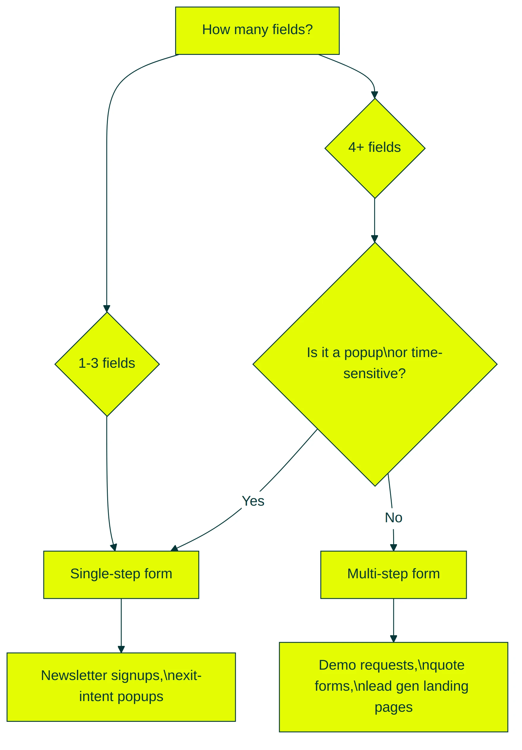
When single-step wins: 1-3 fields, time-sensitive popups, newsletter signups.
When multi-step wins: 5+ fields, qualifying questions, dedicated lead generation landing pages where the form is the whole point.
How to create a lead generation form that converts
Here’s a step-by-step approach that works whether you’re building a new form or fixing one that’s underperforming. Pair this with a high-converting landing page for the best results.
Step 1: Start with a specific offer. “Contact us” isn’t an offer. “Get your free SEO audit” is. The more specific the value, the more willing visitors are to share their info.
Your form is only as strong as the thing it promises. And keep the language simple. Unbounce’s 2024 benchmark found that complex vocabulary drops conversions by up to 24%.
Step 2: Pick fields your team will actually use. If your sales rep won’t read the “job title” field, don’t include it. Every unnecessary field is a small wall between you and a lead.
Step 3: Write a button that describes what happens next. “Submit” is the most wasted word in marketing. HubSpot’s data confirms it underperforms descriptive alternatives. “Get my free report” or “Book my demo” tells the visitor exactly what they’re getting.
Step 4: Enable browser autofill. Zuko studied 215 forms with over 1,000 sessions each. Forms where autofill worked properly had a 71% completion rate. Without autofill: 59%.
That’s a 12-point gap, and fixing it is free. Use standard HTML field names (name, email, tel, organization) so browsers recognize what to fill in.
Step 5: Place the form where intent matches. On your landing page, that’s above the fold. On blog posts, it’s after you’ve delivered value (not before). Putting a demo request form at the top of an educational blog post is like proposing on a first date.
Step 6: Add trust signals near the form. A short privacy note (“We won’t share your email. Ever.”). A security badge if you handle sensitive data. Social proof like “Join 10,000 marketers” next to the submit button. These reduce anxiety at the exact moment someone’s deciding whether to hand over their info.
Step 7: Make the post-submit experience instant. This one’s underrated. Chili Piper analyzed nearly 3 million form submissions. When leads could book a meeting right after submitting, conversions nearly doubled (30% to 66.7%). Don’t make someone fill out a form and then wait for a callback. Let them pick a time right there.
Step 8: Test it. Don’t guess which version of your form works better. A/B test the headline above the form, the number of fields, the button copy, and the form placement. Kirro lets you split test your lead form without writing code. Set up a free test and let the numbers tell you what converts. Three minutes. That’s it.
Lead quality vs lead quantity: the trade-off most forms get wrong
Shorter forms get more submissions. That’s true. But more submissions doesn’t mean more revenue.
61% of B2B marketers admit they send unqualified leads directly to sales. That’s wasted sales time, frustrated reps, and a conversion funnel that looks full but doesn’t close.
LinkedIn’s Lead Gen Forms are the poster child. They pre-fill everything from the visitor’s profile, making them dead easy to submit. Conversion rates hit around 13%, compared to 2-5% for landing page conversions. Sounds great. But practitioners consistently report that 20-40% fewer of those leads are ones sales can actually work. Easier to submit, harder to close.
Easy fills attract casual interest. That’s fine for newsletters. It’s a problem for $10,000 software deals.
When to care about quality over quantity
- You sell something expensive or complex (long sales cycles, high ticket)
- Your sales team has limited capacity
- Your lead generation conversion rate looks healthy but close rates are low
When volume matters more
- Low-ticket products people can buy without talking to sales
- Newsletter or community building
- Top-of-funnel awareness where any contact is valuable
The middle ground: progressive profiling
Progressive profiling (asking a few questions now, then more over time) resolves this tension. Collect email on the first visit. Company and role on the second. Budget and timeline on the third. Each interaction builds the lead profile without overwhelming the visitor.
78% of marketers using progressive profiling report improved lead quality. The idea: earn more information as you deliver more value.
The metric that actually matters is cost per qualified lead, not cost per lead. Say one form generates 100 leads at $10 each. Another generates 30 at $25 each. If only 5 of those 100 leads are qualified, but 20 of the 30 are? The “expensive” form wins by a mile.
Want to see which form version produces leads that actually close? Kirro tracks downstream conversions through GA4 (Google Analytics) integration. Compare a short form vs a longer one and measure which version sends better leads to sales.
That’s the number that matters. And once you know which form wins, you can increase your conversion rate across your whole conversion funnel.
FAQ
What is a lead generation form?
A lead generation form is a web form that collects visitor info (name, email, phone) in exchange for something valuable. A free guide, a demo, a quote. It’s the first step in turning a visitor into a potential customer.
A checkout form processes a payment. A support form is for existing customers. A lead form starts a new sales relationship.
How do I create a lead generation form?
Pick a form builder (most website platforms have one built in). Choose 2-5 fields based on what your sales team actually needs. Write a clear button label that says what happens next (“Get my free guide,” not “Submit”). Place it where visitors are already interested. If you want to test which version converts better, Kirro makes it simple. Connect your site, pick the form, launch a test.
How many fields should a lead generation form have?
There’s no magic number. Newsletter signups work with just email. Demo requests typically need 4-6 fields. The Zuko 93-million-session study found that field TYPE matters more than field COUNT. A well-designed 6-field form can outperform a sloppy 3-field one. When in doubt, test it.
What’s the average conversion rate for a lead generation form?
Around 17%, according to Formstack’s analysis of 650,000+ businesses. But that average hides huge variation. Contest forms hit 35%. Contact forms average just 1%. The offer, the audience, and the traffic source matter far more than the form itself. For detailed benchmarks by form type, see our lead conversion rate guide.
Should I use a multi-step form or a single-step form?
If your form has 5+ fields, test a multi-step version. Formstack data shows multi-step forms convert at 13.85% vs 4.53% for single-step. But for simple 1-3 field forms, single-step is fine. Multi-step reduces visual overwhelm. It shouldn’t add clicks for the sake of it.
How can I improve my lead form conversion rate?
Four things move the needle most: a specific offer (not “contact us”), fields that match the value of what you’re giving away, descriptive button copy, and browser autofill. Then test variations. Small changes to button text, field order, or form placement can surprise you. Testing your forms beats following generic best practices every time. For more tactics, check our CRO best practices guide.

Randy Wattilete
CRO expert and founder with nearly a decade running conversion experiments for companies from early-stage startups to global brands. Built programs for Nestlé, felyx, and Storytel. Founder of Kirro (A/B testing).
View all author posts